Tutorial: Microbial Diversity#
Flow cytometry can characterize a complex mixture of cells based on their morphology and staining – and those mixtures are not just mammalian cells! Microbial ecology studies are increasingly turning to flow cytometry, and Cytoflow has a bunch of tools that can support these studies too.
This tutorial demonstrates one approach using data from Görnt A et al, Chemical and microbial similarities and heterogeneities of wastewater from single-household cesspits for decentralised water reuse. Water Reuse 15(2), 255-270. 2025. https://doi.org/10.2166/wrd.2025.011. The authors collected wastewater from cesspits, staines samples with Hoescht dye and propidium iodide, then ran them through a flow cytometer. To compute a Shannon diversity index, they clustered events using a self-organizing map, then treated each cluster as a “species”.
If you’d like to follow along, you can do so by downloading one of the
cytoflow-#####-examples-basic.zip files from the Cytoflow releases
page on GitHub. These data are in the data/microbial_diversity
subfolder. Note that this example uses a function from scikit-bio to
compute a Shannon diversity index, so you’ll need to install that too.
Preprocessing#
The raw data, downloaded from https://zenodo.org/records/14731601,
contained approximately 600,000 events across 59 channels – this is
what happens when you collect your data on a sorter, I suppose. I
subsampled this data to 30,000 events per sample and only included the
FSC, SSC, PI (propidium iodide) and Hoescht (Hoescht
33342) channels. Additionally, while the study included 20 sites, I have
only included data for 5. No other data cleaning or transformation was
applied.
Set up Cytoflow and import the data#
import cytoflow as flow

# if your figures are too big or too small, you can scale them by changing matplotlib's DPI
import matplotlib
matplotlib.rc('figure', dpi = 160)
Because we don’t have any metadata besides the filename, use that as
Sample metadata.
ex = flow.ImportOp(tubes = [flow.Tube(file = "data/microbial_diversity/Sample_1.fcs",
                                      conditions = {"Sample" : 1}),
                            flow.Tube(file = "data/microbial_diversity/Sample_2.fcs",
                                      conditions = {"Sample" : 2}),
                            flow.Tube(file = "data/microbial_diversity/Sample_3.fcs",
                                      conditions = {"Sample" : 3}),
                            flow.Tube(file = "data/microbial_diversity/Sample_4.fcs",
                                      conditions = {"Sample" : 4}),
                            flow.Tube(file = "data/microbial_diversity/Sample_5.fcs",
                                      conditions = {"Sample" : 5})],
                   conditions = {"Sample" : "int"}).apply()
Preview and filter data#
Let’s have a quick look at the FSC/SSC distribution.
flow.ScatterplotView(xchannel = "FSC",
                     xscale = "log",
                     ychannel = "SSC",
                     yscale = "log").plot(ex, s = 0.2)
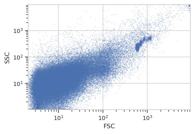
Note a number of “strange” clusters, one at about 10^3 in the FSC
channel and the other at the very top-right. The investigators included
both 10 um counting beads and 1 um Bright Blue beads; I think the
counting beads are the clusters at 10^3 and the 10 uM beads are up at
10^4. Both also show up in the Hoescht channel:
flow.HistogramView(channel = "Hoescht",
                   scale = "log").plot(ex)
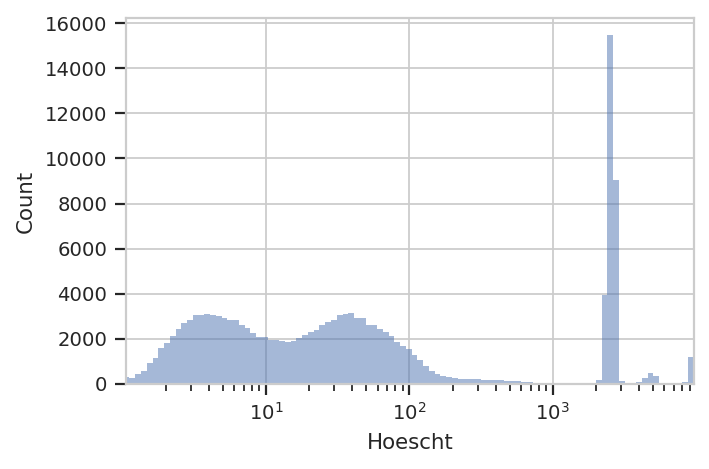
The investigators are using Hoescht 33342 dye to distinguish real cells
from junk with a threshold of 10 in the Hoescht channel. We’ll do
the same – that seems to split the low population from the high. But
instead of a ThresholdOp, let’s use a RangeOp so we can get rid
of the beads, which are all brighter than 10^3.
ex_live = flow.RangeOp(name = "Live",
                       channel = "Hoescht",
                       low = 10,
                       high = 1000).apply(ex)
Let’s check: If we plot the Live == True subset, did we get rid of
those clusters in FSC/SSC?
flow.ScatterplotView(xchannel = "FSC",
                     xscale = "log",
                     ychannel = "SSC",
                     yscale = "log",
                     subset = "Live == True").plot(ex_live, s = 0.2)
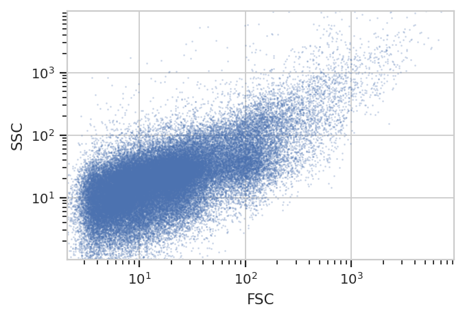
We sure did – and without gating out the other events with high FSC and SSC! Nice.
Cluster with a self-organizing map#
The researchers used a self-organizing map with 2025 clusters – that
corresponds to a 45x45 map. They did not cluster on Hoescht, but
instead used only FSC, SSC and PI. (Note that we’re
disabling consensus clustering – we want to keep all 2025 clusters. And
don’t forget to estimate the map using only the Live == True
subset!)
som_op = flow.SOMOp(name = "SOM",
                    channels = ["FSC", "SSC", "PI"],
                    scale = {"FSC" : "log",
                             "SSC" : "log",
                             "PI" : "log"},
                    consensus_cluster = False,
                    width = 45,
                    height = 45)
som_op.estimate(ex_live, subset = "Live == True")
/home/brian/src/cytoflow/cytoflow/utility/minisom.py:645: RuntimeWarning: invalid value encountered in sqrt
As usual, we check SOMOp.default_view() to see how the training
went:
som_op.default_view().plot(ex_live)
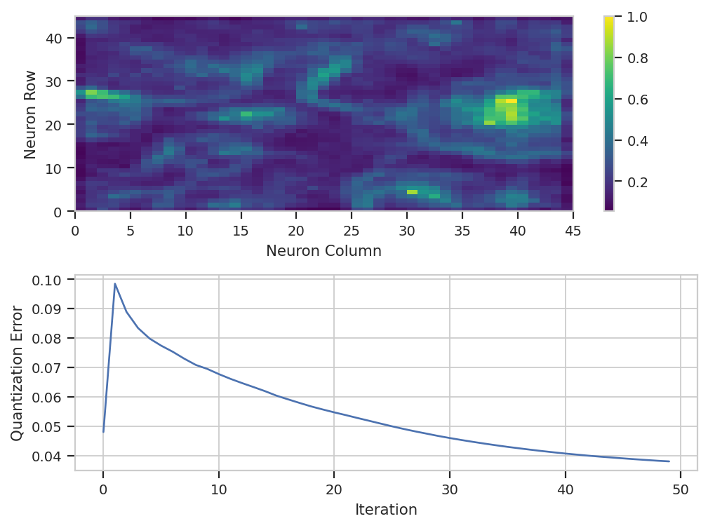
Huh. It’s not clear that after the default 50 iterations, that the model
has converged – if you’d like, feel free to run the training for more
iterations. There is a lot of structure in the neuron map, though. And
remember, the map was trained using a subset of the data – by default,
5%. We have to apply() it to the entire data set to classify each
event.
ex_som = som_op.apply(ex_live)
Count events in each cluster and compute the Shannon diversity index#
Remember, when we want to summarize some flow data, we create a
statistic. There are a number of operations that do so, but since
we’re only interested in one channel, we’ll use ChannelStatisticOp.
And actually, since all we’re doing is counting events, we can apply the
len function to any channel we’d like. So let’s count the number of
events in each cluster in each sample.
ex_count = flow.ChannelStatisticOp(name = "Count",
                                   channel = "FSC",
                                   function = len,
                                   by = ["SOM", "Sample"],
                                   subset = "Live == True").apply(ex_som)
ex_count.statistics['Count']
| FSC | ||
|---|---|---|
| SOM | Sample | |
| 0 | 1 | 28.0 |
| 2 | 4.0 | |
| 3 | 13.0 | |
| 4 | 4.0 | |
| 5 | 1.0 | |
| ... | ... | ... |
| 2024 | 1 | 17.0 |
| 2 | 6.0 | |
| 3 | 10.0 | |
| 4 | 10.0 | |
| 5 | 36.0 |
9773 rows × 1 columns
Great. We have a statistic with two indices, SOM (which cluster) and
Sample (which sample). Let’s use TransformStatisticOp and the
diversity.alpha.shannon function from scikit-bio to compute the
diversity index of each sample. And this is the power of doing flow
analysis in Python (and not a GUI) – you can use any function in the
scientific Python ecosystem that takes a pandas.Series and returns
a float or a pandas.Series. You can complete every step up to
this far in the GUI, but this next one can only be done in a script or
a Jupyter notebook – otherwise, you’d have to export the previous table
and use another tool.
import skbio

ex_diversity = flow.TransformStatisticOp(name = "Diversity",
                                         statistic = "Count",
                                         feature = "FSC",
                                         by = ["Sample"],
                                         function = skbio.diversity.alpha.shannon).apply(ex_count)
ex_diversity.statistics['Diversity']
| FSC | |
|---|---|
| Sample | |
| 1 | 7.317997 |
| 2 | 7.354961 |
| 3 | 7.336487 |
| 4 | 7.303949 |
| 5 | 7.308412 |
These values are quite close to the values reported by the researchers, which were all 7.4 or so.