cytoflow.views.matrix#
Plots a “matrix” view – a 2D representation of a heat map, pie plots, or petal plots.
MatrixView – plots the matrix view.
- class cytoflow.views.matrix.MatrixView[source]#
Bases:
HasStrictTraitsA view that creates a matrix view (a 2D grid representation) of a statistic. Set
statisticto the name of the statistic to plot; setfeatureto the name of that statistic’s feature you’d like to analyze.Setting
xfacetandyfacetto levels of the statistic’s index will result in a separate column or row for each value of that statistic.There are three different ways of plotting the values of the matrix view (the “cells” in the matrix), controlled by the
typeparameter:Setting
styletoheat(the default) will produce a “traditional” heat map, where each “cell” is a circle and the color of the circle is related to the intensity of the value offeature. (In this scenario,variableis ignored.)Setting
styletopiewill draw a pie plot in each cell. Ifvariableis set, then the values ofvariableare used as the categories of the pie, and the arc length of each slice of pie is related to the intensity of the value offeature. Ifvariableis not set, however,featureis ignored and the features of the statistic become the categories. In this case, all of the statistic index levels must be either used in the view facets or specified in theplot_nameparameter ofplot.Setting
styletopetalwill draw a “petal plot” in each cell. Ifvariableis set, then the values ofvariableare used as the categories, but unlike a pie plot, the arc width of each slice is equal. Instead, the radius of the pie slice scales with the square root of the intensity, so that the relationship between area and intensity remains the same. Ifvariableis not set, however,featureis ignored and the features of the statistic become the categories. In this case, all of the statistic index levels must be either used in the view facets or set in theplot_nameparameter ofplot
Warning
If
styleispieorpetal, then negative data will be clipped to 0!Optionally, you can set
size_functionto scale the circles (or pies or petals) by a function computed onExperiment.data. (Often set tolento scale by the number of events in each subset.)- statistic#
The statistic to plot. Must be a key in
Experiment.statistics.- Type:
Str
- xfacet#
Set to one of the index levels in the statistic being plotted, and a new column of subplots will be added for every unique value of that index level.
- Type:
String
- yfacet#
Set to one of the index levels in the statistic being plotted, and a new row of subplots will be added for every unique value of that index level.
- Type:
String
- variable#
The variable (index level) used for plotting pie and petal plots. Ignored for a heatmap. If unset, use the statistic features as categories.
- Type:
Str
- feature#
The column in the statistic to plot (often a channel name.) Ignored if
variableis left unset.- Type:
Str
- style#
What kind of matrix plot to make?
- Type:
Enum(
heat,pie,petal) (default =heat)
- scale#
For a heat map, how should the color of
featurebe scaled before plotting? Ifstyleis notheat,scalemust belinear.- Type:
Enum(
linear,log,logicle} (default =linear)
- size_function#
If set, separate the
Experimentinto subsets byxfacetandyfacet(which should be conditions in theExperiment), compute a function on them, and scale the size of each matrix cell by those values. The callable should take a singlepandas.DataFrameargument and return a positivefloator value that can be cast tofloat(such asint). Of particular use islen, which will scale the cells by the number of events in each subset.- Type:
Callable
- subset#
Only plot a subset of the data in
statistic. Passed directly topandas.DataFrame.query.- Type:
Str
Note
MatrixViewimplements theIViewinterface, but it is NOT a subclassBaseStatisticsView. This is becauseMatrixViewdoes not useseaborn.FacetGridto lay out the subplots – all the layout logic imposes a huge overhead cost. InsteadMatrixViewuses classes frommpl_toolkits.axes_grid1for its layout.Examples
Make a little data set.
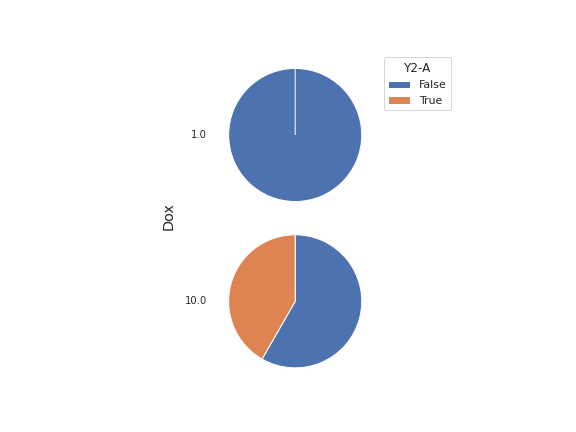
>>> import cytoflow as flow
>>> import_op = flow.ImportOp()
>>> import_op.tubes = [flow.Tube(file = "Plate01/RFP_Well_A3.fcs",
...                              conditions = {'Dox' : 10.0}),
...                    flow.Tube(file = "Plate01/CFP_Well_A4.fcs",
...                              conditions = {'Dox' : 1.0})]
>>> import_op.conditions = {'Dox' : 'float'}
>>> ex = import_op.apply()
Add a threshold gate
>>> ex2 = flow.ThresholdOp(name = 'Threshold',
...                        channel = 'Y2-A',
...                        threshold = 2000).apply(ex)
Add a statistic
>>> ex3 = flow.ChannelStatisticOp(name = "ByDox",
...                               channel = "Y2-A",
...                               by = ['Dox', 'Threshold'],
...                               function = len).apply(ex2)
Plot the bar chart
>>> flow.MatrixView(statistic = "ByDox",
...                 xfacet = 'Dox',
...                 variable = 'Threshold',
...                 feature = 'Y2-A',
...                 style = 'pie').plot(ex3)
- plot(experiment, plot_name=None, **kwargs)[source]#
Plot a chart of a variable’s values against a statistic.
- Parameters:
experiment (Experiment) – The
Experimentto plot using this view.plot_name (str) – If this
IViewcan make multiple plots,plot_nameis the name of the plot to make. Must be one of the values retrieved fromenum_plots.title (str) – Set the plot title
xlabel (str) – Set the X axis label
ylabel (str) – Set the Y axis label
legend (bool) – Plot a legend or color bar? Defaults to
True.legendlabel (str) – Set the label for the color bar or legend
legend_loc (str) – If we plot a legend, where should it go? This is a
matplotliblegend location string, like ‘lower right’ or ‘outside center right’. Default is ‘upper right’.palette (palette name) – Colors to use for the different levels of the hue variable. Should be something that can be interpreted by
seaborn.color_palette. If plotting a heat map, this should be a continuous color map (‘viridis’ is the default.) Otherwise, choose either a discrete color map (‘deep’ is the default) or a continuous color map from which equi-spaced colors will be drawn.All other parameters are passed to the ``wedgeprops`` argument of
`matplotlib.axes.Axes.pie` – ie, they should be matplotlib patch
properties.