cytoflow.operations.range#
Applies a (1D) range gate to an Experiment. range has two classes:
RangeOp – Applies the gate, given a pair of thresholds
RangeSelection – an IView that allows you to view the range and/or
interactively set the thresholds.
- class cytoflow.operations.range.RangeOp[source]#
Bases:
HasStrictTraitsApply a range gate to a cytometry experiment.
- name#
The operation name. Used to name the new metadata field in the experiment that’s created by
apply- Type:
Str
- channel#
The name of the channel to apply the range gate.
- Type:
Str
- low#
The lowest value to include in this gate.
- Type:
Float
- high#
The highest value to include in this gate.
- Type:
Float
Examples
Make a little data set.
>>> import cytoflow as flow
>>> import_op = flow.ImportOp()
>>> import_op.tubes = [flow.Tube(file = "Plate01/RFP_Well_A3.fcs",
...                              conditions = {'Dox' : 10.0}),
...                    flow.Tube(file = "Plate01/CFP_Well_A4.fcs",
...                              conditions = {'Dox' : 1.0})]
>>> import_op.conditions = {'Dox' : 'float'}
>>> ex = import_op.apply()
Create and parameterize the operation.
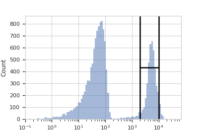
>>> range_op = flow.RangeOp(name = 'Range',
...                         channel = 'Y2-A',
...                         low = 2000,
...                         high = 10000)
Plot a diagnostic view
>>> rv = range_op.default_view(scale = 'log')
>>> rv.plot(ex)
Note
If you want to use the interactive default view in a Jupyter notebook, make sure you say
%matplotlib notebookin the first cell (instead of%matplotlib inlineor similar). Then calldefault_view()withinteractive = True:rv = range_op.default_view(scale = 'log', interactive = True) rv.plot(ex)
Apply the gate, and show the result
>>> ex2 = range_op.apply(ex)
>>> ex2.data.groupby('Range', observed = True).size()
Range
False    16042
True      3958
dtype: int64
- apply(experiment)[source]#
Applies the range gate to an experiment.
- Parameters:
experiment (
Experiment) – theExperimentto which this op is applied- Returns:
a new
Experiment, the same as oldExperimentbut with a new column of typeboolwith the same as the operation name. The bool isTrueif the event’s measurement inchannelis greater thanlowand less thanhigh; it isFalseotherwise.- Return type:
- class cytoflow.operations.range.RangeSelection[source]#
Bases:
Op1DView,HistogramViewPlots, and lets the user interact with, a selection on the X axis.
- interactive#
is this view interactive? Ie, can the user set min and max with a mouse drag?
- Type:
Bool
- channel#
The channel this view is viewing. If you created the view using
default_view, this is already set.- Type:
Str
- scale#
The way to scale the x axes. If you created the view using
default_view, this may be already set.- Type:
{‘linear’, ‘log’, ‘logicle’}
- op#
The
IOperationthat this view is associated with. If you created the view usingdefault_view, this is already set.- Type:
Instance(
IOperation)
- subset#
An expression that specifies the subset of the statistic to plot. Passed unmodified to
pandas.DataFrame.query.- Type:
- xfacet#
Set to one of the
Experiment.conditionsin theExperiment, and a new column of subplots will be added for every unique value of that condition.- Type:
String
- yfacet#
Set to one of the
Experiment.conditionsin theExperiment, and a new row of subplots will be added for every unique value of that condition.- Type:
String
- huefacet#
Set to one of the
Experiment.conditionsin the in theExperiment, and a new color will be added to the plot for every unique value of that condition.- Type:
String
Examples
In an IPython notebook with
%matplotlib notebook>>> r = RangeOp(name = "RangeGate", ... channel = 'Y2-A') >>> rv = r.default_view() >>> rv.interactive = True >>> rv.plot(ex2) >>> ### draw a range on the plot ### >>> print r.low, r.high
- plot(experiment, **kwargs)[source]#
Plot the underlying histogram and then plot the selection on top of it.
- Parameters:
experiment (Experiment) – The
Experimentto plot using this view.title (str) – Set the plot title
xlabel (str) – Set the X axis label
ylabel (str) – Set the Y axis label
huelabel (str) – Set the label for the hue facet (in the legend)
legend (bool) – Plot a legend for the color or hue facet? Defaults to
True.legend_loc (str) – If we plot a legend, where should it go? This is a
matplotliblegend location string, like ‘lower right’ or ‘outside center right’. Default is ‘upper right’.sharex (bool) – If there are multiple subplots, should they share X axes? Defaults to
True.sharey (bool) – If there are multiple subplots, should they share Y axes? Defaults to
True.row_order (list) – Override the row facet value order with the given list. If a value is not given in the ordering, it is not plotted. Defaults to a “natural ordering” of all the values.
col_order (list) – Override the column facet value order with the given list. If a value is not given in the ordering, it is not plotted. Defaults to a “natural ordering” of all the values.
hue_order (list) – Override the hue facet value order with the given list. If a value is not given in the ordering, it is not plotted. Defaults to a “natural ordering” of all the values.
height (float) – The height of each row in inches. Default = 3.0
aspect (float) – The aspect ratio of each subplot. Default = 1.5
col_wrap (int) – If
xfacetis set andyfacetis not set, you can “wrap” the subplots around so that they form a multi-row grid by setting this to the number of columns you want.sns_style ({“darkgrid”, “whitegrid”, “dark”, “white”, “ticks”}) – Which
seabornstyle to apply to the plot? Default iswhitegrid.sns_context ({“notebook”, “paper”, “talk”, “poster”}) – Which
seaborncontext to use? Controls the scaling of plot elements such as tick labels and the legend. Default isnotebook.palette (palette name, list, or dict) – Colors to use for the different levels of the hue variable. Should be something that can be interpreted by
seaborn.color_palette, or a dictionary mapping hue levels to matplotlib colors. See https://seaborn.pydata.org/tutorial/color_palettes.html for a good overview.despine (Bool) – Remove the top and right axes from the plot? Default is
True.min_quantile (float (>0.0 and <1.0, default = 0.001)) – Clip data that is less than this quantile.
max_quantile (float (>0.0 and <1.0, default = 1.00)) – Clip data that is greater than this quantile.
lim ((float, float)) – Set the range of the plot’s data axis.
orientation ({‘vertical’, ‘horizontal’})
num_bins (int) – The number of bins to plot in the histogram. Clipped to [100, 1000]
histtype ({‘stepfilled’, ‘step’, ‘bar’}) – The type of histogram to draw.
stepfilledis the default, which is a line plot with a color filled under the curve.density (bool) – If
True, re-scale the histogram to form a probability density function, so the area under the histogram is 1.linewidth (float) – The width of the histogram line (in points)
linestyle ([‘-’ | ‘–’ | ‘-.’ | ‘:’ | “None”]) – The style of the line to plot
alpha (float (default = 0.5)) – The alpha blending value, between 0 (transparent) and 1 (opaque).
line_props (Dict) – The properties of the
matplotlib.lines.Line2Dthat are drawn on top of the histogram. They’re passed directly to thematplotlib.lines.Line2Dconstructor. Default:{color : 'black', linewidth : 2}