Hierarchical Gating#
A common strategy for manual gating is hierarchical gating – a skilled
cytometrist examines sets of one- or two-dimensional plots, one after
another, to separate cells into “positive” and “negative” populations.
While I like to think that modern cytometry has better, less biased
tools to accomplish this task, it is still a necessary one in many
contexts, and Cytoflow supports it.
This notebook demonstrates a hierarchical gating scheme from
Saeys Y, Van Gassen S, Lambrecht BN. Computational flow cytometry: helping to make sense of high-dimensional immunology data. Nature Reviews Immunology 16:449-462 (2016).
Our question here is a basic one – what is the count of each cell type
in each tube in the six tubes in the experiment? The data were
downloaded from the Sayes Lab
github and compensated
using the bleedthrough matrix in the provided FlowJo workspace before
being re-saved by Cytoflow – no other data preprocessing was
applied.
We want to quantify NK, NK T, T and B cells; neutrophils, DCs, basophils, and macrophages. The markers (and the channels they were measured in) are in the table below (also from the Sayes lab github). Per [https://flowrepository.org/experiments/833], these cells were splenocytes from wild-type C57Bl/6 mice.
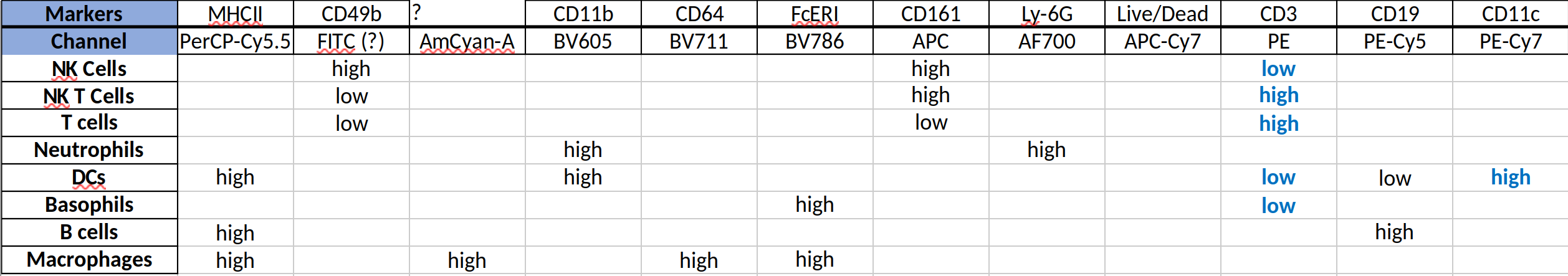
Markers#
Set up the notebook and import the data set#
This notebook uses the interactive widges provided by the ipympl package. If you are seeing only blank spaces where you are expecting interactive plots, make sure you are using the Jupyter Lab interface instead of the Jupyter Notebook interface. For whatever reason, it seems to work more consistently.
# set up the notebook
%matplotlib widget
import cytoflow as flow

# if your figures are too big or too small, you can scale them by changing matplotlib's DPI
import matplotlib
matplotlib.rc('figure', dpi = 160)
In Cytoflow, we’d usually add additional metadata to each tube.
Here, however, all we have is the tube number. We are going to use the
channels attribute of ImportOp to map channels to markers,
though. (I don’t know which marker is on the AmCyan or Pacific Blue
channels, though. And let’s be clear, I am not an immunologist, to
know about any of these markers!)
import_op = flow.ImportOp(conditions = {"Tube" : "category"},
                          tubes = [flow.Tube(file='data/Saeys_11.fcs', conditions = {"Tube" : "11"}),
                                   flow.Tube(file='data/Saeys_12.fcs', conditions = {"Tube" : "12"}),
                                   flow.Tube(file='data/Saeys_13.fcs', conditions = {"Tube" : "13"}),
                                   flow.Tube(file='data/Saeys_28.fcs', conditions = {"Tube" : "28"}),
                                   flow.Tube(file='data/Saeys_30.fcs', conditions = {"Tube" : "30"}),
                                   flow.Tube(file='data/Saeys_31.fcs', conditions = {"Tube" : "31"})],
                          channels = {"FSC-A" : "FSC_A",
                                      "FSC-H" : "FSC_H",
                                      "APC-Cy7-A" : "Live_Dead",
                                      "AmCyan-A" : "AmCyan",
                                      "BV711-A" : "CD64",
                                      "PE-A" : "CD3",
                                      "PE-Cy5-A" : "CD19",
                                      "APC-A" : "CD161",
                                      "PE-Cy7-A" : "CD11c",
                                      "PerCP-Cy5-5-A" : "MHCII",
                                      "Alexa Fluor 700-A" : "Ly_6G",
                                      "BV605-A" : "CD11b",
                                      "BV786-A" : "FcERI",
                                      "Pacific Blue-A" : "Pacific_Blue"})

ex = import_op.apply()
Gate single cells and live cells#
First, gate on FSC_A and FSC-H to separate single cells from
debris and clumps.
single_gate = flow.PolygonOp(name = "Single_Cell",
                             xchannel = "FSC_A",
                             ychannel = "FSC_H")
single_gate.default_view(density = True,
                         huescale = "log",
                         interactive = True).plot(ex, gridsize = 100)

ex_single = single_gate.apply(ex)
Next, gate on FSC_A and Live_Dead to find live cells. Remember,
dead cells are the positive population!
live_gate = flow.PolygonOp(name = "Live",
                           xchannel = "FSC_A",
                           ychannel = "Live_Dead",
                           yscale = "logicle")
live_gate.default_view(density = True,
                       huescale = "log",
                       subset = "Single_Cell == True",
                       interactive = True).plot(ex_single, gridsize = 100)

ex_live = live_gate.apply(ex_single)
Gate immune cells#
Now, we’ll set up a single gate for each immunological population we’re
interested in. Here, we are not looking at subsets defined by previous
gates – instead, for each population, we’re just plotting cells that
are Single_Cell == True and also Live == True.
We start with macrophages, which are CD64 high and AmCyan high
macrophage_gate = flow.PolygonOp(name = "Macrophage",
                                 xchannel = "CD64",
                                 xscale = "logicle",
                                 ychannel = "AmCyan",
                                 yscale = "logicle")
macrophage_gate.default_view(density = True,
                             huescale = "log",
                             subset = "Single_Cell == True & Live == True",
                             interactive = True).plot(ex_live, gridsize = 100)

B cells are CD19 high and CD3 low.
bcell_gate = flow.PolygonOp(name = "B_Cell",
                            xchannel = "CD3",
                            xscale = "logicle",
                            ychannel = "CD19",
                            yscale = "logicle")
bcell_gate.default_view(density = True,
                        huescale = "log",
                        subset = "Single_Cell == True & Live == True",
                        interactive = True).plot(ex_live, gridsize = 100)

We can use CD3 and CD161 to distinguish NK, NK T and T Cells.
nk_gate = flow.PolygonOp(name = "NK",
                         xchannel = "CD3",
                         xscale = "logicle",
                         ychannel = "CD161",
                         yscale = "logicle")
nk_gate.default_view(density = True,
                     huescale = "log",
                     subset = "Single_Cell == True & Live == True",
                     interactive = True).plot(ex_live, gridsize = 100)

nkt_gate = flow.PolygonOp(name = "NK_T",
                          xchannel = "CD3",
                          xscale = "logicle",
                          ychannel = "CD161",
                          yscale = "logicle")
nkt_gate.default_view(density = True,
                      huescale = "log",
                      subset = "Single_Cell == True & Live == True",
                      interactive = True).plot(ex_live, gridsize = 100)

tcell_gate = flow.PolygonOp(name = "T_Cell",
                            xchannel = "CD3",
                            xscale = "logicle",
                            ychannel = "CD161",
                            yscale = "logicle")
tcell_gate.default_view(density = True,
                        huescale = "log",
                        subset = "Single_Cell == True & Live == True",
                        interactive = True).plot(ex_live, gridsize = 100)

DCs are CD11c high and MHCII high
dc_gate = flow.PolygonOp(name = "DC",
                         xchannel = "CD11c",
                         xscale = "logicle",
                         ychannel = "MHCII",
                         yscale = "logicle")
dc_gate.default_view(density = True,
                     huescale = "log",
                     subset = "Single_Cell == True & Live == True",
                     interactive = True).plot(ex_live, gridsize = 100)

Neutrophils are Ly-6G high and CD11b high.
neutrophil_gate = flow.PolygonOp(name = "Neutrophil",
                                 xchannel = "Ly_6G",
                                 xscale = "logicle",
                                 ychannel = "CD11b",
                                 yscale = "logicle")
neutrophil_gate.default_view(density = True,
                             huescale = "log",
                             subset = "Single_Cell == True & Live == True",
                             interactive = True).plot(ex_live, gridsize = 100)

Finally, basophils are FcERI high. (I don’t know what marker is on the Pacific Blue channel – they seem to be high for that marker too.
basophil_gate = flow.PolygonOp(name = "Basophil",
                               xchannel = "FcERI",
                               xscale = "logicle",
                               ychannel = "Pacific_Blue",
                               yscale = "logicle")
basophil_gate.default_view(density = True,
                           huescale = "log",
                           subset = "Single_Cell == True & Live == True",
                           interactive = True).plot(ex_live, gridsize = 100)

Apply the gates and analyze the result#
Up to now, we’ve created and parameterized the various gates. Let’s apply all of them sequentially.
ex_gated = macrophage_gate.apply(ex_live)
ex_gated = bcell_gate.apply(ex_gated)
ex_gated = nk_gate.apply(ex_gated)
ex_gated = nkt_gate.apply(ex_gated)
ex_gated = tcell_gate.apply(ex_gated)
ex_gated = dc_gate.apply(ex_gated)
ex_gated = neutrophil_gate.apply(ex_gated)
ex_gated = basophil_gate.apply(ex_gated)
Now we can apply the hierarchical gating strategy. The HierarchyOp
operation uses an ordered series of gates to create a new categorical
condition. You parameterize it with a list of gates, values, and labels.
If an event has the first condition equal to the first value, it gets
the first label. Otherwise, if it has the second condition equal to the
second value, it gets the second label. And so on. Left over events get
a default label, which is Unknown by default.
ex_hierarchy = flow.HierarchyOp(name = "Cell_Type",
                                gates = [("Macrophage", True, "Macrophage"),
                                         ("B_Cell", True, "B Cell"),
                                         ("NK", True, "NK"),
                                         ("NK_T", True, "NK T"),
                                         ("T_Cell", True, "T Cell"),
                                         ("DC", True, "DC"),
                                         ("Neutrophil", True, "Neutrophil"),
                                         ("Basophil", True, "Basophil")]).apply(ex_gated)
Now, let’s compute a simple statistic on the FSC-A channel and just
count the number of events that have each label of the Cell Type
condition, broken out by Tube.
ex_hierarchy_count = flow.ChannelStatisticOp(name = "Cell_Type",
                                             channel = "FSC_A",
                                             function = len,
                                             by = ["Cell_Type", "Tube"],
                                             subset = "Single_Cell == True & Live == True").apply(ex_hierarchy)
Cytoflow has a TableView, but it’s not great for displaying wide
tables. Instead, let’s use pandas to pivot the new statistic and
Jupyter’s pretty-printing to display it.
ex_hierarchy_count.statistics['Cell_Type'].reset_index().pivot(columns = "Tube",
                                                               index = "Cell_Type",
                                                               values = "FSC_A")
| Tube | 11 | 12 | 13 | 28 | 30 | 31 |
|---|---|---|---|---|---|---|
| Cell_Type | ||||||
| B Cell | 19353.0 | 16382.0 | 18564.0 | 20205.0 | 17178.0 | 19686.0 |
| Basophil | 31.0 | 17.0 | 31.0 | 26.0 | 20.0 | 13.0 |
| DC | 994.0 | 867.0 | 561.0 | 783.0 | 612.0 | 685.0 |
| Macrophage | 484.0 | 629.0 | 565.0 | 463.0 | 381.0 | 274.0 |
| NK | 40.0 | 36.0 | 44.0 | 661.0 | 348.0 | 554.0 |
| NK T | 272.0 | 247.0 | 192.0 | 161.0 | 127.0 | 151.0 |
| Neutrophil | 212.0 | 166.0 | 198.0 | 229.0 | 231.0 | 238.0 |
| T Cell | 6280.0 | 6046.0 | 6411.0 | 7901.0 | 9322.0 | 10866.0 |
| Unknown | 1904.0 | 2036.0 | 2918.0 | 1535.0 | 1565.0 | 1343.0 |
Finally, everyone loves a plot instead of a table. Let’s make pie charts
using MatrixView.
flow.MatrixView(statistic = "Cell_Type",
                style = "pie",
                variable = "Cell_Type",
                feature = "FSC_A",
                xfacet = "Tube").plot(ex_hierarchy_count,
                                      legendlabel = "Cell Type",
                                      linestyle = 'none')
/home/brian/src/cytoflow/cytoflow/views/matrix.py:392: RuntimeWarning: More than 20 figures have been opened. Figures created through the pyplot interface (matplotlib.pyplot.figure) are retained until explicitly closed and may consume too much memory. (To control this warning, see the rcParamfigure.max_open_warning). Consider usingmatplotlib.pyplot.close().

At the end of the day, I don’t think that any of these tubes was substantially different from the rest of them.