Basic example cytometry workflow#
Welcome to cytoflow! I’m glad you’re here. The following is a
heavily commented workflow for importing a few tubes of cytometry data
and doing some (very) basic analysis. The goal is to give you not only a
taste of using the library for interactive work, but also some insight
into the rationale for the way it’s designed the way it is and the way
it differs from existing projects.
cytoflow’s goal is to enable quantitative, reproducible
cytometry analysis. Reproducibility between cytometry experiments is
poor, due in part to differences in analysis between operators; but if
all your analysis is in a Jupyter notebook (like this one!), then
sharing and reuse of workflows is much easier.
Let’s look at a very basic experiment, containing only two tubes. These two tubes contain cells that are expressing fluorescent proteins as the read-out of some cell state. We’ll assume that these two tubes are identical, except that one has been induced with 1 µM of the small molecule inducer doxycycline (aka ‘Dox’) and the other tube has been induced with 10 µM Dox.
Start by importing the cytoflow module.
import cytoflow as flow

# if your figures are too big or too small, one way to scale them is by changing matplotlib's DPI
import matplotlib
matplotlib.rc('figure', dpi = 160)
The central data structure in cytoflow is the Experiment, which
is basically a pandas.DataFrame containing the events; its
associated metadata (experimental conditions and the like); and some
methods to manipulate them.
You usually create an Experiment using an instance of the
ImportOp class. Start by defining two tubes, including their
experimental conditions (ie, how much Dox is in each); then give those
tubes, and a dict specifying the experimental conditions’ names and
types, to ImportOp. Call the apply() function to get back the
Experiment with all the data in it.
tube1 = flow.Tube(file = 'data/RFP_Well_A3.fcs',
                  conditions = {'Dox' : 10.0})
tube2 = flow.Tube(file='data/CFP_Well_A4.fcs',
                  conditions = {'Dox' : 1.0})

import_op = flow.ImportOp(conditions = {'Dox' : 'float'},
                          tubes = [tube1, tube2])

ex = import_op.apply()
Once you have an Experiment instance, this is the last time you
should ever think about tubes or wells. Rather, think of your experiment
as a very large set of single-cell measurements, each of which has some
metadata associated with it; in this case, how much Dox the cell was
exposed to. cytoflow helps you focus your analysis on how those
measurements change as the experimental conditions change, without
worrying about what cells were in what tube.
Let’s have a quick look at one of the fluorescence channels, Y2-A.
We plot data from Experiments by instantiating view classes,
parameterizing them, then calling plot(). So lets instantiate a
HistogramView and tell it which channel we’re looking at, then call
plot and pass it the experiment containing the data. Remember, this
is not a single tube, but rather all the data in the Experiment.
hist = flow.HistogramView()
hist.channel = 'Y2-A'
hist.plot(ex)
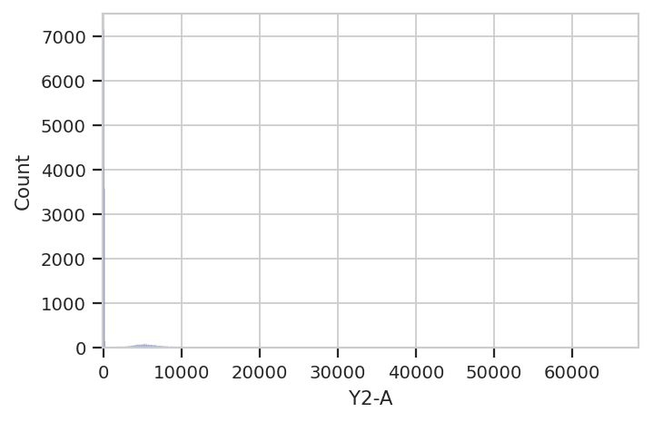
Hmmm. This plot is hard to interpret because most of the data is
clustered around 0, in the linear range of the detector’s response.
Let’s re-plot using a different scale. My favorite is logicle, a
type of biexponential scale which has a linear response around 0 and
a log range elsewhere. We specify the plot scale by setting the
scale attribute of HistogramView to logicle; other options
at the moment are log and linear.
The cell below also demonstrates a different way to parameterize the
HistogramView instance, by passing parameters to the constructor
instead of setting the values of the instance’s attributes after we make
it. Either way is correct.
hist = flow.HistogramView(channel = 'Y2-A',
                          scale = 'logicle')
hist.plot(ex)

Ah, much better. There is clearly a population of cells around 0 and a
population of cells around about 5000. But! This is the entire
Experiment – is is one of the populations from the low-Dox tube and
the other population from the high-Dox tube?
Let’s see if the histogram is different for the two different
concentrations of inducer. cytoflow’s plotting takes inspiration
from Trellis plots (eg the lattice package in R): to split the data into
subsets, you tell the plotting module which metadata “facet” you want to
plot in the X, Y and color (hue) axes.
This time, we tell HistogramView to make a separate plot for each
different value of Dox and stack them on top of eachother by saying
yfacet = 'Dox'; if we wanted the plots side-by-side, we would have
said xfacet = 'Dox'.
Also note that this time, we don’t keep around the HistogramView
object; if we don’t need to re-use it, we can just call plot right
after the constructor.
flow.HistogramView(channel = 'Y2-A',
                   scale = 'logicle',
                   yfacet = 'Dox').plot(ex)

Indeed, the two tubes have dramatically different histograms. We could
also plot them on top of eachother with different colors, by using
huefacet instead of yfacet – this is one of my favorite ways to
compare a few distributions at once.
flow.HistogramView(channel = "Y2-A",
                   scale = "logicle",
                   huefacet = 'Dox').plot(ex)
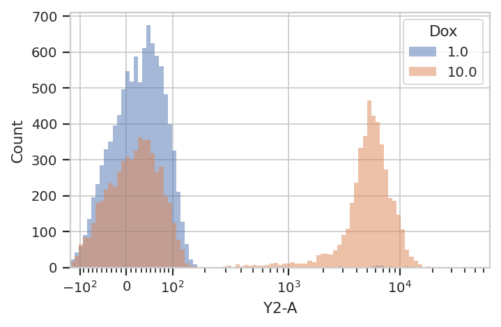
So, there’s a clear difference between these tubes: one has a
substantial population above about ~200 in the Y2-A, and the other
doesn’t. What’s the proportion of “high” cells? Let’s gate out the
“high” population using a ThresholdOp.
thresh = flow.ThresholdOp(name = "T",
                          channel = "Y2-A",
                          threshold = 200)

ex2 = thresh.apply(ex)
Two important things to note here: first, an Operation (such as
ThresholdOp) does not operate in place; instead, you create a
ThresholdOp object, then call apply() to run it on an
Experiment. The apply() function returns a new Experiment.
Second, a gate does not remove events; it simply adds additional
metadata to the events already there. You can see this if we look at
the underlying pandas.DataFrame for ex and ex2:
print(ex.data.head())
print("----")
print(ex2.data.head())
         B1-A        B1-H          B1-W   Dox       FSC-A       FSC-H  0 -127.094002  257.718353 -63040.300781  10.0  459.962982  437.354553
1  -70.234840  255.798340 -34034.042969  10.0 -267.174652  365.354553
2  -96.471756  313.398346 -41931.687500  10.0 -201.582336  501.354553
3   18.831570  277.669250   8514.489258  10.0  291.259888  447.029755
4  100.882095  255.756256  51291.074219  10.0 -397.168579  354.565308

           FSC-W      HDR-T        SSC-A        SSC-H          SSC-W  0  137847.578125   2.018511   840.091370   747.917847  147225.328125
1  -95849.679688  27.451754  3476.902344  3163.917969  144038.046875
2  -52700.828125  32.043865   480.270691   507.917877  123937.437500
3   85399.273438  79.327492  8026.275879  6741.838867  156043.484375
4 -146821.125000  79.731194  7453.750488   609.884277  262143.968750

         V2-A        V2-H           V2-W         Y2-A         Y2-H  0   41.593452  240.153854   22701.017578   109.946274   153.630051
1  103.437637  336.153870   40332.058594  5554.108398  4273.629883
2 -271.375580  256.153870 -138860.828125    81.835281   121.630051
3  -26.212378  207.677841  -16543.453125   -54.120304    98.122017
4   44.559933  216.036865   27035.013672   -10.542595   127.326027

            Y2-W
0   93802.468750
1  170344.203125
2   88188.023438
3  -72294.242188
4  -10852.761719
----
         B1-A        B1-H          B1-W   Dox       FSC-A       FSC-H  0 -127.094002  257.718353 -63040.300781  10.0  459.962982  437.354553
1  -70.234840  255.798340 -34034.042969  10.0 -267.174652  365.354553
2  -96.471756  313.398346 -41931.687500  10.0 -201.582336  501.354553
3   18.831570  277.669250   8514.489258  10.0  291.259888  447.029755
4  100.882095  255.756256  51291.074219  10.0 -397.168579  354.565308

           FSC-W      HDR-T        SSC-A        SSC-H          SSC-W  0  137847.578125   2.018511   840.091370   747.917847  147225.328125
1  -95849.679688  27.451754  3476.902344  3163.917969  144038.046875
2  -52700.828125  32.043865   480.270691   507.917877  123937.437500
3   85399.273438  79.327492  8026.275879  6741.838867  156043.484375
4 -146821.125000  79.731194  7453.750488   609.884277  262143.968750

         V2-A        V2-H           V2-W         Y2-A         Y2-H  0   41.593452  240.153854   22701.017578   109.946274   153.630051
1  103.437637  336.153870   40332.058594  5554.108398  4273.629883
2 -271.375580  256.153870 -138860.828125    81.835281   121.630051
3  -26.212378  207.677841  -16543.453125   -54.120304    98.122017
4   44.559933  216.036865   27035.013672   -10.542595   127.326027

            Y2-W      T
0   93802.468750  False
1  170344.203125   True
2   88188.023438  False
3  -72294.242188  False
4  -10852.761719  False
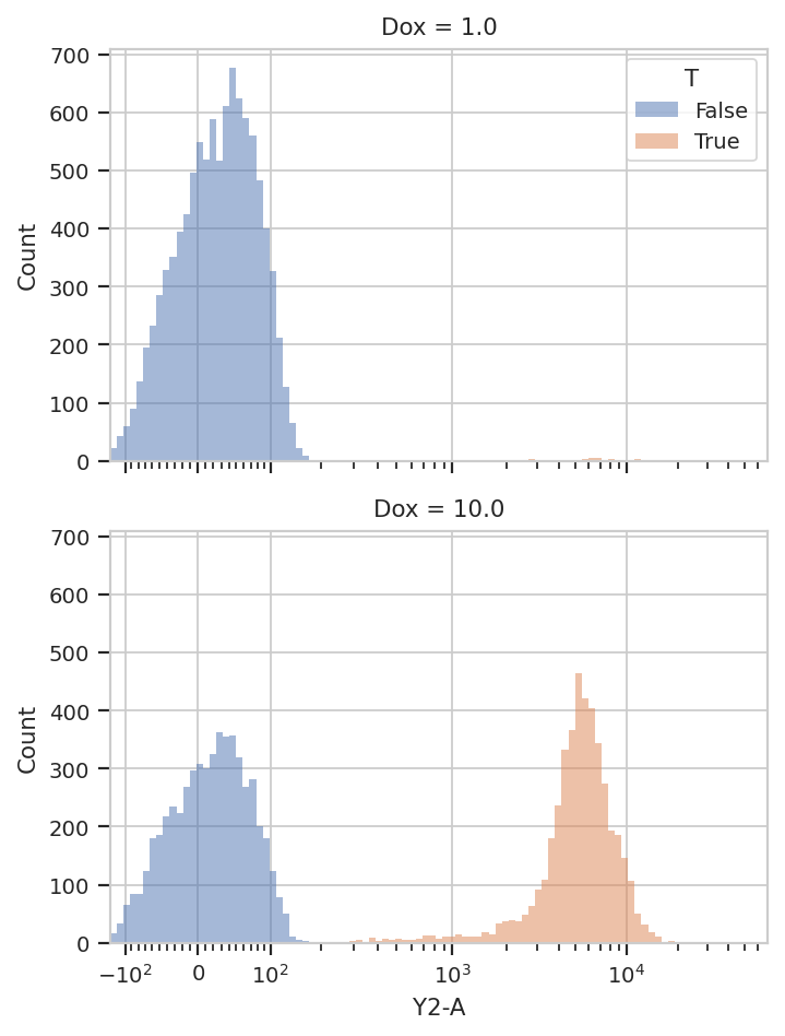
In ex2, the ThresholdOp added a new column, named T, which
has the same name as the ThresholdOp’s name attribute. It is
True if the Y2-A value is greater than 200, and False
otherwise. The T column is now a piece metadata just like the Dox
concentration that we can use to facet the plots. For example, the
following plots different Dox concentrations in separate plots
stacked on top of eachother (yfacet = "Dox"), and on each of these
plots uses separate colors for the “low” and “high” populations
(huefacet = 'T'):
flow.HistogramView(channel = "Y2-A",
                   scale = "logicle",
                   yfacet = "Dox",
                   huefacet = 'T').plot(ex2)
It’s also important to note that we can still access the underlying
pandas.Dataframe: either by looking at the Experiment.data
attribute, or by referencing a column directly:
ex2["T"].head(10)
0    False
1     True
2    False
3    False
4    False
5    False
6     True
7    False
8     True
9    False
Name: T, dtype: bool
Because the data is all stored in a single pandas.Dataframe, we can
use the pandas API, and indeed the rest of the SciPy stack, to ask
sophisticated questions of the underlying data. For example, “how many
events of each Dox concentration were above the threshold?”
ex2.data.groupby(['Dox', 'T']).size()
Dox   T
1.0   False    9946
      True       54
10.0  False    5561
      True     4439
dtype: int64
cytoflow can answer the same question for us using one of its
statistics views. In cytoflow, a statistic is a piece of data that
summarizes a population; one of the key features of cytoflow is that
it makes it easy to create theses statistics and see how these summary
statistics change as your experimental conditions change.
Several operations add statistics to an experiment; one of the most
straightforward ones is ChannelStatisticOp. It groups the
experiment’s data by the conditions specified in by, then applies
function to channel for each group.
In this case, we’ll divide up the data into the subgroups
T == True & Dox == 1; T == True & Dox == 10;
T == False & Dox == 1; and T == False & Dox == 10. Then, we’ll
apply the function len to the Y2-A channel. You can use any
Python function in function that takes a pandas.Series and
returns either a single float or a pandas.Series of
floats. See the documentation for details.
ex3 = flow.ChannelStatisticOp(name = "ByDox",
                              channel = "Y2-A",
                              by = ['T', 'Dox'],
                              function = len).apply(ex2)
Now we can look at the new statistic: Experiment.statistics is a
dictionary whose keys are tuples and whose values are the computed
statistics (stored as MultiIndexed pandas.Series). The first
element in the tuple is the name of the operation that added it, and the
second is defined by that operation. In this case, it’s len, the
name of the function.
ex3.statistics["ByDox"]
| Y2-A | ||
|---|---|---|
| T | Dox | |
| False | 1.0 | 9946.0 |
| 10.0 | 5561.0 | |
| True | 1.0 | 54.0 |
| 10.0 | 4439.0 |
We can also plot statistics using one of the various statistics views,
such as BarChartView.
flow.BarChartView(statistic = "ByDox",
                  feature = "Y2-A",
                  variable = "Dox",
                  huefacet = 'T').plot(ex3)

Statistics are important enough that they get an entire notebook of
examples; please see Statistics.ipynb for a more in-depth
exploration.
I hope this makes the semantics of the cytoflow package clear. This
was a pretty simplistic toy analysis; for more sophisticated examples,
see the other accompanying Jupyter notebooks.