cytoflow.operations.quad#
Applies a (2D) quad gate to an Experiment. quad has two classes:
QuadOp – Applies the gate, given a pair of thresholds
ScatterplotQuadSelectionView – an IView that allows you to view the
quadrants and/or interactively set the thresholds on a scatterplot.
ScatterplotQuadSelectionView – an IView that allows you to view the
quadrants and/or interactively set the thresholds on a density plot.
- class cytoflow.operations.quad.QuadOp[source]#
Bases:
HasStrictTraitsApply a quadrant gate to a cytometry experiment.
Creates a new metadata column named
name, with valuesname_1(upper-left quadrant),name_2(upper-right),name_3(lower-left), andname_4(lower-right). This ordering is arbitrary, and was chosen to match the FACSDiva order.- name#
The operation name. Used to name the new metadata field in the experiment that’s created by
apply- Type:
Str
- xchannel#
The name of the first channel to apply the range gate.
- Type:
Str
- xthreshold#
The threshold in the xchannel to gate with.
- Type:
Float
- ychannel#
The name of the secon channel to apply the range gate.
- Type:
Str
- ythreshold#
The threshold in ychannel to gate with.
- Type:
Float
Examples
Make a little data set.
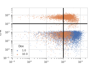
>>> import cytoflow as flow
>>> import_op = flow.ImportOp()
>>> import_op.tubes = [flow.Tube(file = "Plate01/RFP_Well_A3.fcs",
...                              conditions = {'Dox' : 10.0}),
...                    flow.Tube(file = "Plate01/CFP_Well_A4.fcs",
...                              conditions = {'Dox' : 1.0})]
>>> import_op.conditions = {'Dox' : 'float'}
>>> ex = import_op.apply()
Create and parameterize the operation.
>>> quad = flow.QuadOp(name = "Quad",
...                    xchannel = "V2-A",
...                    xthreshold = 100,
...                    ychannel = "Y2-A",
...                    ythreshold = 1000)
Show the default view
>>> qv = quad.default_view(huefacet = "Dox",
...                        xscale = 'log',
...                        yscale = 'log')
...
>>> qv.plot(ex)
Note
If you want to use the interactive default view in a Jupyter notebook, make sure you say
%matplotlib notebookin the first cell (instead of%matplotlib inlineor similar). Then calldefault_view()withinteractive = True:qv = quad.default_view(huefacet = "Dox", xscale = 'log', yscale = 'log', interactive = True) qv.plot(ex)
Apply the gate and show the result
>>> ex2 = quad.apply(ex)
>>> ex2.data.groupby('Quad', observed = True).size()
Quad
Quad_1    1783
Quad_2    2584
Quad_3    8236
Quad_4    7397
dtype: int64
- apply(experiment)[source]#
Applies the quad gate to an experiment.
- Parameters:
experiment (
Experiment) – theExperimentto which this op is applied- Returns:
a new
Experiment, the same as the oldExperimentbut with a new column the same as the operationname. The new column is of type Category, with valuesname_1,name_2,name_3, andname_4, applied to events CLOCKWISE from upper-left.- Return type:
- Raises:
CytoflowOpError – if for some reason the operation can’t be applied to this experiment. The reason is in the
argsattribute ofCytoflowOpError.
- class cytoflow.operations.quad.ScatterplotQuadSelectionView[source]#
Bases:
_QuadSelection,ScatterplotViewPlots, and lets the user interact with, a quadrant gate.
- interactive#
is this view interactive? Ie, can the user set the threshold with a mouse click?
- Type:
Bool
- xchannel#
The channels to use for this view’s X axis. If you created the view using
default_view, this is already set.- Type:
Str
- ychannel#
The channels to use for this view’s Y axis. If you created the view using
default_view, this is already set.- Type:
Str
- xscale#
The way to scale the x axis. If you created the view using
default_view, this may be already set.- Type:
{‘linear’, ‘log’, ‘logicle’}
- yscale#
The way to scale the y axis. If you created the view using
default_view, this may be already set.- Type:
{‘linear’, ‘log’, ‘logicle’}
- op#
The
IOperationthat this view is associated with. If you created the view usingdefault_view, this is already set.- Type:
Instance(
IOperation)
- huechannel#
If set, color the points using a normed color scale. The norm function is set by
huescale, and the color palette can be changed by passing thepaletteparameter toplot.- Type:
Str
- subset#
An expression that specifies the subset of the statistic to plot. Passed unmodified to
pandas.DataFrame.query.- Type:
- xfacet#
Set to one of the
Experiment.conditionsin theExperiment, and a new column of subplots will be added for every unique value of that condition.- Type:
String
- yfacet#
Set to one of the
Experiment.conditionsin theExperiment, and a new row of subplots will be added for every unique value of that condition.- Type:
String
- huefacet#
Set to one of the
Experiment.conditionsin the in theExperiment, and a new color will be added to the plot for every unique value of that condition.- Type:
String
Examples
In an Jupyter notebook with
%matplotlib notebook>>> q = flow.QuadOp(name = "Quad", ... xchannel = "V2-A", ... ychannel = "Y2-A")) >>> qv = q.default_view() >>> qv.interactive = True >>> qv.plot(ex2)
- plot(experiment, **kwargs)[source]#
Plot the default view, and then draw the quad selection on top of it.
- Parameters:
experiment (Experiment) – The
Experimentto plot using this view.title (str) – Set the plot title
xlabel (str) – Set the X axis label
ylabel (str) – Set the Y axis label
huelabel (str) – Set the label for the hue facet (in the legend)
legend (bool) – Plot a legend for the color or hue facet? Defaults to
True.legend_loc (str) – If we plot a legend, where should it go? This is a
matplotliblegend location string, like ‘lower right’ or ‘outside center right’. Default is ‘upper right’.sharex (bool) – If there are multiple subplots, should they share X axes? Defaults to
True.sharey (bool) – If there are multiple subplots, should they share Y axes? Defaults to
True.row_order (list) – Override the row facet value order with the given list. If a value is not given in the ordering, it is not plotted. Defaults to a “natural ordering” of all the values.
col_order (list) – Override the column facet value order with the given list. If a value is not given in the ordering, it is not plotted. Defaults to a “natural ordering” of all the values.
hue_order (list) – Override the hue facet value order with the given list. If a value is not given in the ordering, it is not plotted. Defaults to a “natural ordering” of all the values.
height (float) – The height of each row in inches. Default = 3.0
aspect (float) – The aspect ratio of each subplot. Default = 1.5
col_wrap (int) – If
xfacetis set andyfacetis not set, you can “wrap” the subplots around so that they form a multi-row grid by setting this to the number of columns you want.sns_style ({“darkgrid”, “whitegrid”, “dark”, “white”, “ticks”}) – Which
seabornstyle to apply to the plot? Default iswhitegrid.sns_context ({“notebook”, “paper”, “talk”, “poster”}) – Which
seaborncontext to use? Controls the scaling of plot elements such as tick labels and the legend. Default isnotebook.palette (palette name, list, or dict) – Colors to use for the different levels of the hue variable. Should be something that can be interpreted by
seaborn.color_palette, or a dictionary mapping hue levels to matplotlib colors. See https://seaborn.pydata.org/tutorial/color_palettes.html for a good overview.despine (Bool) – Remove the top and right axes from the plot? Default is
True.min_quantile (float (>0.0 and <1.0, default = 0.001)) – Clip data that is less than this quantile.
max_quantile (float (>0.0 and <1.0, default = 1.00)) – Clip data that is greater than this quantile.
xlim ((float, float)) – Set the range of the plot’s X axis.
ylim ((float, float)) – Set the range of the plot’s Y axis.
alpha (float (default = 0.25)) – The alpha blending value, between 0 (transparent) and 1 (opaque).
s (int (default = 2)) – The size in points^2.
marker (a matplotlib marker style, usually a string) – Specfies the glyph to draw for each point on the scatterplot. See matplotlib.markers for examples. Default: ‘o’
line_props (Dict) – The properties of the
matplotlib.lines.Line2Dthat are drawn on top of the scatterplot or density view. They’re passed directly to thematplotlib.lines.Line2Dconstructor. Default:{color : 'black', linewidth : 2}
- class cytoflow.operations.quad.DensityQuadSelectionView[source]#
Bases:
_QuadSelection,DensityViewPlots, and lets the user interact with, a quadrant gate on a density view
- interactive#
is this view interactive? Ie, can the user set the threshold with a mouse click?
- Type:
Bool
- xchannel#
The channels to use for this view’s X axis. If you created the view using
default_view, this is already set.- Type:
Str
- ychannel#
The channels to use for this view’s Y axis. If you created the view using
default_view, this is already set.- Type:
Str
- xscale#
The way to scale the x axis. If you created the view using
default_view, this may be already set.- Type:
{‘linear’, ‘log’, ‘logicle’}
- yscale#
The way to scale the y axis. If you created the view using
default_view, this may be already set.- Type:
{‘linear’, ‘log’, ‘logicle’}
- op#
The
IOperationthat this view is associated with. If you created the view usingdefault_view, this is already set.- Type:
Instance(
IOperation)
- huefacet#
You must leave the hue facet unset!
- Type:
None
- subset#
An expression that specifies the subset of the statistic to plot. Passed unmodified to
pandas.DataFrame.query.- Type:
- xfacet#
Set to one of the
Experiment.conditionsin theExperiment, and a new column of subplots will be added for every unique value of that condition.- Type:
String
- yfacet#
Set to one of the
Experiment.conditionsin theExperiment, and a new row of subplots will be added for every unique value of that condition.- Type:
String
Examples
In an Jupyter notebook with
%matplotlib notebook>>> q = flow.QuadOp(name = "Quad", ... xchannel = "V2-A", ... ychannel = "Y2-A")) >>> qv = q.default_view(density = True) >>> qv.interactive = True >>> qv.plot(ex2)
- plot(experiment, **kwargs)[source]#
Plot the default view, and then draw the quad selection on top of it.
- Parameters:
experiment (Experiment) – The
Experimentto plot using this view.title (str) – Set the plot title
xlabel (str) – Set the X axis label
ylabel (str) – Set the Y axis label
huelabel (str) – Set the label for the hue facet (in the legend)
legend (bool) – Plot a legend for the color or hue facet? Defaults to
True.legend_loc (str) – If we plot a legend, where should it go? This is a
matplotliblegend location string, like ‘lower right’ or ‘outside center right’. Default is ‘upper right’.sharex (bool) – If there are multiple subplots, should they share X axes? Defaults to
True.sharey (bool) – If there are multiple subplots, should they share Y axes? Defaults to
True.row_order (list) – Override the row facet value order with the given list. If a value is not given in the ordering, it is not plotted. Defaults to a “natural ordering” of all the values.
col_order (list) – Override the column facet value order with the given list. If a value is not given in the ordering, it is not plotted. Defaults to a “natural ordering” of all the values.
hue_order (list) – Override the hue facet value order with the given list. If a value is not given in the ordering, it is not plotted. Defaults to a “natural ordering” of all the values.
height (float) – The height of each row in inches. Default = 3.0
aspect (float) – The aspect ratio of each subplot. Default = 1.5
col_wrap (int) – If
xfacetis set andyfacetis not set, you can “wrap” the subplots around so that they form a multi-row grid by setting this to the number of columns you want.sns_style ({“darkgrid”, “whitegrid”, “dark”, “white”, “ticks”}) – Which
seabornstyle to apply to the plot? Default iswhitegrid.sns_context ({“notebook”, “paper”, “talk”, “poster”}) – Which
seaborncontext to use? Controls the scaling of plot elements such as tick labels and the legend. Default isnotebook.palette (palette name, list, or dict) – Colors to use for the different levels of the hue variable. Should be something that can be interpreted by
seaborn.color_palette, or a dictionary mapping hue levels to matplotlib colors. See https://seaborn.pydata.org/tutorial/color_palettes.html for a good overview.despine (Bool) – Remove the top and right axes from the plot? Default is
True.min_quantile (float (>0.0 and <1.0, default = 0.001)) – Clip data that is less than this quantile.
max_quantile (float (>0.0 and <1.0, default = 1.00)) – Clip data that is greater than this quantile.
xlim ((float, float)) – Set the range of the plot’s X axis.
ylim ((float, float)) – Set the range of the plot’s Y axis.
gridsize (int) – The size of the grid on each axis. Default = 50
smoothed (bool) – Should the resulting mesh be smoothed?
smoothed_sigma (int) – The standard deviation of the smoothing kernel. default = 1.
cmap (cmap) – An instance of matplotlib.colors.Colormap. By default, the
viridiscolormap is usedunder_color (matplotlib color) – Sets the color to be used for low out-of-range values.
bad_color (matplotlib color) – Set the color to be used for masked values.
line_props (Dict) – The properties of the
matplotlib.lines.Line2Dthat are drawn on top of the scatterplot or density view. They’re passed directly to thematplotlib.lines.Line2Dconstructor. Default:{color : 'black', linewidth : 2}