cytoflow.operations.polygon#
Apply a polygon gate to two channels in an Experiment.
polygon has two classes:
PolygonOp – Applies the gate, given a set of vertices.
ScatterplotPolygonSelectionView – an IView that allows you to view the
polygon and/or interactively set the vertices on a scatterplot.
DensityPolygonSelectionView – an IView that allows you to view the
polygon and/or interactively set the vertices on a scatterplot.
- class cytoflow.operations.polygon.PolygonOp[source]#
Bases:
HasStrictTraitsApply a polygon gate to a cytometry experiment.
- name#
The operation name. Used to name the new metadata field in the experiment that’s created by
apply- Type:
Str
- xchannel, ychannel
The names of the x and y channels to apply the gate.
- Type:
Str
- xscale, yscale
The scales applied to the data before drawing the polygon.
- Type:
{‘linear’, ‘log’, ‘logicle’} (default = ‘linear’)
- vertices#
The polygon verticies. An ordered list of 2-tuples, representing the x and y coordinates of the vertices.
- Type:
List((Float, Float))
Notes
You can set the verticies by hand, I suppose, but it’s much easier to use the interactive view you get from
default_viewto do so. SetScatterplotPolygonSelectionView.interactivetoTrue, then single-click to set vertices. Click the first vertex a second time to close the polygon. You’ll need to do this in a Jupyter notebook with%matplotlib notebook– see theInteractive Plotsdemo for an example.Examples
Make a little data set.
>>> import cytoflow as flow
>>> import_op = flow.ImportOp()
>>> import_op.tubes = [flow.Tube(file = "Plate01/RFP_Well_A3.fcs",
...                              conditions = {'Dox' : 10.0}),
...                    flow.Tube(file = "Plate01/CFP_Well_A4.fcs",
...                              conditions = {'Dox' : 1.0})]
>>> import_op.conditions = {'Dox' : 'float'}
>>> ex = import_op.apply()
Create and parameterize the operation.
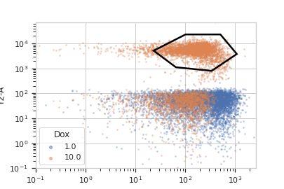
>>> p = flow.PolygonOp(name = "Polygon",
...                    xchannel = "V2-A",
...                    ychannel = "Y2-A")
>>> p.vertices = [(23.411982294776319, 5158.7027015021222),
...               (102.22182270573683, 23124.058843387455),
...               (510.94519955277201, 23124.058843387455),
...               (1089.5215641232173, 3800.3424832180476),
...               (340.56382570202402, 801.98947404942271),
...               (65.42597937575897, 1119.3133482602157)]
Show the default view.
>>> df = p.default_view(huefacet = "Dox",
...                     xscale = 'log',
...                     yscale = 'log',
...                     density = True)
>>> df.plot(ex)
Note
If you want to use the interactive default view in a Jupyter notebook, make sure you say
%matplotlib notebookin the first cell (instead of%matplotlib inlineor similar). Then calldefault_viewwithinteractive = True:df = p.default_view(huefacet = "Dox", xscale = 'log', yscale = 'log', interactive = True) df.plot(ex)
Apply the gate, and show the result
>>> ex2 = p.apply(ex)
>>> ex2.data.groupby('Polygon', observed = True).size()
Polygon
False    15875
True      4125
dtype: int64
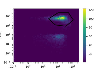
You can also get (or draw) the polygon on a density plot instead of a scatterplot:
>>> df = p.default_view(huefacet = "Dox",
...                     xscale = 'log',
...                     yscale = 'log')
>>> df.plot(ex)
- apply(experiment)[source]#
Applies the gate to an experiment.
- Parameters:
experiment (Experiment) – the old
Experimentto which this op is applied- Returns:
a new ‘Experiment`, the same as
experimentbut with a new column of typeboolwith the same as the operation name. The bool isTrueif the event’s measurement is within the polygon, andFalseotherwise.- Return type:
- Raises:
CytoflowOpError – if for some reason the operation can’t be applied to this experiment. The reason is in the
argsattribute.
- class cytoflow.operations.polygon.ScatterplotPolygonSelectionView[source]#
Bases:
_PolygonSelection,ScatterplotViewPlots, and lets the user interact with, a 2D polygon selection on a scatterplot.
- interactive#
is this view interactive? Ie, can the user set the polygon verticies with mouse clicks?
- Type:
- xchannel#
The channels to use for this view’s X axis. If you created the view using
default_view, this is already set.- Type:
Str
- ychannel#
The channels to use for this view’s Y axis. If you created the view using
default_view, this is already set.- Type:
Str
- xscale#
The way to scale the x axis. If you created the view using
default_view, this may be already set.- Type:
{‘linear’, ‘log’, ‘logicle’}
- yscale#
The way to scale the y axis. If you created the view using
default_view, this may be already set.- Type:
{‘linear’, ‘log’, ‘logicle’}
- op#
The
IOperationthat this view is associated with. If you created the view usingdefault_view, this is already set.- Type:
Instance(
IOperation)
- huechannel#
If set, color the points using a normed color scale. The norm function is set by
huescale, and the color palette can be changed by passing thepaletteparameter toplot.- Type:
Str
- subset#
An expression that specifies the subset of the statistic to plot. Passed unmodified to
pandas.DataFrame.query.- Type:
- xfacet#
Set to one of the
Experiment.conditionsin theExperiment, and a new column of subplots will be added for every unique value of that condition.- Type:
String
- yfacet#
Set to one of the
Experiment.conditionsin theExperiment, and a new row of subplots will be added for every unique value of that condition.- Type:
String
- huefacet#
Set to one of the
Experiment.conditionsin the in theExperiment, and a new color will be added to the plot for every unique value of that condition.- Type:
String
Examples
In a Jupyter notebook with
%matplotlib notebook>>> s = flow.PolygonOp(xchannel = "V2-A", ... ychannel = "Y2-A") >>> poly = s.default_view() >>> poly.plot(ex2) >>> poly.interactive = True
- plot(experiment, **kwargs)[source]#
Plot the default view, and then draw the selection on top of it.
- Parameters:
experiment (Experiment) – The
Experimentto plot using this view.title (str) – Set the plot title
xlabel (str) – Set the X axis label
ylabel (str) – Set the Y axis label
huelabel (str) – Set the label for the hue facet (in the legend)
legend (bool) – Plot a legend for the color or hue facet? Defaults to
True.legend_loc (str) – If we plot a legend, where should it go? This is a
matplotliblegend location string, like ‘lower right’ or ‘outside center right’. Default is ‘upper right’.sharex (bool) – If there are multiple subplots, should they share X axes? Defaults to
True.sharey (bool) – If there are multiple subplots, should they share Y axes? Defaults to
True.row_order (list) – Override the row facet value order with the given list. If a value is not given in the ordering, it is not plotted. Defaults to a “natural ordering” of all the values.
col_order (list) – Override the column facet value order with the given list. If a value is not given in the ordering, it is not plotted. Defaults to a “natural ordering” of all the values.
hue_order (list) – Override the hue facet value order with the given list. If a value is not given in the ordering, it is not plotted. Defaults to a “natural ordering” of all the values.
height (float) – The height of each row in inches. Default = 3.0
aspect (float) – The aspect ratio of each subplot. Default = 1.5
col_wrap (int) – If
xfacetis set andyfacetis not set, you can “wrap” the subplots around so that they form a multi-row grid by setting this to the number of columns you want.sns_style ({“darkgrid”, “whitegrid”, “dark”, “white”, “ticks”}) – Which
seabornstyle to apply to the plot? Default iswhitegrid.sns_context ({“notebook”, “paper”, “talk”, “poster”}) – Which
seaborncontext to use? Controls the scaling of plot elements such as tick labels and the legend. Default isnotebook.palette (palette name, list, or dict) – Colors to use for the different levels of the hue variable. Should be something that can be interpreted by
seaborn.color_palette, or a dictionary mapping hue levels to matplotlib colors. See https://seaborn.pydata.org/tutorial/color_palettes.html for a good overview.despine (Bool) – Remove the top and right axes from the plot? Default is
True.min_quantile (float (>0.0 and <1.0, default = 0.001)) – Clip data that is less than this quantile.
max_quantile (float (>0.0 and <1.0, default = 1.00)) – Clip data that is greater than this quantile.
xlim ((float, float)) – Set the range of the plot’s X axis.
ylim ((float, float)) – Set the range of the plot’s Y axis.
alpha (float (default = 0.25)) – The alpha blending value, between 0 (transparent) and 1 (opaque).
s (int (default = 2)) – The size in points^2.
marker (a matplotlib marker style, usually a string) – Specfies the glyph to draw for each point on the scatterplot. See matplotlib.markers for examples. Default: ‘o’
patch_props (Dict) – The properties of the
matplotlib.patches.Patchthat are drawn on top of the scatterplot. They’re passed directly to thematplotlib.patches.Patchconstructor. Default:{edgecolor : 'black', linewidth : 2, fill : False}selector_props (Dict) – The properties of the
matplotlib.lines.Line2Dthat are drawn on top of the scatterplot. They’re passed directly to thematplotlib.patches.Patchconstructor. Default:{color : 'black', linestyle : '-', linewidth : 2, alpha = 0.5}
- class cytoflow.operations.polygon.DensityPolygonSelectionView[source]#
Bases:
_PolygonSelection,DensityViewPlots, and lets the user interact with, a 2D polygon selection on a density plot.
- interactive#
is this view interactive? Ie, can the user set the polygon verticies with mouse clicks?
- Type:
- xchannel#
The channels to use for this view’s X axis. If you created the view using
default_view, this is already set.- Type:
Str
- ychannel#
The channels to use for this view’s Y axis. If you created the view using
default_view, this is already set.- Type:
Str
- xscale#
The way to scale the x axis. If you created the view using
default_view, this may be already set.- Type:
{‘linear’, ‘log’, ‘logicle’}
- yscale#
The way to scale the y axis. If you created the view using
default_view, this may be already set.- Type:
{‘linear’, ‘log’, ‘logicle’}
- op#
The
IOperationthat this view is associated with. If you created the view usingdefault_view, this is already set.- Type:
Instance(
IOperation)
- huefacet#
You must leave the hue facet unset!
- Type:
None
- subset#
An expression that specifies the subset of the statistic to plot. Passed unmodified to
pandas.DataFrame.query.- Type:
- xfacet#
Set to one of the
Experiment.conditionsin theExperiment, and a new column of subplots will be added for every unique value of that condition.- Type:
String
- yfacet#
Set to one of the
Experiment.conditionsin theExperiment, and a new row of subplots will be added for every unique value of that condition.- Type:
String
Examples
In a Jupyter notebook with
%matplotlib notebook>>> s = flow.PolygonOp(xchannel = "V2-A", ... ychannel = "Y2-A") >>> poly = s.default_view(density = True) >>> poly.plot(ex2) >>> poly.interactive = True
- plot(experiment, **kwargs)[source]#
Plot the default view, and then draw the selection on top of it.
- Parameters:
patch_props (Dict) – The properties of the
matplotlib.patches.Patchthat are drawn on top of the scatterplot or density view. They’re passed directly to thematplotlib.patches.Patchconstructor. Default: {edgecolor : ‘white’, linewidth : 2, fill : False}selector_props (Dict) – The properties of the
matplotlib.lines.Line2Dthat are drawn on top of the scatterplot. They’re passed directly to thematplotlib.patches.Patchconstructor. Default:{color : 'white', linestyle : '-', linewidth : 2, alpha = 0.5}