Tutorial: Microbial Diversity#
Flow cytometry can characterize a complex mixture of cells based on their morphology and staining – and those mixtures are not just mammalian cells! Microbial ecology studies are increasingly turning to flow cytometry, and Cytoflow has a bunch of tools that can support these studies too.
This tutorial demonstrates one approach using data from Görnt A et al, Chemical and microbial similarities and heterogeneities of wastewater from single-household cesspits for decentralised water reuse. Water Reuse 15(2), 255-270. 2025. DOI: 10.2166/wrd.2025.011. The authors collected wastewater from cesspits, staines samples with Hoescht dye and propidium iodide, then ran them through a flow cytometer. To compute a Shannon diversity index, they clustered events using a self-organizing map, then treated each cluster as a “species”.
If you’d like to follow along, you can do so by downloading one of the
cytoflow-#####-examples-basic.zip files from the
Cytoflow releases page
on GitHub. These data are in the data/microbial_diversity subfolder.
Preprocessing#
The raw data, downloaded from https://zenodo.org/records/14731601, contained approximately 600,000 events across 59 channels – this is what happens when you collect your data on a sorter, I suppose. I subsampled this data to 30,000 events per sample and only included the FSC, SSC, PI (propidium iodide) and Hoescht (Hoescht 33342) channels. Additionally, while the study included 20 sites, I have only included data for 5. No other data cleaning or transformation was applied.
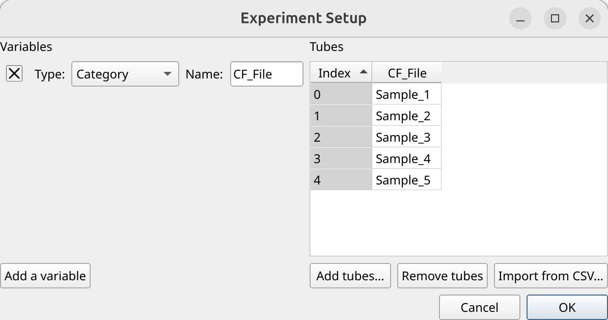
Import the data#
Open the experiment setup panel and select all of the files. (Remember, you can click the first, then shift-click the last, to select multiple files.) Because we don’t have any metadata besides the filename, change the CF_File column type to Category and click OK.
Preview and gate the data#
Let’s have a quick look at the FSC/SSC distribution (both on a log scale)
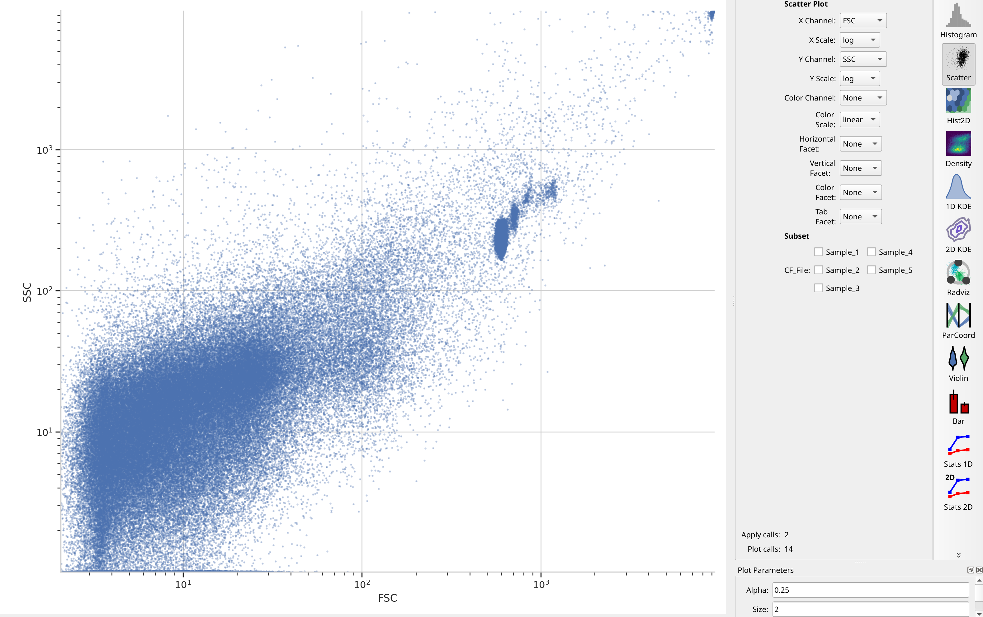
Note a number of “strange” clusters, one at about 10^3 in the FSC channel
and the other at the very top-right. The investigators included both 10 um
counting beads and 1 um Bright Blue beads; I think the counting beads are the
clusters at 10^3 and the 10 uM beads are up at 10^4. Both also show up in the
Hoescht channel:
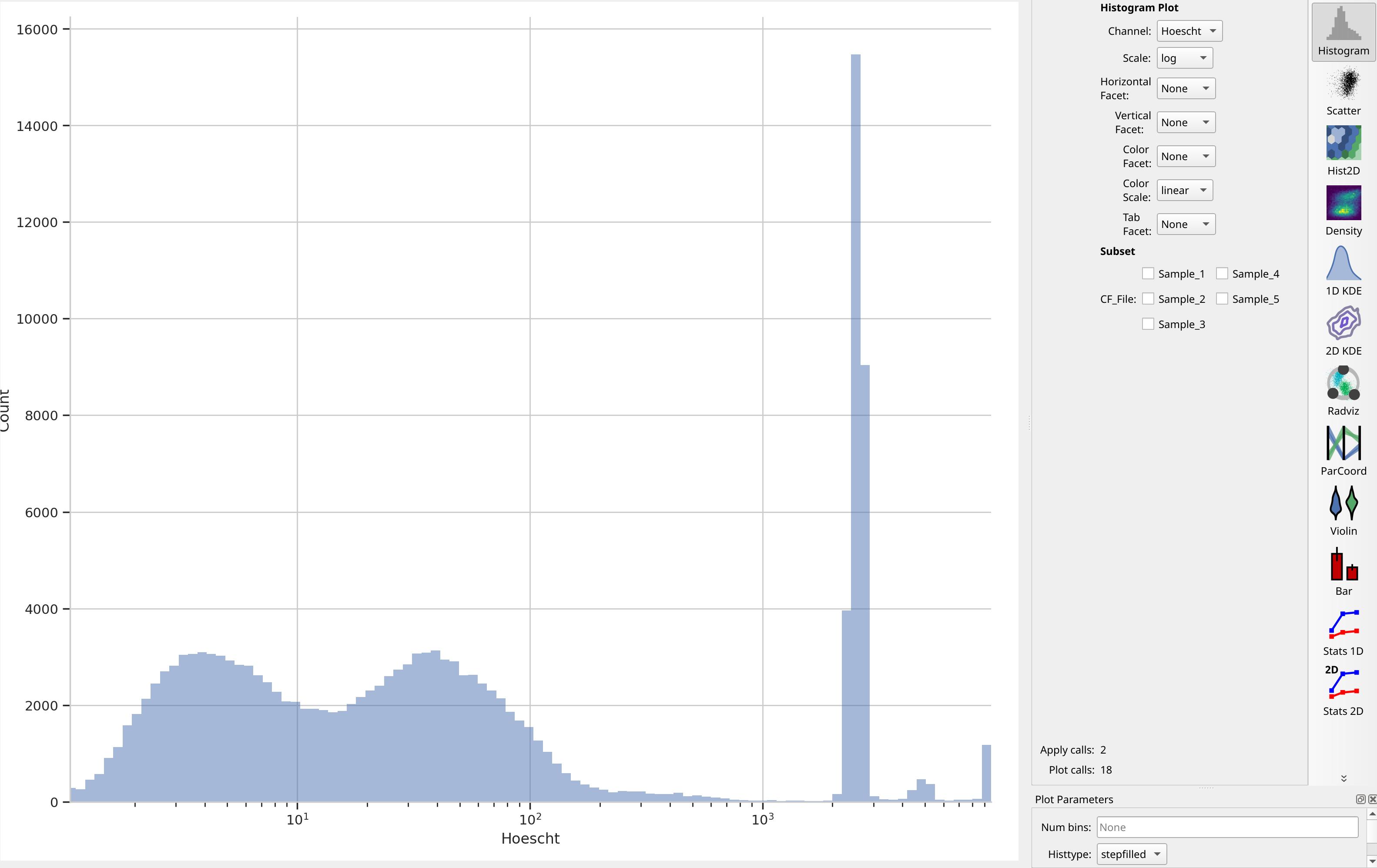
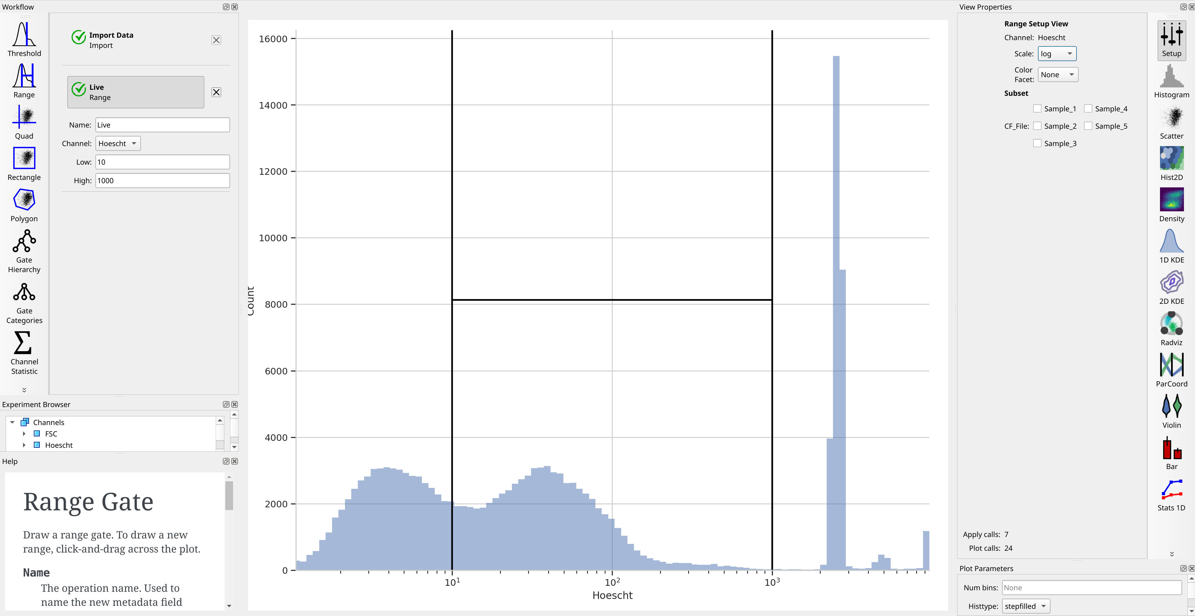
The investigators are using Hoescht 33342 dye to distinguish real cells from junk with a threshold of 10 in the Hoescht channel. We’ll do the same – that seems to split the low population from the high. But instead of a Threshold operation, let’s use a Range operation so we can also get rid of the beads, which are all brighter than 10^3.
Let’s check: if we plot an FSC / SSC scatter plot with the Live+
subset selected, did we get rid of those clusters?
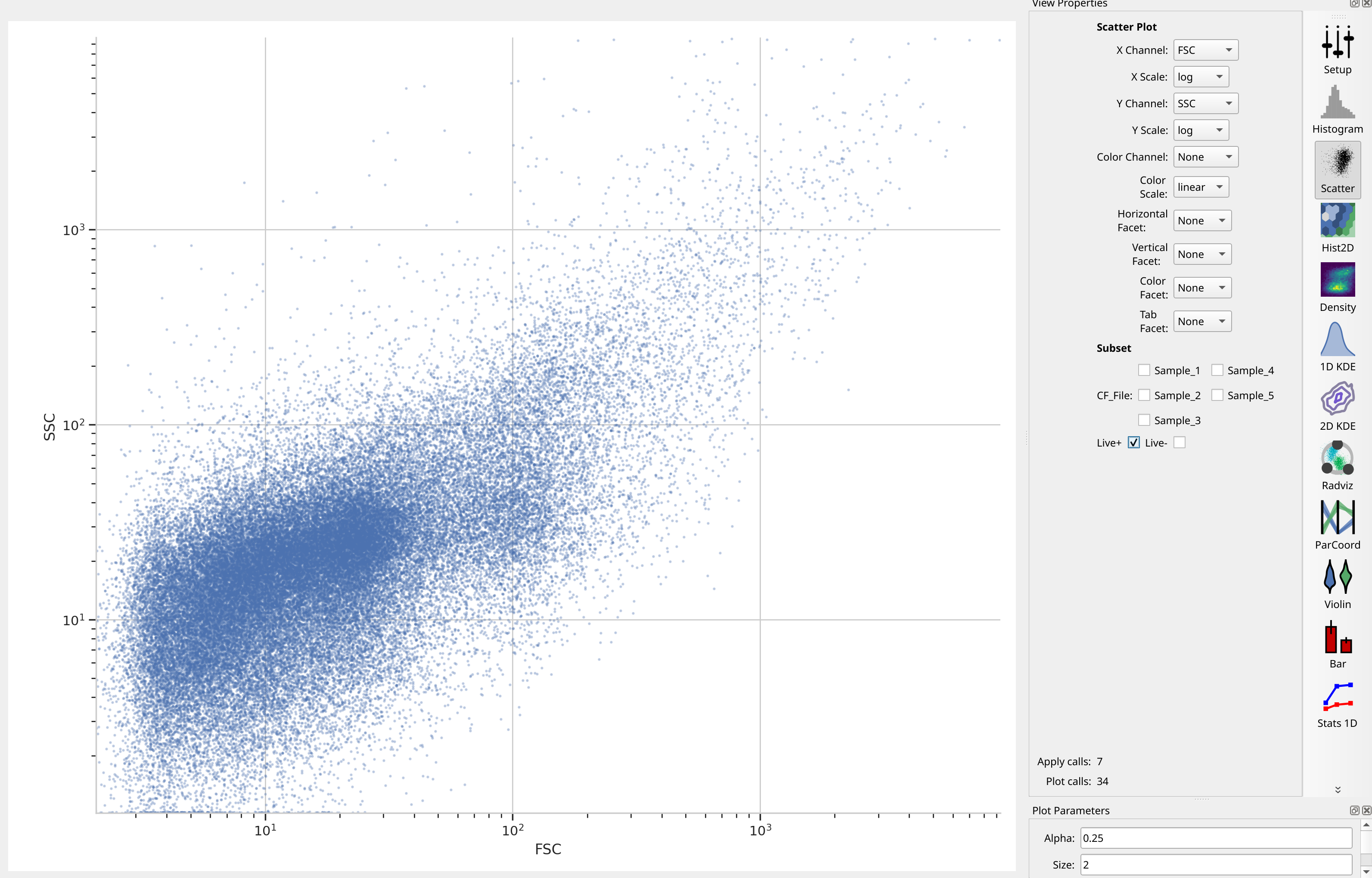
We sure did – and without gating out the other events with high FSC and
SSC! Nice.
Cluster with a self-organizing map#
The researchers used a self-organizing map with 2025 clusters – that
corresponds to a 45x45 map. They did not cluster on Hoescht, but instead
used only FSC, SSC and PI. (Note that we’re disabling consensus
clustering – we want to keep all 2025 clusters. And don’t forget to estimate
the map using the Live+ subset!)
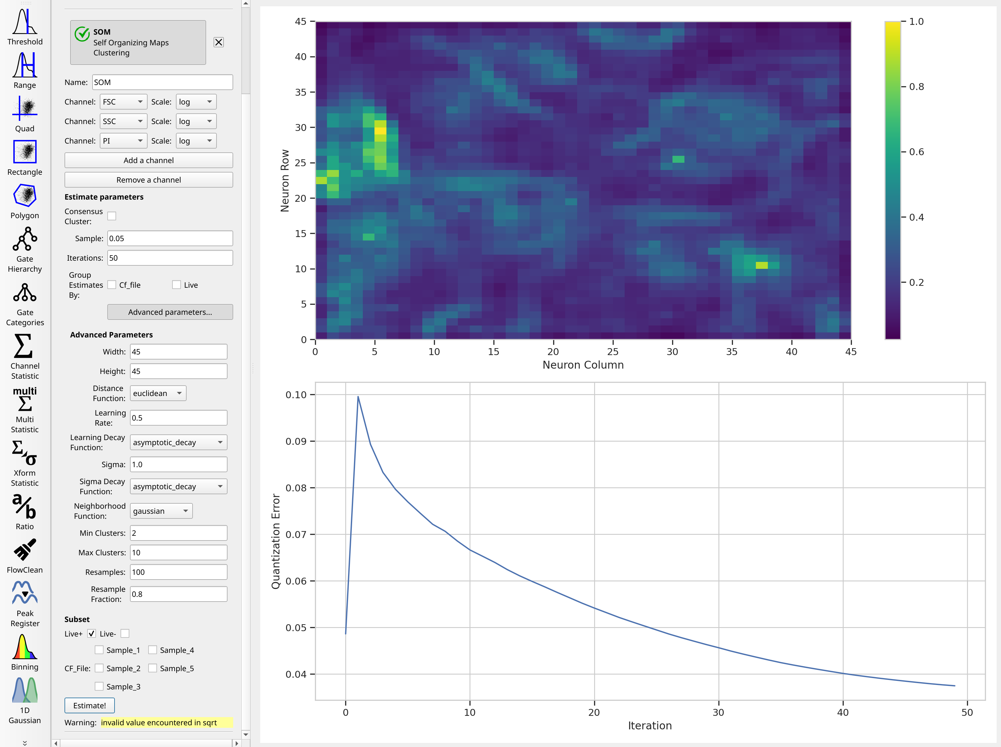
Huh. It’s not clear that after the default 50 iterations, that the model has converged – if you’d like, feel free to run the training for more iterations. There is a lot of structure in the neuron map, though. And remember, the map was trained using a subset of the data – by default, 5%. You can increase that if you’d like.
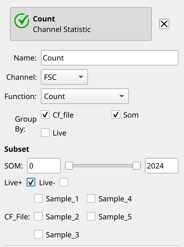
Count events in each cluster#
Remember, when we want to summarize some flow data, we create a statistic. There are a number of operations that do so, but since we’re only interested in one channel, we’ll use the Channel Statistic operation. And actually, since all we’re doing is counting events, it doesn’t matter which channel we compute on! So let’s count the number of events in each cluster in each sample (that is also Live+, remember!)
Now, let’s make a table. Cytoflow uses a plotting package called matplotlib,
and while it makes lovely plots, creating large tables with it is infeasible.
Note the error you get when you try to create a table with CF_File as the
row and SOM (the self-organizing map cluster) as the column:
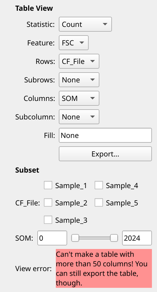
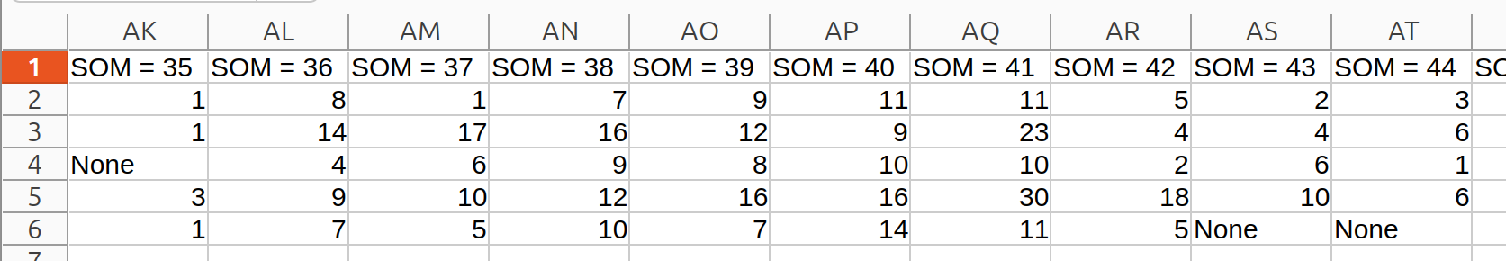
However, you can still export the table to a CSV file and use a spreadsheet
program to open it! Click the Export... button and give it a file name,
but heed the warning:
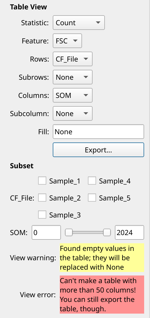
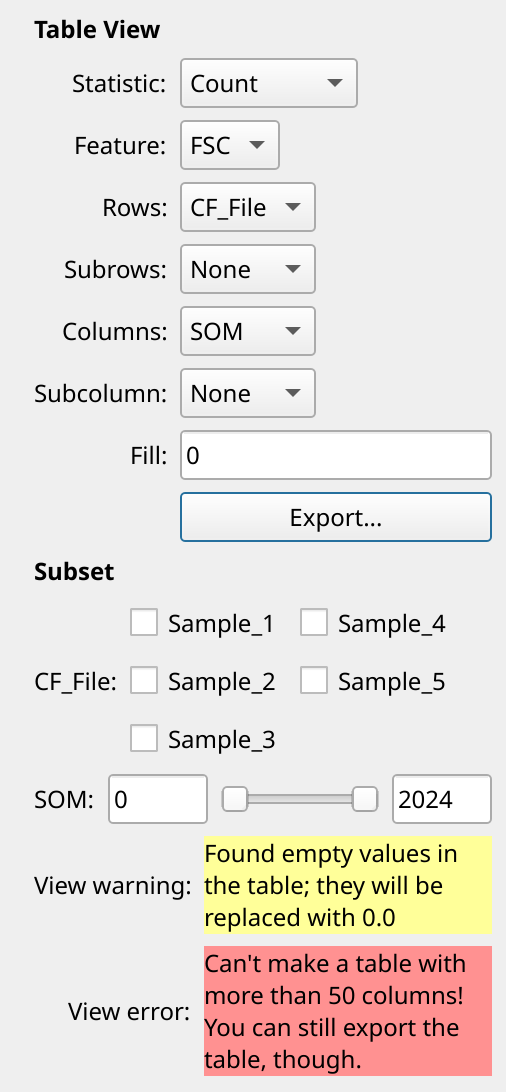
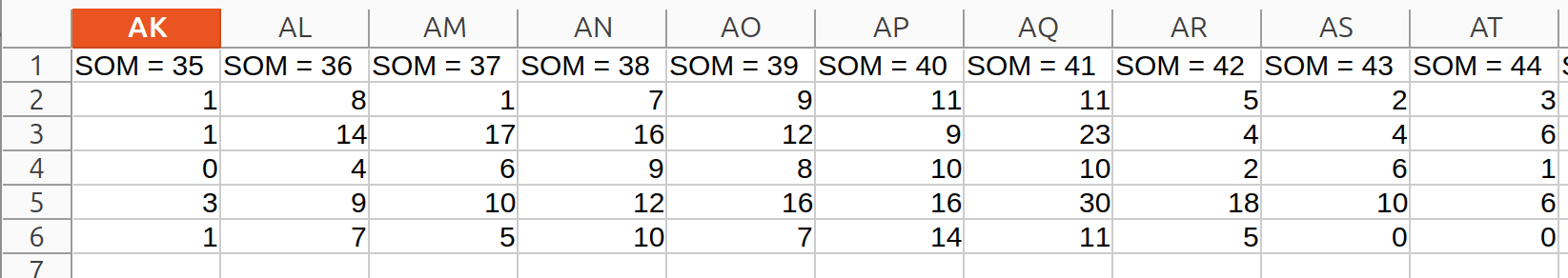
Cytoflow is telling you that you have missing data in your table. This could happen, for example, if there were clusters that didn’t have any events from a particular sample.
Cytoflow doesn’t automatically assume that you want to replace that with any particular value, but in this case it makes sense to fill those cells with 0. You can do that by changing the Fill attribute:
Now, you can go use another tool to compute Shannon alpha diversity. Do note that in the Jupyter Lab version of this tutorial, we loaded another package from the Scientific Python universe and computed those values directly. Go learn Python!
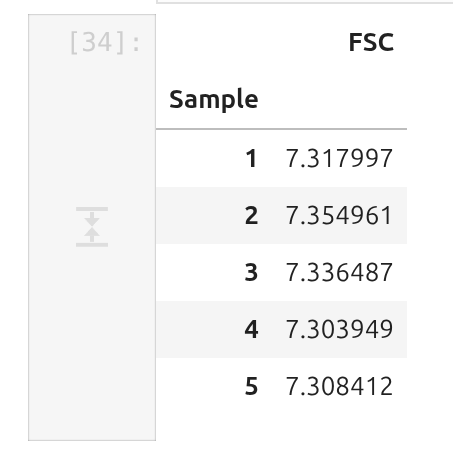
These values are quite close to the values reported by the researchers, which were all 7.4 or so.