Matrix Chart#
Plots a “matrix” chart. This can be a heat map, or a matrix of pie or petal plots:
The default behavior will produce a “traditional” heat map, where each “cell” is a circle and the color of the circle is related to the intensity of the value of
Feature. (In this scenario,Variablemust be left empty.)Setting
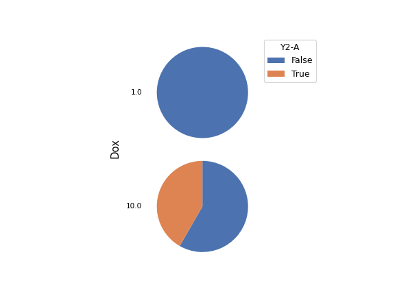
StyletoPie plotwill draw a pie plot in each cell. The values ofVariableare used as the categories of the pie, and the arc length of each slice of pie is related to the intensity of the value ofFeature.Setting
StyletoPetal plotwill draw a “petal plot” in each cell. The values ofVariableare used as the categories, but unlike a pie plot, the arc width of each slice is equal. Instead, the radius of the pie slice scales with the square root of the intensity, so that the relationship between area and intensity remains the same.Optionally, you can set
Scale by eventsto scale the total size of each circle, pie or petal plot by the number of events that match the category.
- Statistic
Which statistic to plot. This is usually the name of the operation that added the statistic.
- Horizontal Facet
What statistic variable should be plotted in the columns of the matrix plot? If left unset, there will only be one column.
- Vertical Facet
What statistic variable should be plotted in the rows of the matrix plot? If left unset, there will only be one row.
- Feature
Which column in the statistic should be plotted?
- Variable
The statistic variable to classify segments in
pieorpetalplots.
- Style
Which style matrix view to plot?
- Scale
How to scale the color, arc length or radii of the plots.
- Subset
Plot only a subset of the statistic.
- Scale by Events
If set, scale each circle/pie/petal by the number of matching events.