HOWTO: Add error bars to a statistics plot#
While statistics plots of things like the geometric mean are useful, we often want to add some sort of “error bars” to that plot as well.
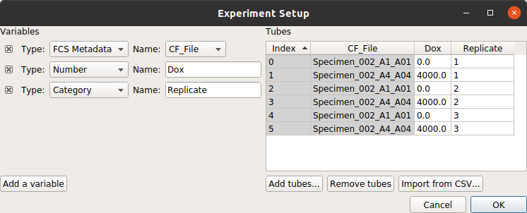
For example, consider the following experiment (taken from the dose response example), in which the geometric mean increases over time:
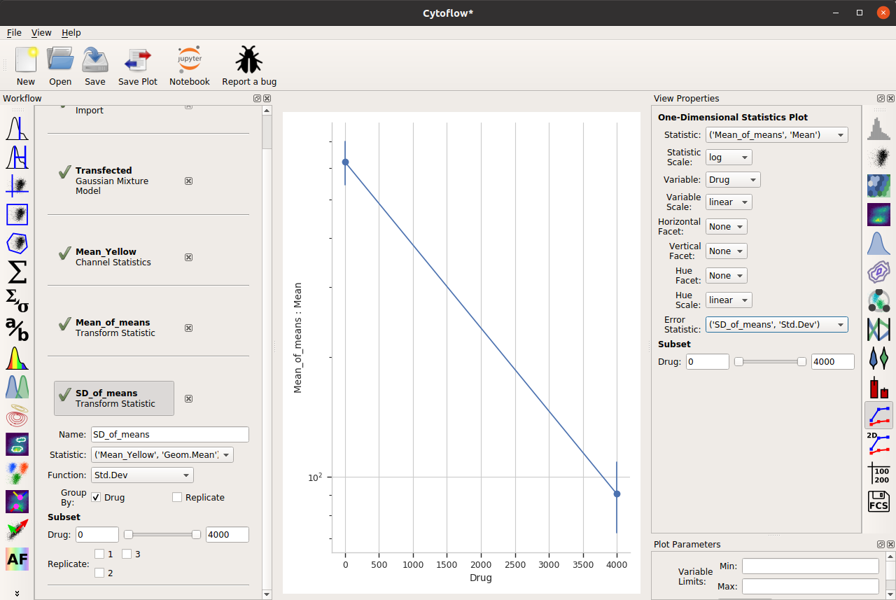
A few of the channel statistic functions, however, add multiple features – for example, the arithmetic mean plus-and-minus the standard deviation, or the geometric mean times-and-divided-by the geometric standard deviation. If we choose one of these functions, we can set the Error Bar Low and Error Bar High view properties to the appropriate features, and then we get error bars:
Two important things to note about this capability. First, the error bar plotting facilities are deliberately limited in the GUI – there is more power in a Jupyter notebook, or you can export your summary statistics and make pretty plots using other software.
And second, error bars are a subtle topic and biologists often misuse them. See
Know when your numbers are significant
and
Error bars in experimental biology
for a deeper discussion.
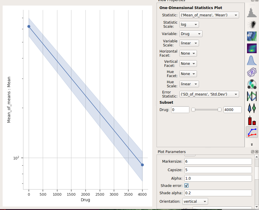
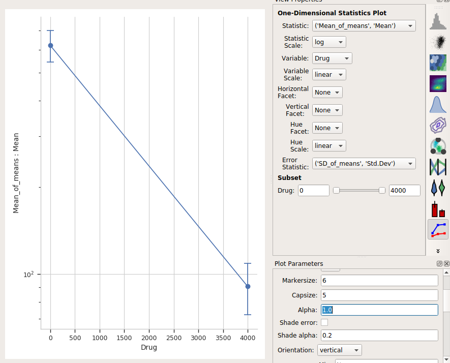
One last thing – the “default” visual properties of those error bars are just vertical lines. This is useful if you’ve got a lot to visualize, but less so if it’s just a few points. Many people like “end caps” on their error bars – to get those, change the Capsize option in the Plot Parameters pane to something greater than 0.
Alternately, choose Shade error to get a “shaded” error display. This one is particularly nice if you have lots of error bars.