Tutorial: Machine Learning#
One of the directions Cytoflow is going in that I’m most excited about is the application of advanced machine learning methods to flow cytometry analysis. After all, cytometry data is just a high-dimensional data set with many data points: making sense of it can take advantage of some of the sophisticated methods that have seen great success with other high-throughput biological data (such as microarrays.)
The following tutorial goes in depth on a common machine-learning method, Gaussian Mixture Models, then demonstrates with briefer examples some of the other machine learning methods that are implemented in Cytoflow.
Import the data#
Start Cytoflow. Under the Import Data operation, choose Set up experiment…
Add one variable, Dox. Make it a Number.
From the examples-basic data set, import RFP_Well_A3.fcs and CFP_Well_A4.fcs. Assign them Dox = 10.0 and Dox = 1.0, respectively. Your setup should look like this:
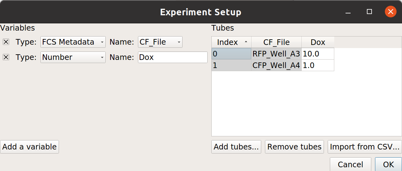
Choose OK
Optional: Remove the -W and -H channels from the Import Data operation; we’re only using the -A channels. Your Import Data operation should look like this:
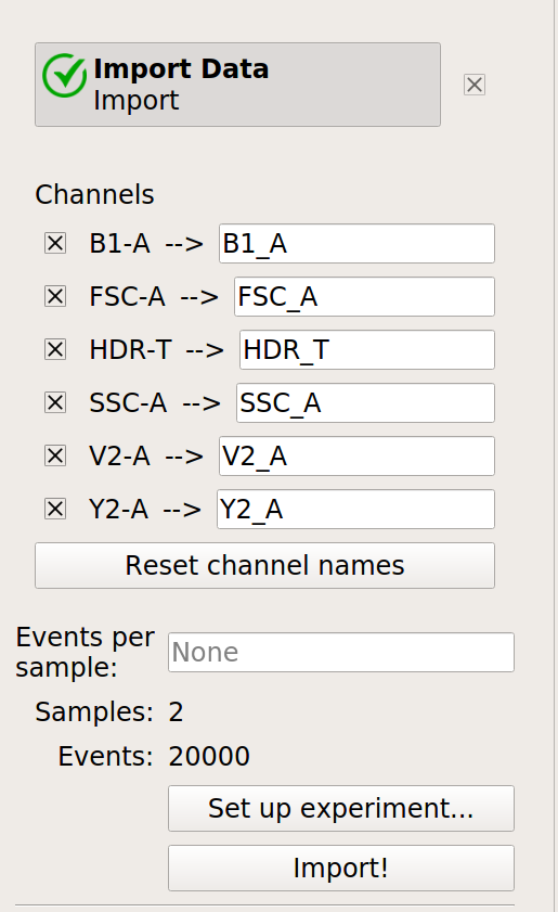
Click the Import! button in the Import Data operation.
Examine the data#
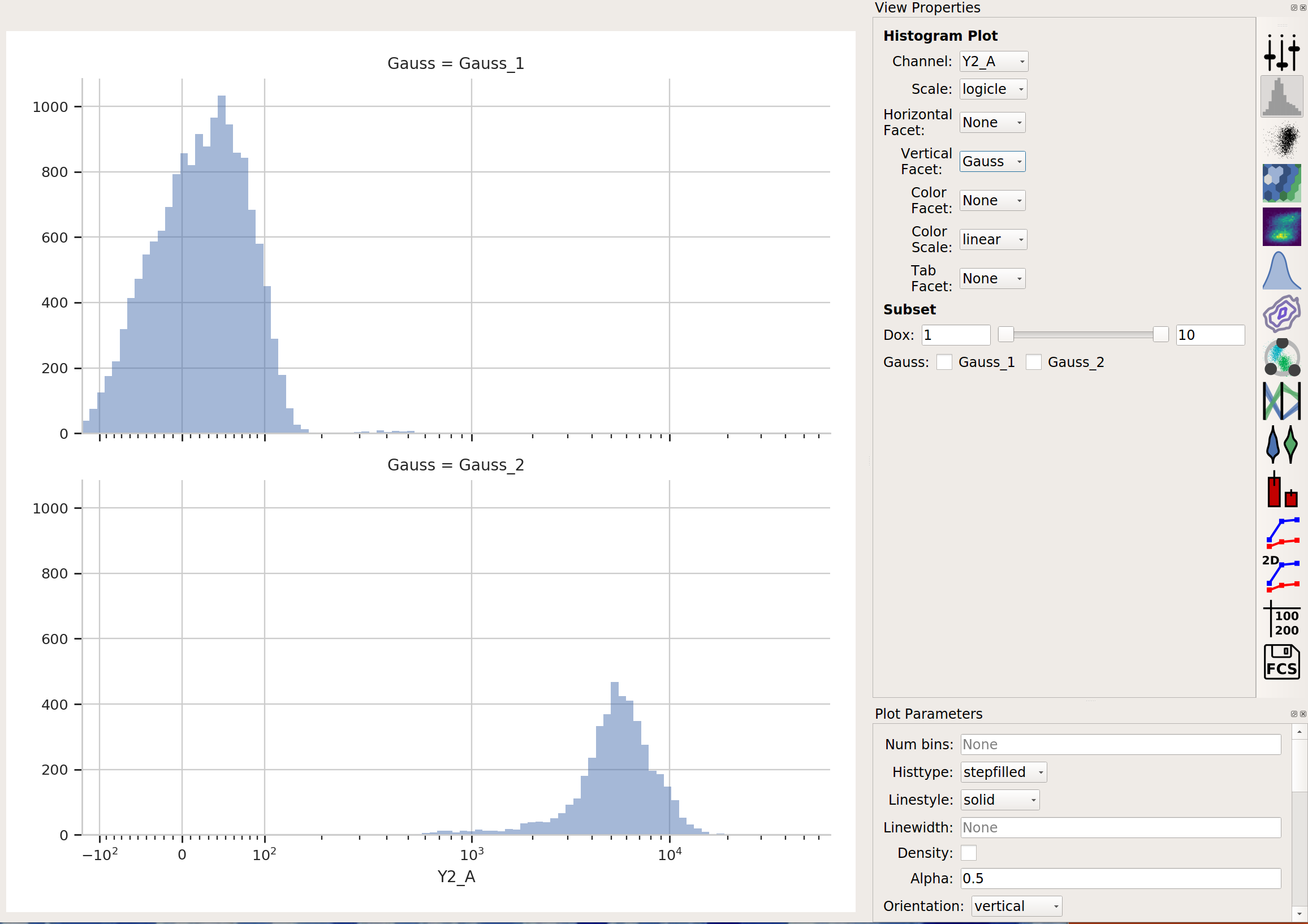
Create a Histogram view. Set the channel to Y2-A and the scale to logicle.
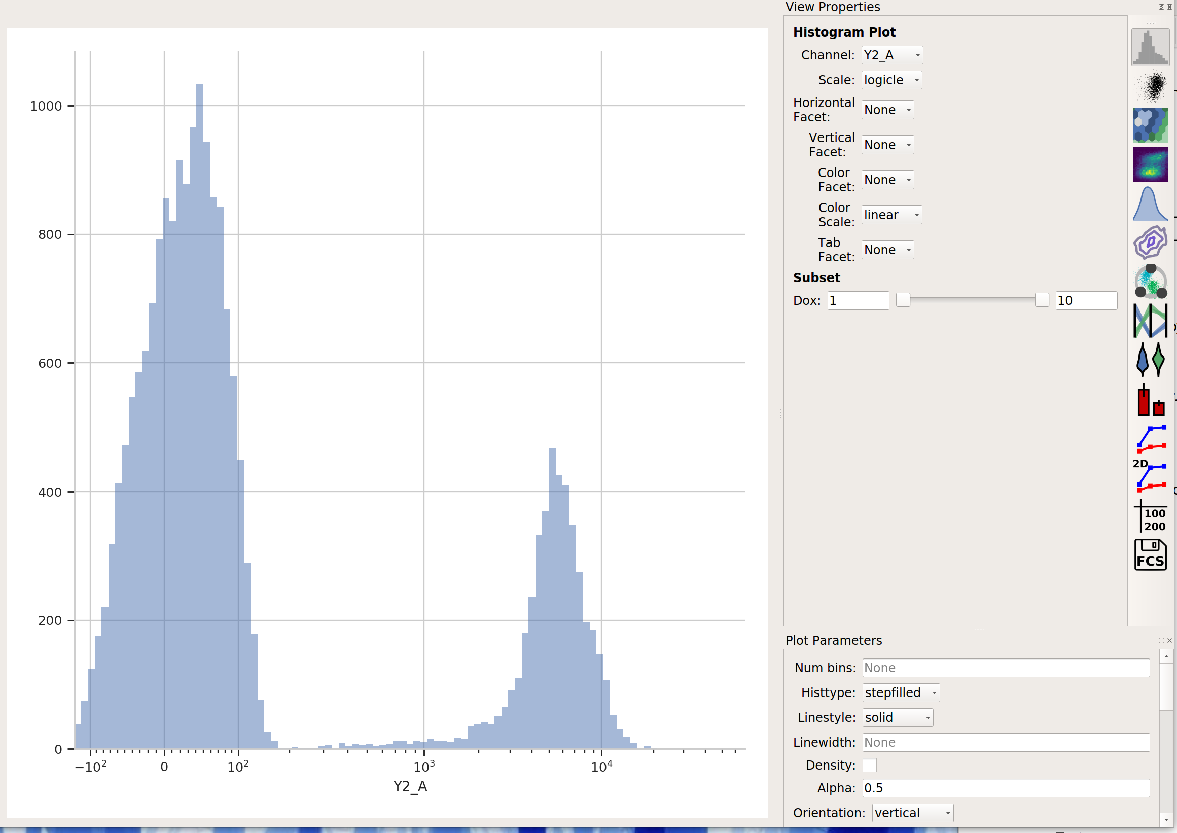
This data looks pretty bi-modal to me. If we wanted to separate out those two populations, a Threshold operation would do nicely. However, using a Gaussian mixture model comes with some advantages which we will see.
Create a Gaussian mixture model#
To model this data as a mixture of Gaussians, click the 1D Mixture Model button:

Set the parameters as follows:
Name – “Gauss” (or something memorable – it’s arbitrary)
Channel – Y2-A (the channel we’re applying the model to)
Scale – logicle (we want the logicle scale applied to the data before we model it)
Num Components – 2 (how many components are in the mixture?)
…and click Estimate! You’ll see a plot like this:
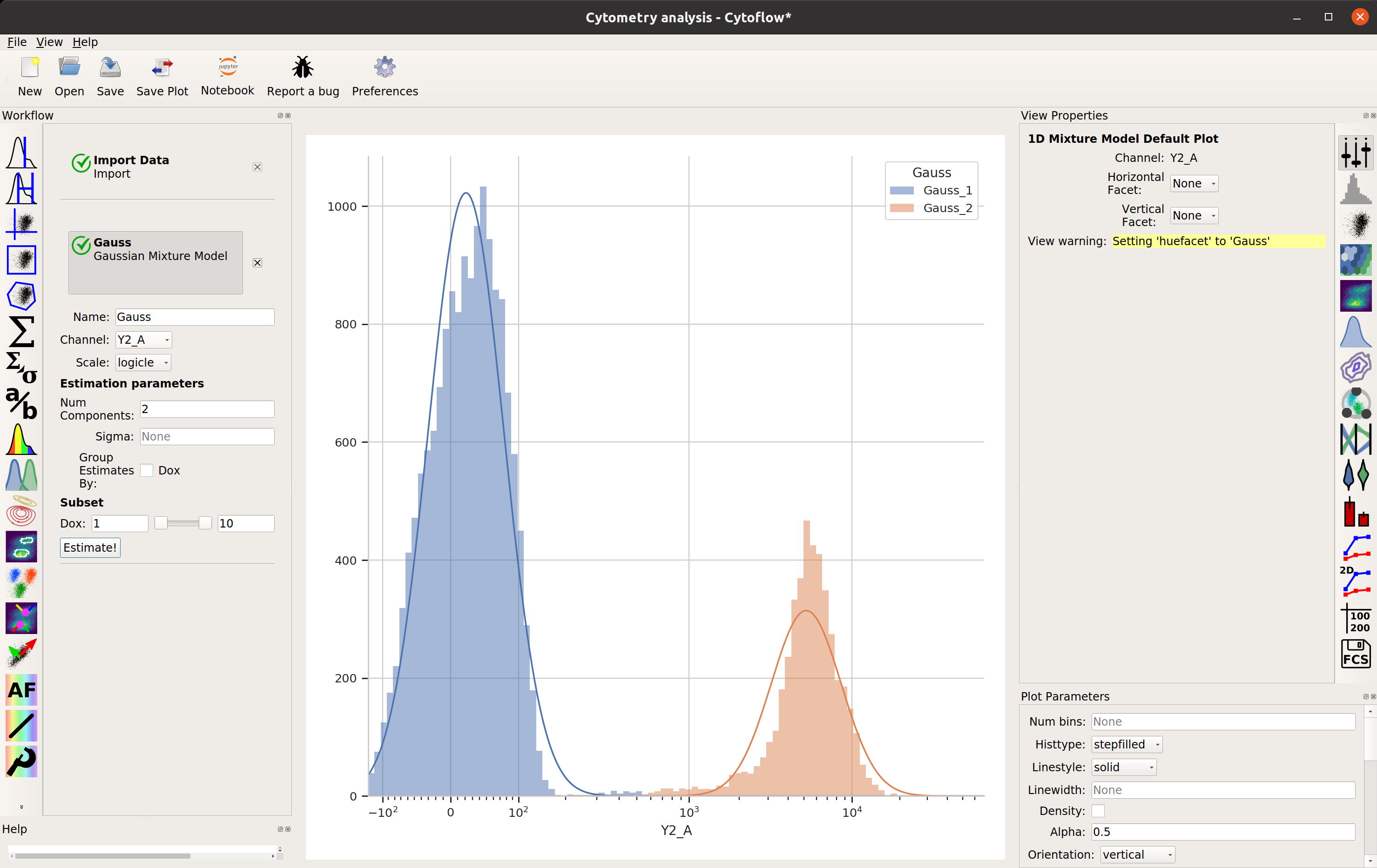
Excellent. It looks like the mixture model found two populations and separated them out.
What did the Gaussian Mixture Model operation actually do? Just like a threshold gate, it makes two new populations – in this case, they’re named Gauss_1 and Gauss_2. You can now view and manipulate them just like you could if you defined the two populations with any other gate. For example, I can view them on separate histograms:
Advanced GMM uses#
Sometimes, data does not separate “cleanly” like this data set does. If that’s the case, you can set the sigma estimation parameter. This tells the operation to create a new boolean variable for each component in the model, which is True if the event is within sigma standard deviations of the population mean. For example, if we set sigma to
1and click Estimate!, our diagnostic plot remains the same: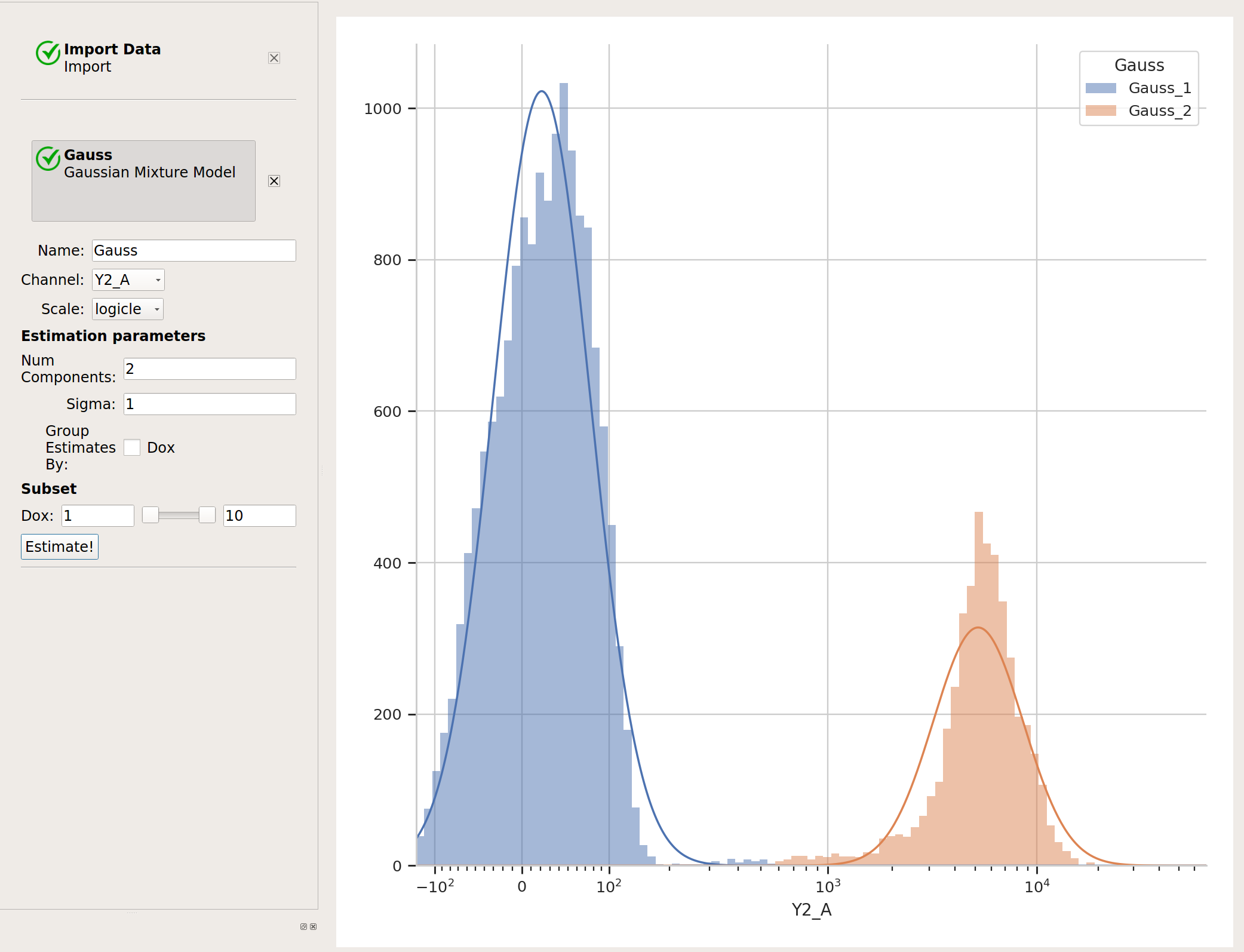
…but now we’ve got two additional variables, Gauss_1 and Gauss_2. For example, I can make a histogram and set the color facet to Gauss_1:
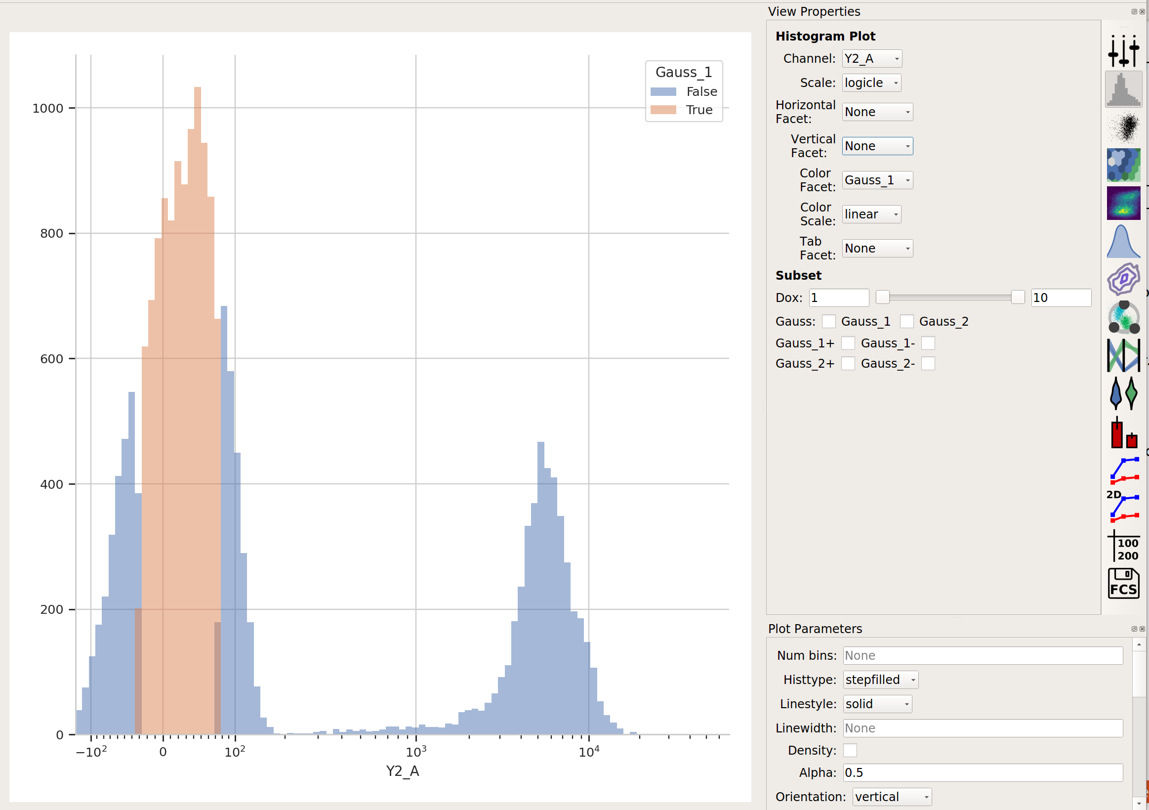
and we can see that only the “center” of the first population has the Gauss_1 variable set to True.
Sometimes, we don’t want to use the same model parameters for the entire data set. Instead, sometimes you want to estimate different models for differe subsets. The Gaussian Mixture Model (and other data-driven operations) have a Group Estimates By parameter that allows you to just that. For example, let’s say I want a different model estimated for each value of Dox (remember, that’s my experimental variable.) I set Group Estimates By to Dox, and instead of getting one mixture model, now I get one for each different value of Dox:
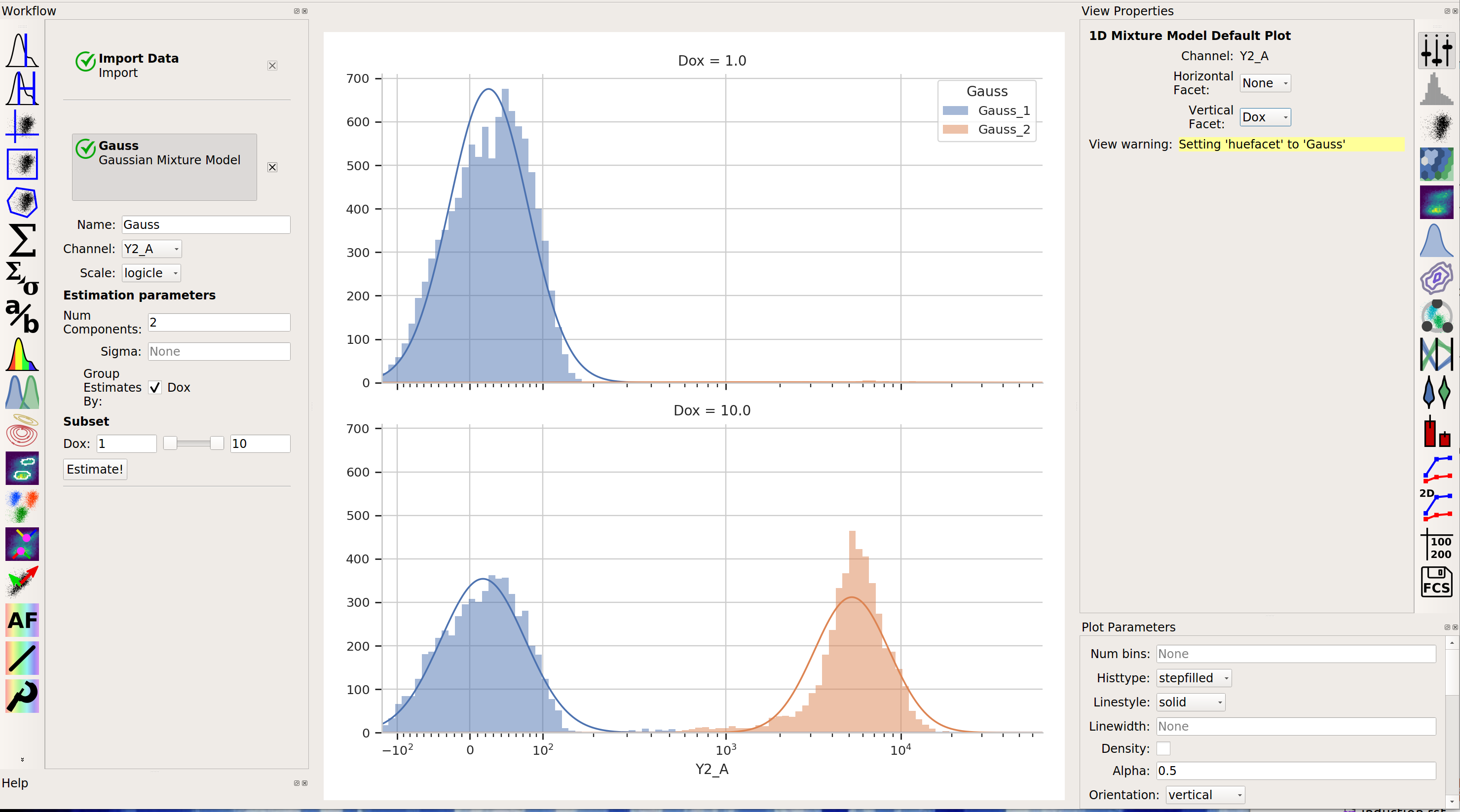
Note that there are two models shown, one for each value of Dox. (Note that I set Vertical Facet on the view to Dox to show both of them.
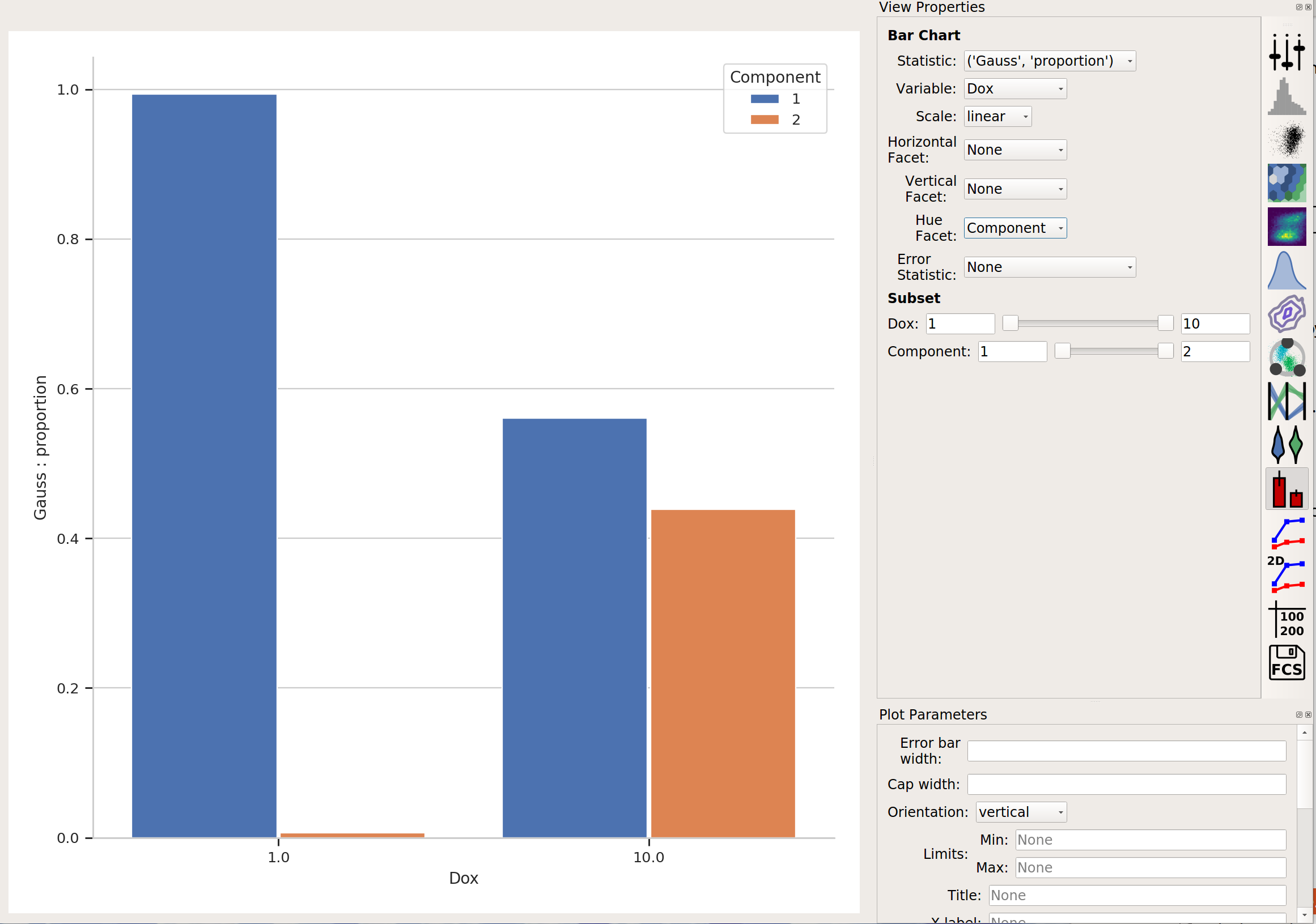
Finally, in addition to gating events, data-driven modules also often create new statistics as well. (See an operation’s help page for details.) For example, the Gaussian Mixture Model operation creates a statistic named the same as the operation name, with the new level Component and the features Mean, Proportion, and others. This lets us analyze these properties of the model that was fit. For example, in the image above, it’s pretty clear that there weren’t many events in component 2 of the data subset Dox = 1.0. If we plot a bar graph of the new statistic with the feature to Proportion, the major variable set to Dox and the hue facet set to Component, we can directly compare those proportions:
The Tutorial: Yeast Multidimensional Induction Timecourse tutorial gives a non-trival example of this.
More Machine Learning Operations#
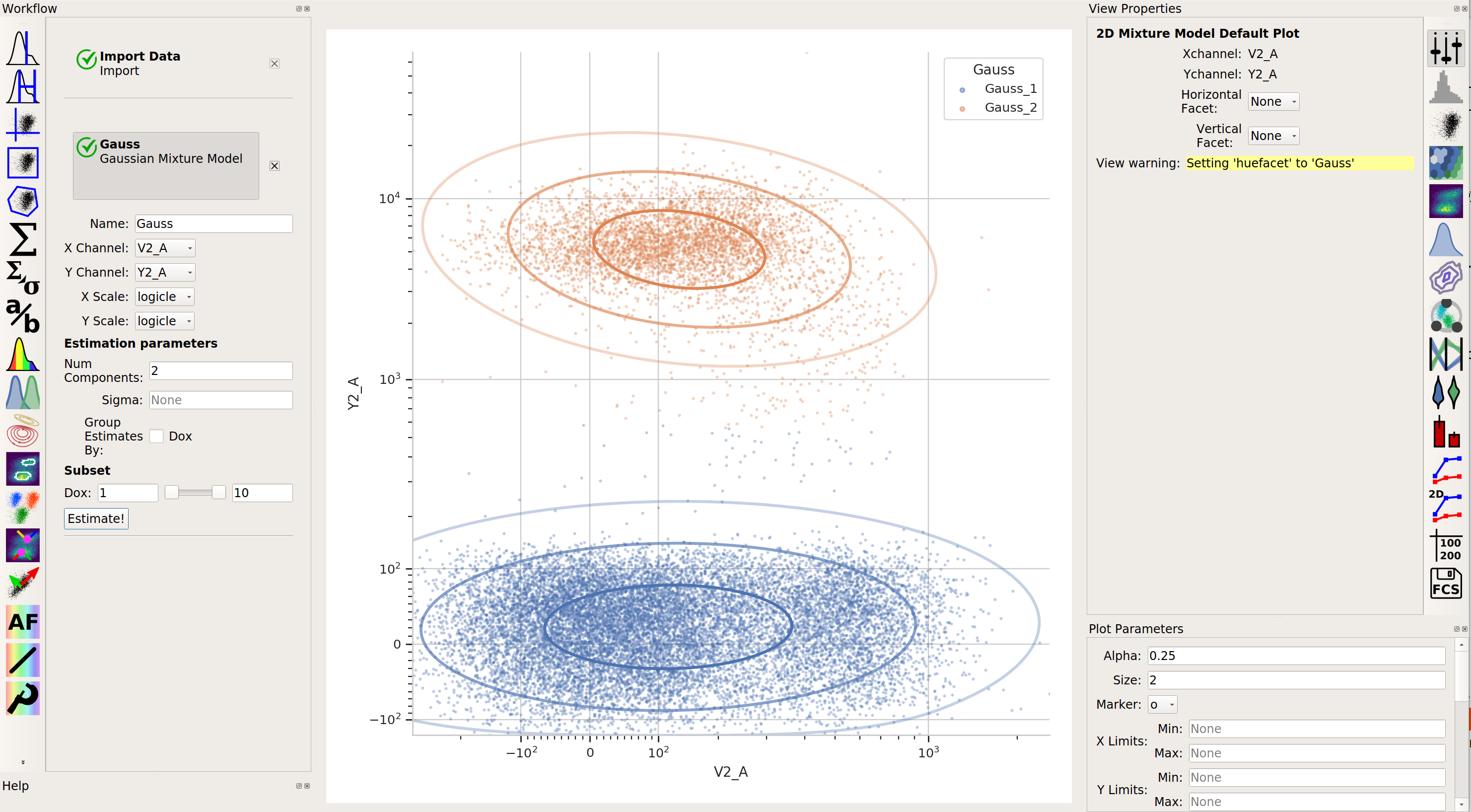
 2-dimensional Gaussian Mixture model
A gaussian mixture model that works in two dimensions (ie, on a scatterplot.)
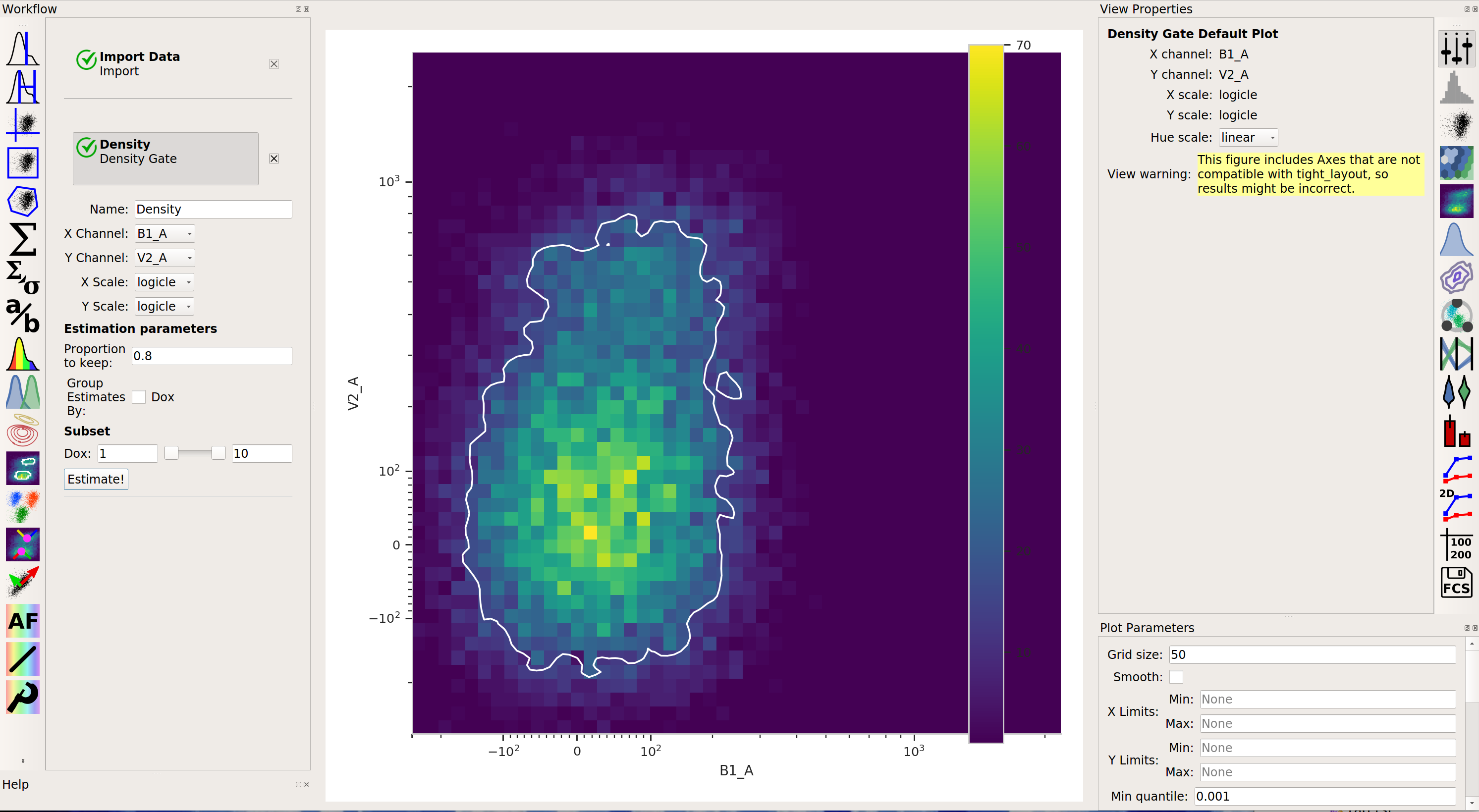
 Density gate
Computes a gate based on a 2D density plot. The user chooses what proportion of events to keep, and the module creates a gate that selects the events in the highest-density bins of a 2D histogram.
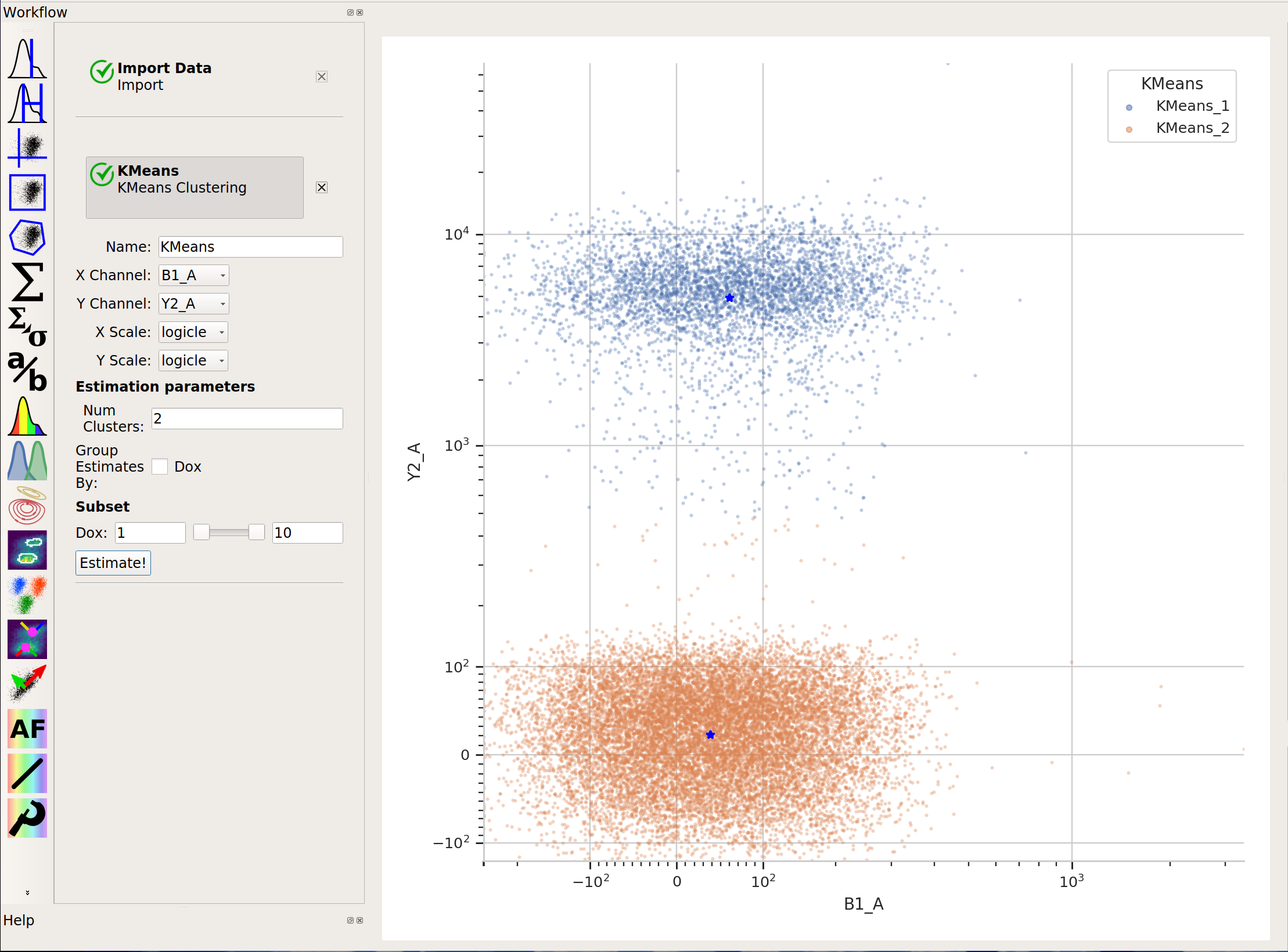
 K-means clustering
Uses k-means clustering on a scatter-plot. This sometimes works better than a 2D Gaussian mixture model if the populations aren’t “normal” (ie, Gaussian- shaped).
 flowPeaks
Sometimes, Gaussian mixtures and k-means clustering don’t do a great job of clustering flow data. These clustering methods like data that is “compact” – regularly spaced around a “center”. Many data sets are not like that. For example, this one, from the
ecoli.fcsfile inexamples-basic/data:
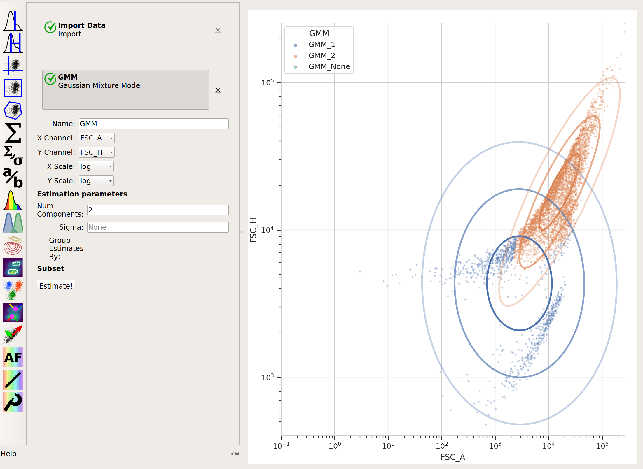
There are clearly two populations, but the Gaussian mixture method isn’t effective at separating them:
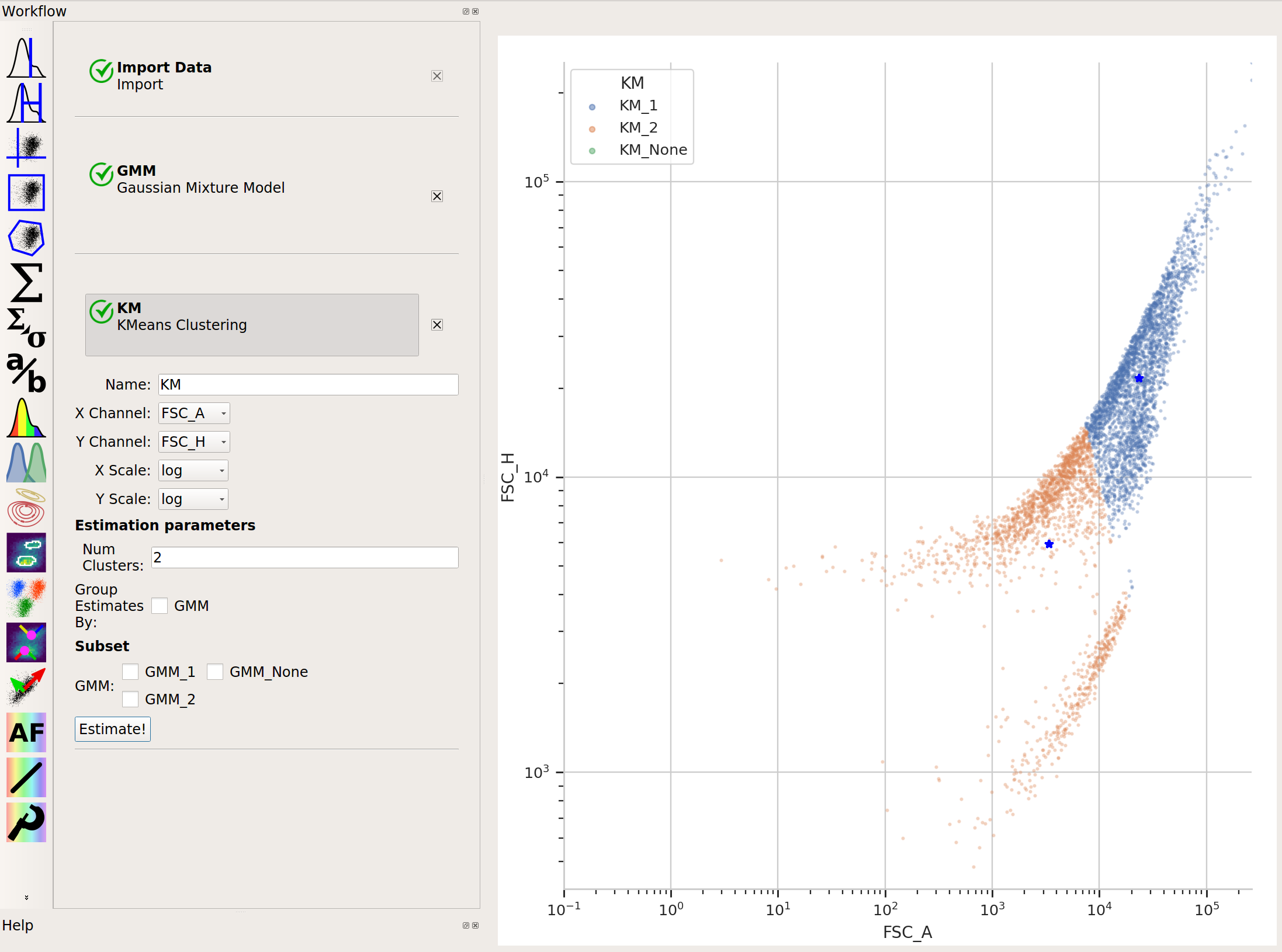
And neither is k-means:
In cases like this, a flow cytometry-specific method called
flowPeaksmay work better.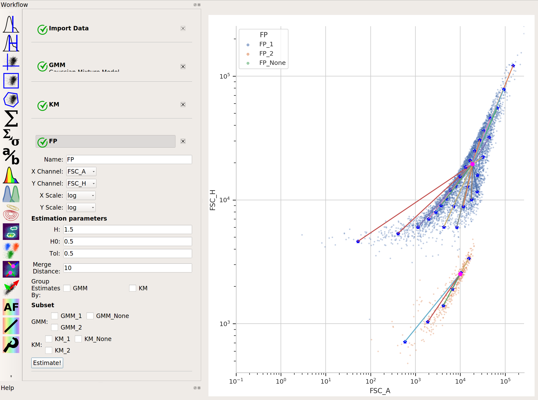
flowPeaksis nice in that it can automatically discover the “natural” number of clusters. There are two caveats, though. First, the peak-finding can be quite sensitive to the estimation parametersh,h0,tandMerge distance. The defaults are a good place to start, but if you’re having trouble getting good performance, try tweaking them (see the documentation for what they mean.) And second,flowPeaksis quite computationally expensive. Thus, on large data sets, it can be quite slow.