Tutorial: Yeast Multidimensional Induction Timecourse
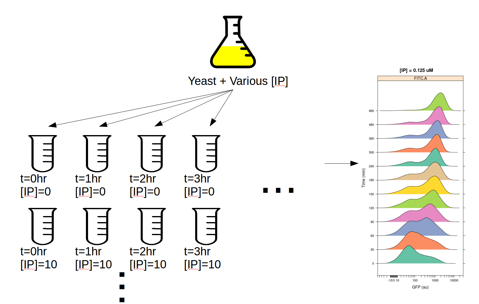
This workflow demonstrates a real-world multidimensional analysis. The yeast strain we’re studying responds to the small molecule isopentyladenine (IP) by expressing a green fluorescent protein, which we can measure using a flow cytometer in the FITC-A channel.
This experiment was designed to determine the dynamics of the IP –> GFP response. I induced several yeast cultures with different amounts of IP, then took readings on the cytometer over the course of the day, every 30 minutes for 8 hours. The outline of the experimental setup is below.
If you’d like to follow along, you can do so by downloading one of the cytoflow-#####-examples-advanced.zip files from the Cytoflow releases page on GitHub. The files are in the yeast/ subdirectory.
Warning
This is a pretty big data set; on modest computers, the operations can take quite some time to complete. Be patient!
Import the data
Start Cytoflow. Under the Import Data operation, choose Set up experiment…
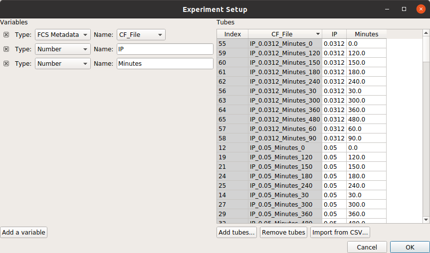
Add two variables, IP and Time. Make both of them Number s.
In this case, I’ve encoded the amount of IP and the time (in minutes) in the FCS files’ file names. For example:
File
IP
Minutes
IP_0.0_Minutes_0
0
0
IP_0.05_Minutes_0
0.05
0
…
…
…
IP_0.0_Minutes_30
0
30
…
…
…
Note
There are a lot of rows in this table. Two things can make setting up these kinds of experiments easier. First, if you already have the details in a table, you can import that table by following the instructions at HOWTO: Import an experiment from a table. And second, you can select multiple cells in the table to edit at once by holding Control or Command and clicking multiple cells.
Warning
It is generally not a good idea to name a variable Time, because most flow cytometers produce FCS files with a Time “channel” and you can’t re-use those names!
At the end, your table should look like this:
Filter out clumps and debris
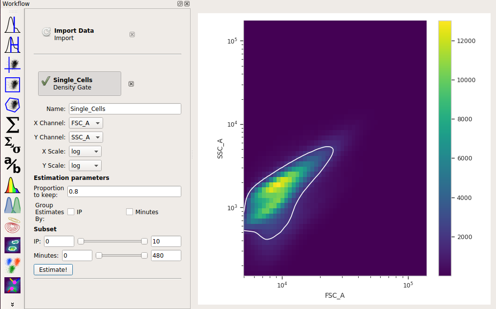
Let’s have a look at the morphological parameters, FSC-A and SSC-A. There are so many events in this data set that a standard scatterplot isn’t a great choice:
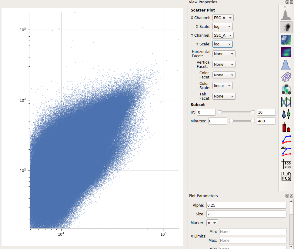
Instead, let’s use a density plot.
Click the density plot button:

Set the X channel to FSC_A and the Y channel to SSC_A. Change both axis scales to log.
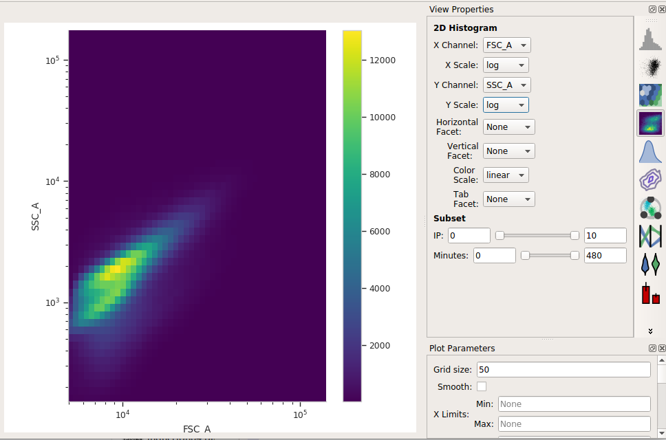
This distribution looks quite tight. Instead of drawing a polygon, let’s use a density gate to keep the 80% of events that are in the “center” of this distribution.
Add a Density Gate operation to your workflow:

Set X channel to FSC_A and Y Channel to SSC_A. Change both axis scales to log. By default, the operation keeps 90% of the events; let’s change that to 80% by setting Proportion to keep to 0.8.
Click Estimate! and check the diagnostic plot to make sure that the gate captures the population you want:
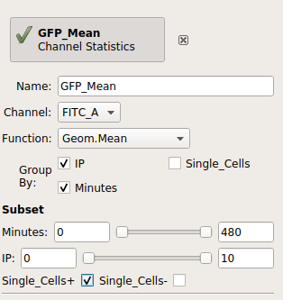
Compute the geometric mean at each different timepoint and IP concentration
Next, we’ll create a new Channel Statistic to compute the geometric mean of the FITC_A channel at each timepoint and IP concentration.
Note
Why the geometric mean? See Guide: Which measure of center should I use?
Add a Channel Statistics operation:

Give the new statistic a name – I called it GFP_Mean – and choose the channel we want to analyze (FITC_A) and the function we want to apply (Geom.Mean)
Now we need to tell
Cytoflowwhich subsets of our data we want to apply the function to. We want the geometric mean computed for every different value of IP and timepoint; so set Group by to IP and Minutes.Again, we only want to analyze the cells in the Single_Cells gate – so set Subset to Single_Cells+.
At the end, your operation should look like this:
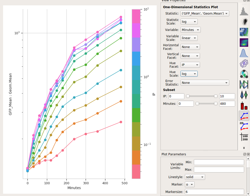
Now that we’ve made a new summary statistic, we want to plot it!
Open the 1D Statistics View:

Set Statistic to the name of the statistic we just created: (‘GFP_Mean’, ‘Geom.Mean’) (note that it shows us both the name of the operation that created the statistic, and the function that we used.)
Set the Statistic Scale to log. This is how the plot will scale the Y axis.
Set Variable to the variable we want on the X axis – in this case, Minutes.
Set Hue Facet to the variable we want plotted in different colors – in this case, IP.
The IP concentrations were a standard dilution series, so change the Hue scale to log.
Et voila, a scatter plot:
Is a geometric mean an appropriate summary statistic?
A geometric mean is only an appropriate summary statistic if the unimodal in log space. Is this actually true? Let’s look at the histogram of each IP/time combination to find out.
Choose the histogram view:

Set the Channel to FITC_A, the Scale to logicle, the Horizontal facet to Minutes and the Vertical facet to IP.
Set Subset to Single_Cells+
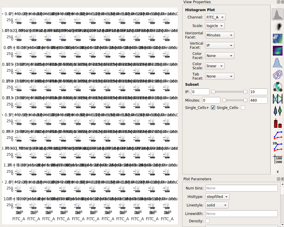
Eeep, that’s impossible to read! Instead, let’s put the IP variable on the Hue axis, and then use the Columns parameter to give us a table of plots. We’ll also change to a 1D Kernel Density Estimate, which will give us smoothed lines instead of jagged histograms.
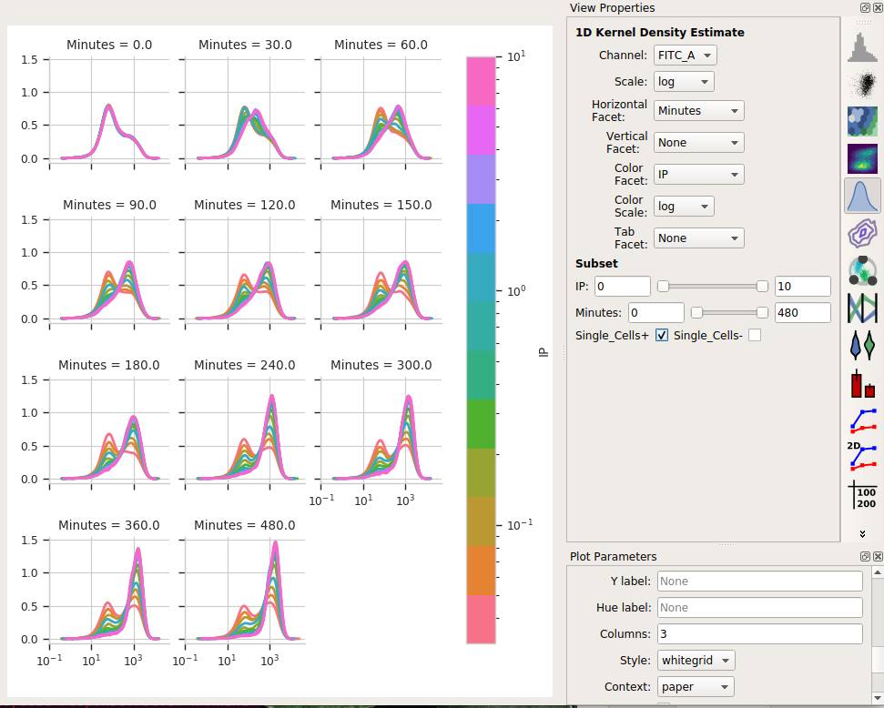
Okay, now this is interesting. Many of these distributions are not unimodal. Instead, there’s significant additional structure. It’s almost like there are two populations of cells in each tube – on that’s “off” and one that’s “on” – and different amounts of IP and time change the proportion of cells in each population.
Model the data as a mixture of gaussians
It turns out that this “mixture of Gaussians” thing is sufficiently common in
cytometery that Cytoflow has a module that can handle it explicitly. Let’s
have Cytoflow model each IP/time subset as a mixture of two gaussians and
see if that’s more informative than the simple dose-response curve.
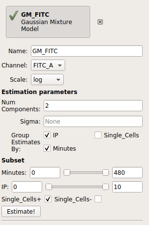
Add a 1D Mixture Model to your workflow:

Set the name to something reasonable – I chose GM_FITC – and the channel to FITC_A and the scale to log.
We want a model with two components, so set Num components to 2.
We want a separate model fit to each subset of data with unique values of IP and Minutes. So, set Group estimates by to IP and Minutes.
We only want to estimate the model from the cells in the Single_Cells gate – so set Subset to Single_Cells+.
Your operation should look like this:
Click Estimate!
You can page through the tabs on the plot to look at the various models that were fit. For example, here’s the IP=0.05, Minutes=300 tab:
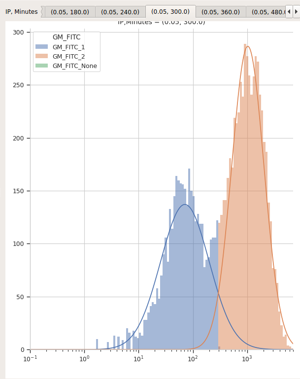
I’d say that’s a pretty good fit!
It’s important to note that most data-driven operations also add statistics that contain information about the models they fit. In this case, the 1D Mixture Model operation creates statistics named mean and proportion, containing the mean and proportion for each component for each data subset.
First, let’s see if the means actually do stay the same for the two components:
Select the 1D Statistics View
Set Statistic to (‘GM_FITC’, ‘mean’) and the Statistic scale to log.
Set Variable to Minutes. Leave the Variable Scale as linear.
Set the Hue facet to IP and change the Hue scale to log.
The tabs at the top of the plot window will show you the results for the different components. (Note that I also set the Y axis minimum to “10”).
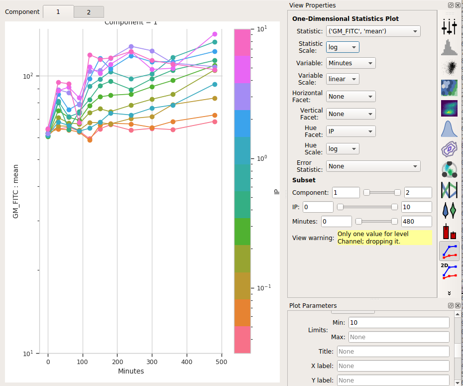
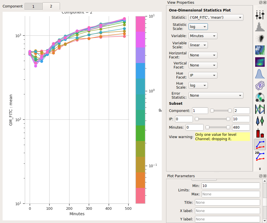
So the means stay pretty constant? They change a lot less than the geometric mean does, at least. A little increase over time – about 5-fold – for the “high” population, and a more-chaotic but still some increase over time for the “low” population.
Second, let’s see if the proportion in the “high” component changes:
Set Statistic to (‘GM_FITC’, ‘proportion’)
Change the Statistic scale back to linear.
Leave the Variable set to Minutes, the Variable scale on linear*, the Hue facet on IP and the Hue scale on log.
If you changed the Y axis minimum, reset it to nothing (default).
Select Component 2 in the tabs at the top of the plot window.
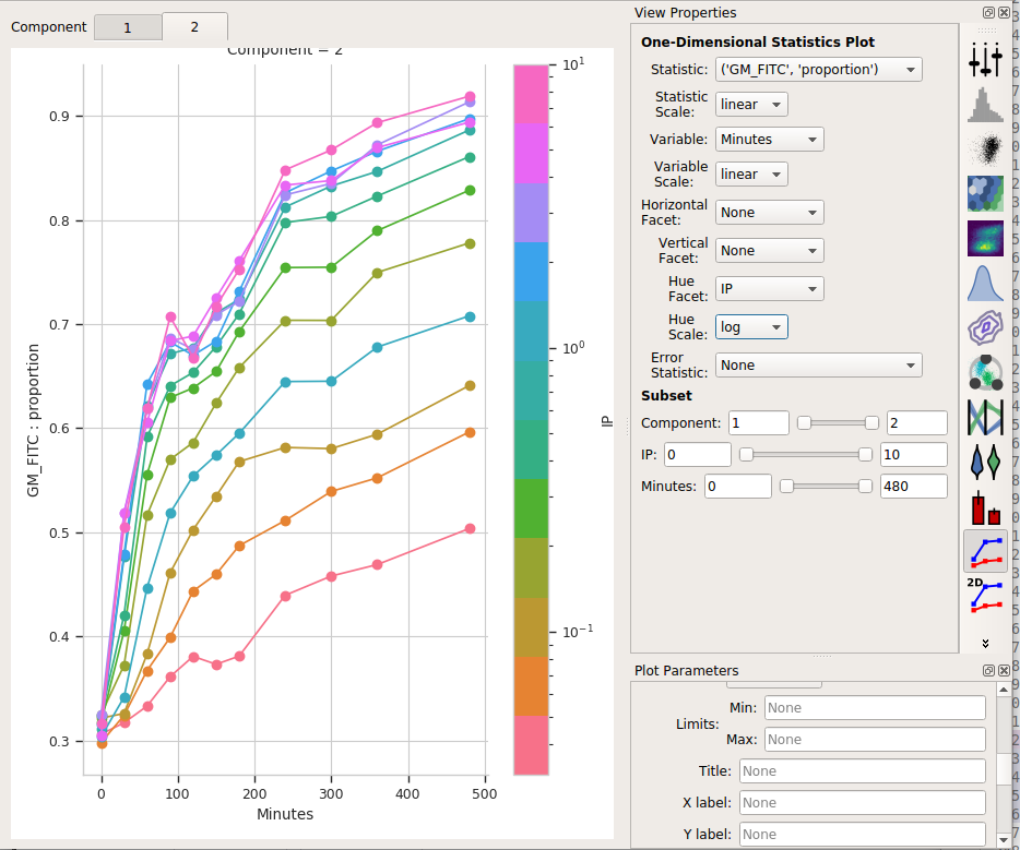
I think those dynamics look significantly different. For one thing, the mixture model “saturates” much more quickly – both in time and in IP. The geometric mean model indicates saturation at about 5 uM, while the mixture model seems to saturate one or two steps earlier. Things also stop changing quite as dramatically by about 240 minutes, whereas the geometric mean hasn’t reached anything like a steady state by 480 minutes (the end of the experiment.)
I hope this has demonstrated a non-trivial insight into the dynamics of this biological system that are gained by looking at it through a quantitative lens, with some machine learning thrown in there as well.