Guide: Using facets to compare data sets
Cytoflow uses an idea called facets to help you analyze data. It’s taken from
Tufte’s trellis plots, which
is a fancy term for a simple idea: that to compare two data sets, you should
plot them next to eachother using the same scale and axes:
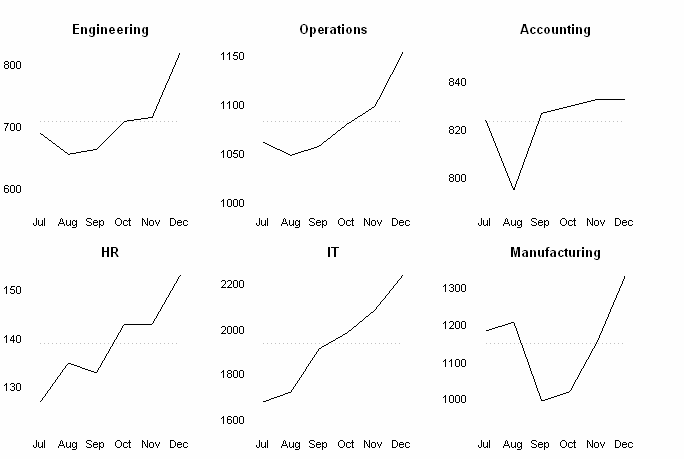
This figure shows multiple line plots on the same X axes, making
it easy to compare between them. (Image by Wikipedia user Chrispounds)
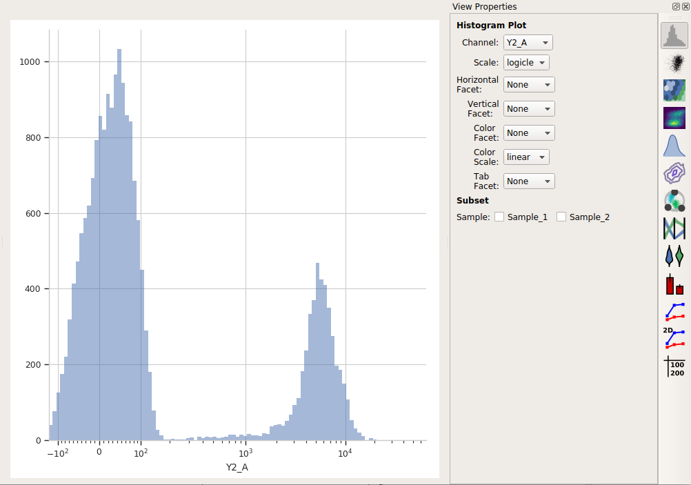
Let’s say I have two different FCS files. As I imported them, I created a Sample
variable and assigned the tubes Sample_1 and Sample_2, respectively. Now I
want to compare them using a histogram plot. Remember that by default, Cytoflow
shows all of the data, from both of the tubes, at the same time on the plot:
However, Cytoflow also makes it easy to compare these two samples. I can put
them on separate plots, side-by-side, by setting Horizontal Facet to the
variable that I want to compare. In this case, it’s Sample:
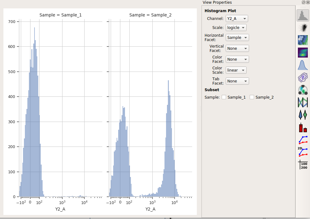
Note that the title of the plot shows me both which variable I’m comparing and
what the value of that variable is in each plot. Similarly, I can create
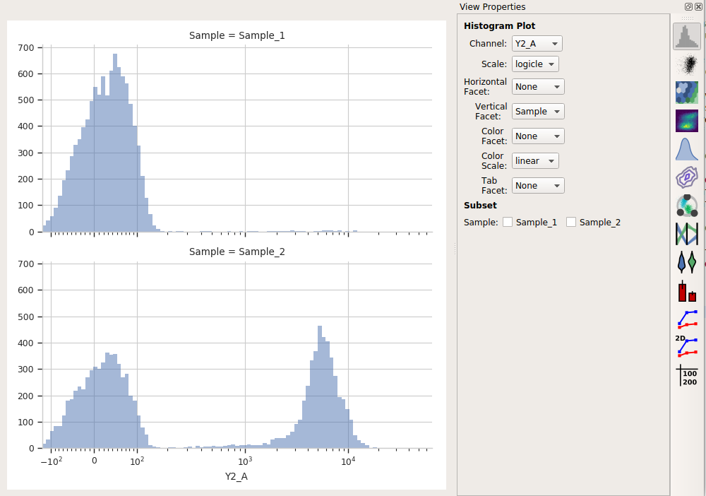
separate plots but stack them on top of eachother with the Vertical Facet
setting:
You can also view them on the same plot but with different colors using
the Color Facet setting:
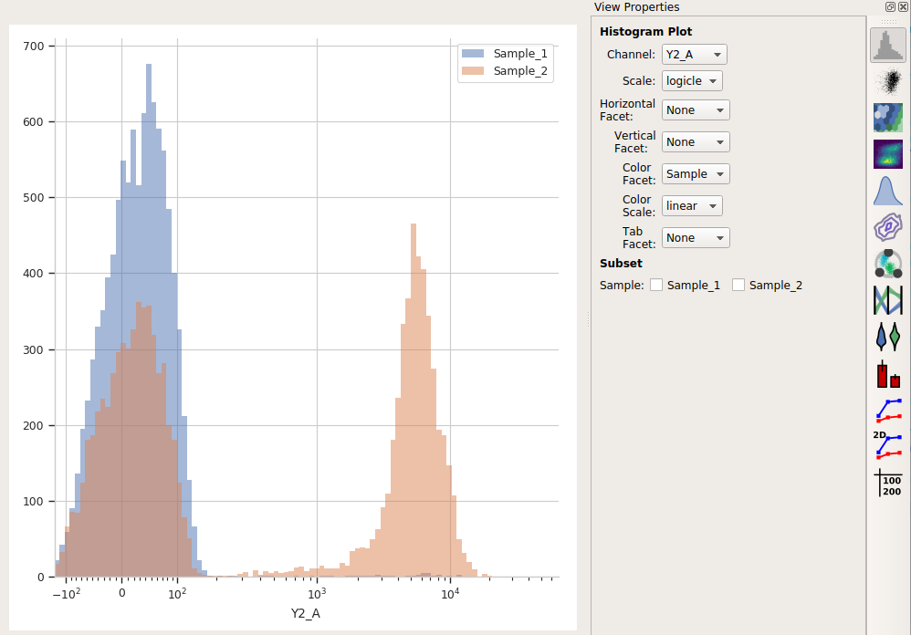
(No, you can’t change the colors, at least not in the point-and-click interface – they’re the from default Seaborn qualitative palette. If you’d like to be able to change the colors, submit a feature request or (even better) a patch!)
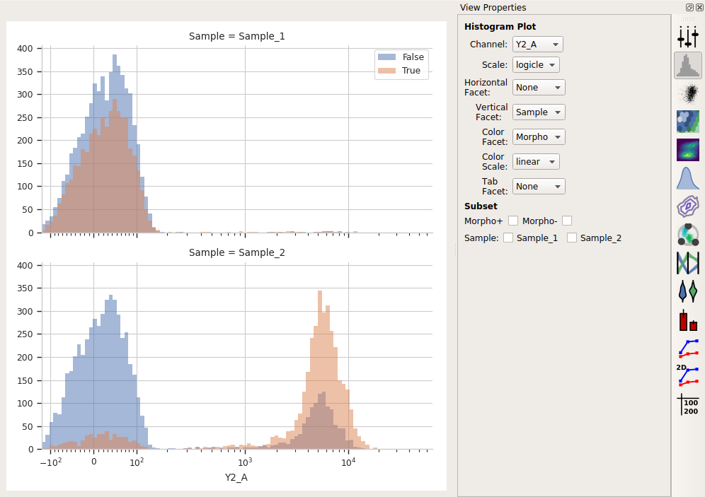
Finally, if you have multiple variables, you can set multiple facets at once to
compare across them all. For example, I’ve added a Threshold gate called
Morpho, and now I can compare data across different values of both Sample
and Morpho: