HOWTO: Add error bars to a statistics plot
While statistics plots of things like the geometric mean are useful, we often want to add some sort of “error bars” to that plot as well.
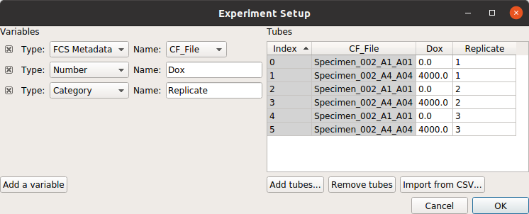
For example, consider the following experiment (taken from the Kiani et al example), in which we have two treatment levels that we’ve measured in triplicate:
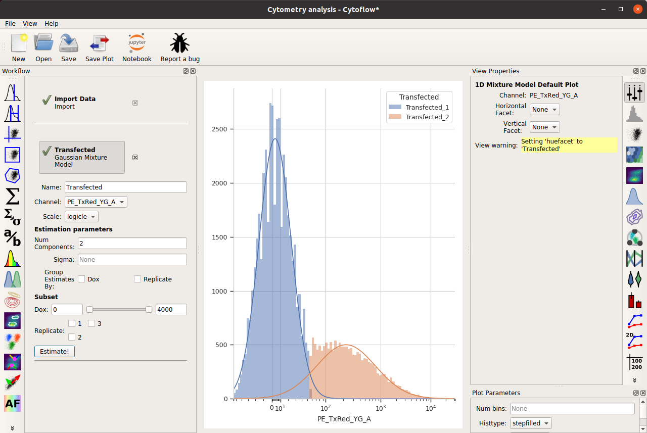
Note that, as per the example, I’m only looking at cells that are already fluorescing in the PE_TxRed_YG channel, which is my transfection marker.
Let’s look at how the FITC_A channel changes across my conditions and replicates:
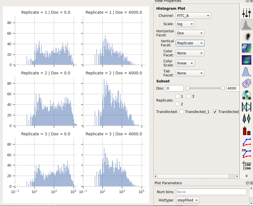
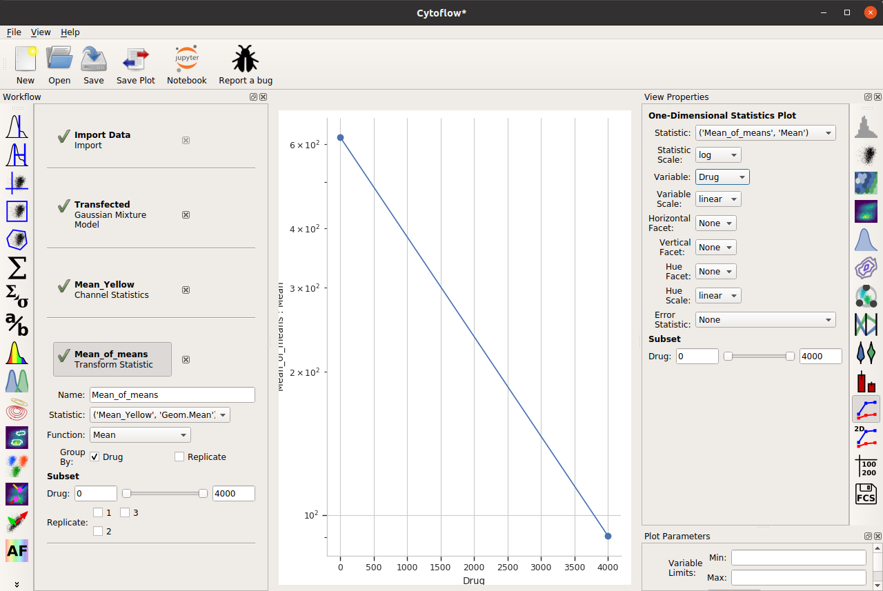
It’s clear from the histograms that the Drug == 0 populations have a much higher fluorescence in the FITC_A channel than the Drug = 4000.0 condition. We can see that quantitatively by creating a Geom.Mean statistic:
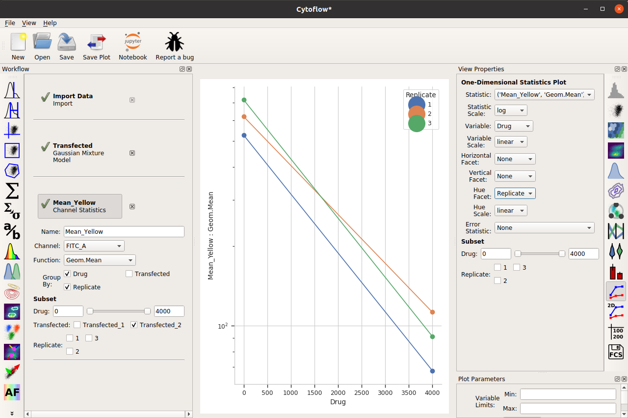
When we compute the geometric mean of all six different subsets (two drugs and three replicates), there’s a definite decrease. Our goal is to also show a visual representation of the amount of variation between the three replicates.
Before that, though, there’s a subtle question to answer – do we want to take a “mean of means” – that is, the geometric mean of these three means? Or do we want a geometric mean of all of the underlying data? I’m going to choose the first approach, but I encourage you to think carefully about the which is more appropriate in your own case.
So I’ll add a Transform Statistic operation, to take the mean-of-geometric-means:
And now, to add error bars, I need another statistic. This will also be a Transform Statistic operation, but this time to compute the standard deviation of the means:
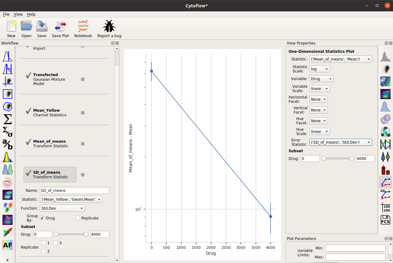
Two important things to note about the above image. First, I have used the same Group by: settings as the Mean_of_means operation. And second, when I set up my One-dimensional statistics plot, I chose the new statistic as the Error statistic.
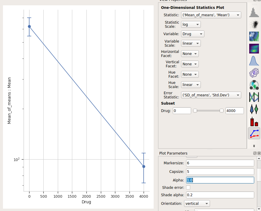
One last thing – the “default” visual properties of those error bars are just vertical lines. This is useful if you’ve got a lot to visualize, but less so if it’s just a few points. Many people like “end caps” on their error bars – to get those, change the Capsize option in the Plot Parameters pane to something greater than 0.
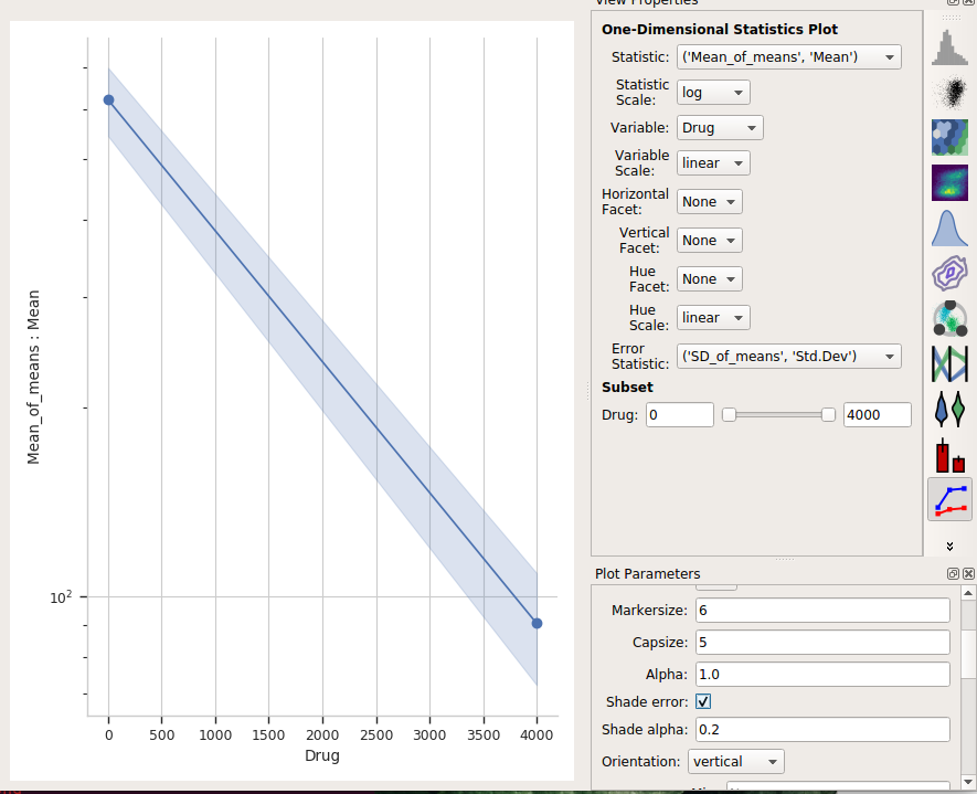
Alternately, choose Shade error to get a “shaded” error display. This one is particularly nice if you have lots of error bars.
One final thing – the use of error bars is a subtle topic – much more so than most biologists grasp. For a useful overview of the issues at play, please see:
Know when your numbers are significant
and