Tutorial: Dose-Response
A common way to use flow cytometry is to analyze a dose-response experiment: cells were treated with increasing doses of some drug or compound, and we want to see how the response changed as we increased the amount of the compound. In this case, I’m treating an engineered yeast line with isopentyladenine, or IP; the yeast cells are engineered with a basic GFP reporter that is expressed in response to IP. We measured GFP fluorescence after 12 hours, at which time we expect the cells to be at steady-state.
(The experiment is described in more detail here: Chen et al, Nature Biotech 2005 )
If you’d like to follow along, you can do so by downloading one of the cytoflow-#####-examples-basic.zip files from the Cytoflow releases page on GitHub.
Importing Data
Start Cytoflow. A workflow always starts with an Import Data operation;
click the Set up experiment button…
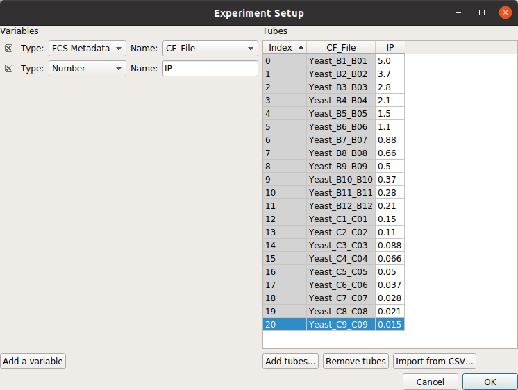
Remember that we need to tell Cytoflow about the experimental conditions for
each sample we’re analysing. In this case, we only have one experimental variable,
IP.
Click Add a variable
Change its type to Number and its name to IP.
Click Add tubes…
Select all of the tubes whose names start with Yeast_B1 through Yeast_C9.
Note
Remember, you can select multiple files by holding down the Control or Command key.
Fill in the experimental values for the IP column. I did a serial dilution; use the the table below for reference.
File
IP
Yeast_B1_B01.fcs
5.0
Yeast_B2_B02.fcs
3.7
Yeast_B3_B03.fcs
2.8
Yeast_B4_B04.fcs
2.1
Yeast_B5_B05.fcs
1.5
Yeast_B6_B06.fcs
1.1
Yeast_B7_B07.fcs
0.88
Yeast_B8_B08.fcs
0.66
Yeast_B9_B09.fcs
0.5
Yeast_B10_B10.fcs
0.37
Yeast_B11_B11.fcs
0.28
Yeast_B12_B12.fcs
0.21
Yeast_C1_C01.fcs
0.15
Yeast_C2_C02.fcs
0.11
Yeast_C3_C03.fcs
0.089
Yeast_C4_C04.fcs
0.066
Yeast_C5_C05.fcs
0.05
Yeast_C6_C06.fcs
0.037
Yeast_C7_C07.fcs
0.028
Yeast_C8_C08.fcs
0.021
Yeast_C9_C09.fcs
0.015
At the end, your table should look like this:
Note
Filling out these tables can be a pain, especially if you’ve already got this information in a table somewhere else already. If so, you can actually import the table directly, following the instructions at HOWTO: Import an experiment from a table
Click Import! to import the data.
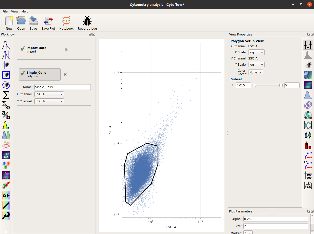
Filter out clumps and debris
Because these cultures were grown on a roller drum, they are quite uniform in size – but there are still some clumps. Let’s filter that out with a polygon gate.
Click the polygon gate button on the operations toolbar:

Name the gate Single_Cells – so we can refer to this subset later – and set the X and Y channels to FSC_A and SSC_A. (These are the forward and side-scatter parameters.)
The initial plot is hard to work with – on the View pane, change both the X and Y scale to log.
Draw a polygon around the major population the center of the plot. Single-click to set a new vertex; double-click to close the polygon.
Here’s what my window looks like now:
Look at the FITC_A channel
Let’s use a histogram to see if we’re seeing a dose-response.
Choose the histogram view:

Set the channel to FITC_A and the scale to log
Set the Horizontal Facet to IP – this will give us one plot for each different value of IP
To only look at the cells in the Single_Cells gate, under Subset, click the check-box next to Single_Cells+
The result is the following plot:
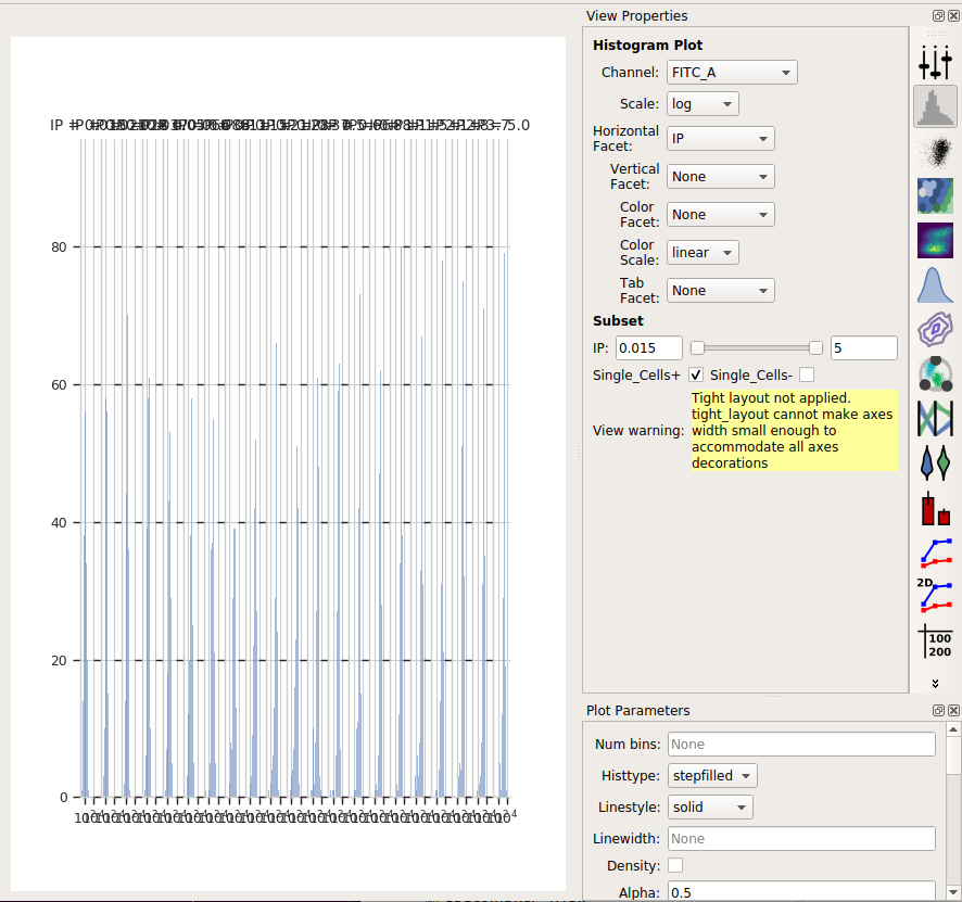
We’ve got so many different values of IP that we can’t squeeze them all
next to eachother. However, we can ask Cytoflow to “wrap” them onto
several lines, like the word-wrap on a word processor. To do so, in the
Plot Parameters pane (bottom-right in the default layout), scroll down
to Columns and set it to 4.
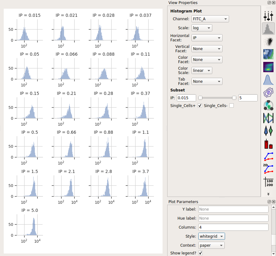
Ah, much better. We can see each plot, and we’re clearly seeing an increase. However, histograms are kind of a terrible way to compare lots of distributions like this. A better way is a violin plot.
Choose the violin plot view:

Set the X variable to IP, the Y variable to FITC_A, and the Y channel scale to log.
As above, set Subset to Single_Cells+
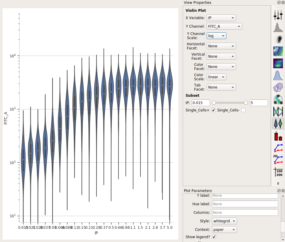
I love how a violin plot lets you compare distributions side-by-side. In this case, it’s very clear that there’s a clear dose-dependent response as IP concentration increases, as well as a clear saturation of the response.
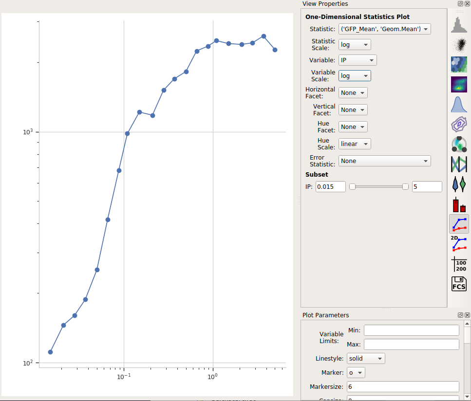
Summarize the dose-response curve on a line plot
Next, let’s make a “traditional” dose-response curve with a scatter plot, where the X axis shows the amount of IP and the Y axis shows the geometric mean of the FITC_A channel.
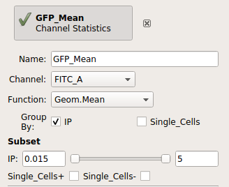
Add a Channel Statistics operation:

Give the new statistic a name – I called it GFP_Mean – and choose the channel we want to analyze (FITC_A) and the function we want to apply (Geom.Mean)
Now we need to tell
Cytoflowwhich subsets of our data we want to apply the function to. We want the geometric mean computed for every different value of IP; so set Group by to IP.Again, we only want to analyze the cells in the Single_Cells gate – so set Subset to Single_Cells+.
At the end, your operation should look like this:
Now that we’ve made a new summary statistic, we want to plot it!
Open the 1D Statistics View:

Set Statistic to the name of the statistic we just created: (‘GFP_Mean’, ‘Geom.Mean’) (note that it shows us both the name of the operation that created the statistic, and the function that we used.)
Set the Statistic Scale to log. This is how the plot will scale the Y axis.
Set Variable to the variable we want on the X axis – in this case, IP.
Set Variable Scale to log – this is the scale on the Y axis.
Et voila, a scatter plot:
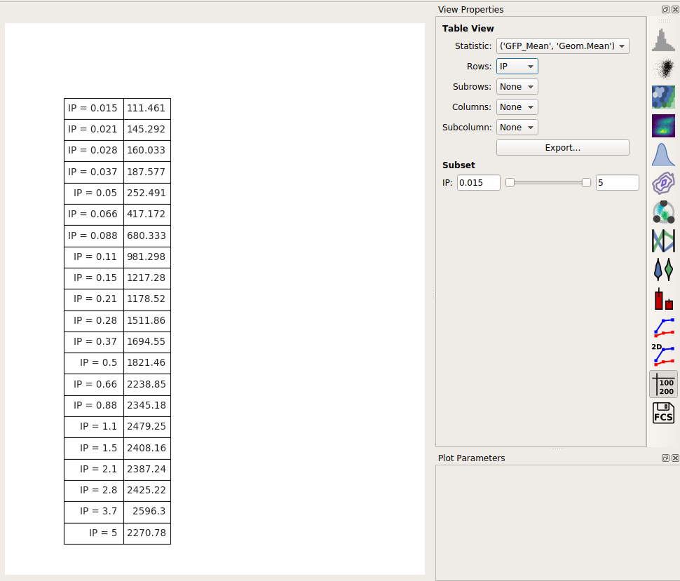
Export the dose-response curve as a table
Often, we want this data avilable for downstream analyses. Any statistic you’ve computed, you can also export as a table (for imporing into a spreadsheet or other plotting or analysis tool.)
Choose the Table View:

Set Statistic to the same statistic we were just looking at: (‘GFP_Mean’, ‘Geom.Mean’)
Set Row to the variable you’d like to put on different rows. In this case, there’s only one, so set it to IP.
You can preview the table in the center plot pane. To export it to a CSV file, click Export…