Guide: Using statistics to summarize data
Summarizing data is a key step in flow cytometry. Even simple, “traditional” analyses involve drawing gates and counting the number of events in them.
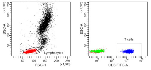
What proportion of these events were T-cells?
Cytoflow calls these summary values – such as the mean or count of a
set of events – statistics. Here, I’m using the word “statistic” in
the technical sense, as in “a quantity that is computed from a sample.”
Another key insight is that we are usually interested in how a statistic changes across our experiment. For example, let’s say that I have some cells that express GFP, and I want to know how the amount of GFP expression changes as I alter the amount of a small molecule that I treat my cells with. I can create a statistic, then plot that statistic, to answer my question. Let’s see how I might do so. (I’m using data from the examples-basic directory – feel free to follow along.)
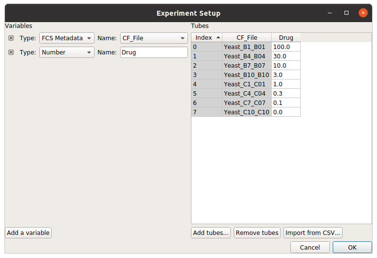
First, I need to import my data. In my experiment setup (in the Import Data operation), I must specify the conditions for each tube – that is, how the cells in each tube are different. In this case, I treated each tube with a different concentration of my drug, so I use “Drug” as a condition.
Using a histogram (and a vertical facet), I can see that the GFP intensity (as displayed in the FITC-A channel) is in fact changing when I vary the amount of drug I treat the cells with.
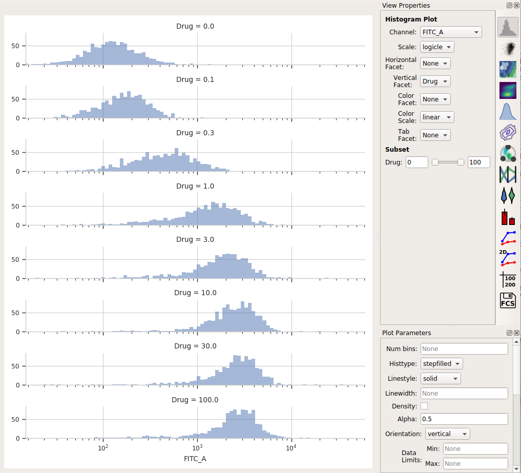
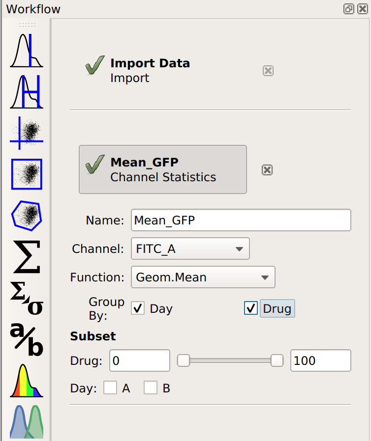
Each distribution seems pretty symmetrical when plotted on a logarithmic scale, so let’s use a geometric mean to summarize them. I can do that with a Channel Statistics operation (the one whose button is a big sigma.)
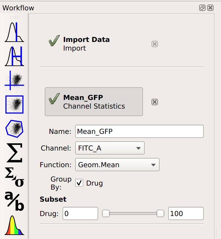
Note that I’ve set a name for the statistic, the channel I want to summarize,
and the function I want to apply. Probably the most important – and most
confusing! – parameter is By. This specifies how I want to Cytoflow
to group the data before applying Function to channel – in this case,
I’ve set it to Drug. Here’s the order that things happen in:
- # Cytoflow sees how many different values of the Drug parameter are in the
data set.
- # It separates the data into groups – subsets – by those different values of
Drug. If each tube has a different Drug value, then each of those subsets is the events from a single tube. However, if I had multiple tubes with the same **Drug* value, those tubes would be combined.*
- # For each subset of the data – each unique value of Drug –
Cytoflow applies the function I asked for (in this case, Geom.Mean – the geometric mean – to the channel I said – in this case, FITC_A.
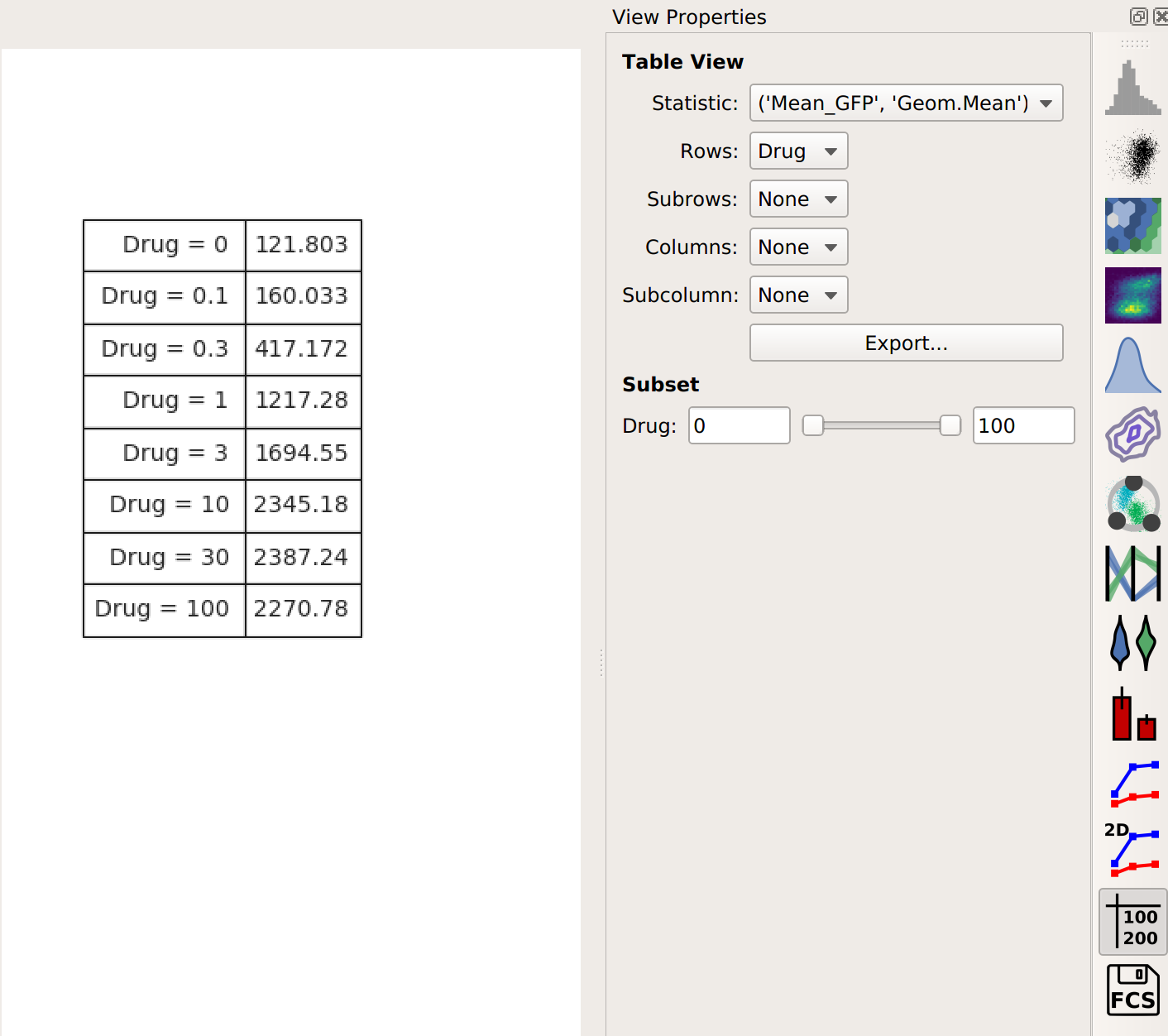
This results in a table of those summary numbers for each subset. You can view this table directly (with the Table View, natch) – here’s what we see.
If you would like to export this data, you can of course do so with the Export
button. However, Cytoflow can plot it directly as well, with the
1D Statistics View.
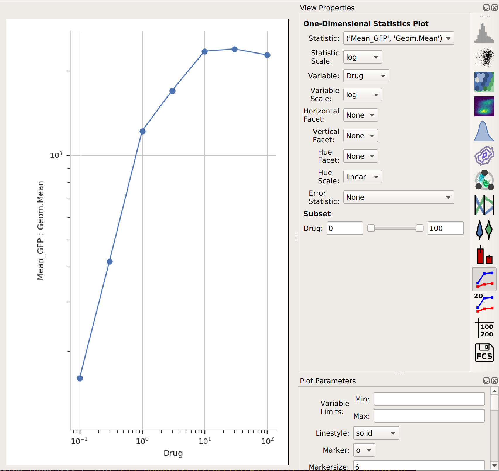
In setting up this plot, I selected the statistic to plot and the variable I wanted on the X axis. I also changed the statistic scale (to log) and the variable scale (to logicle), which makes things easier to interpret. (Note that if I had left the variable scale on log, it would not have plotted the “Drug = 0” condition, because log(0) is undefined!
It’s clear from this analysis that the mean GFP value increases as the amount of drug increases. However, statistics are more powerful than this because they can capture multiple variables at the same time. For example, let’s imagine that I did two different replicates on two different days:
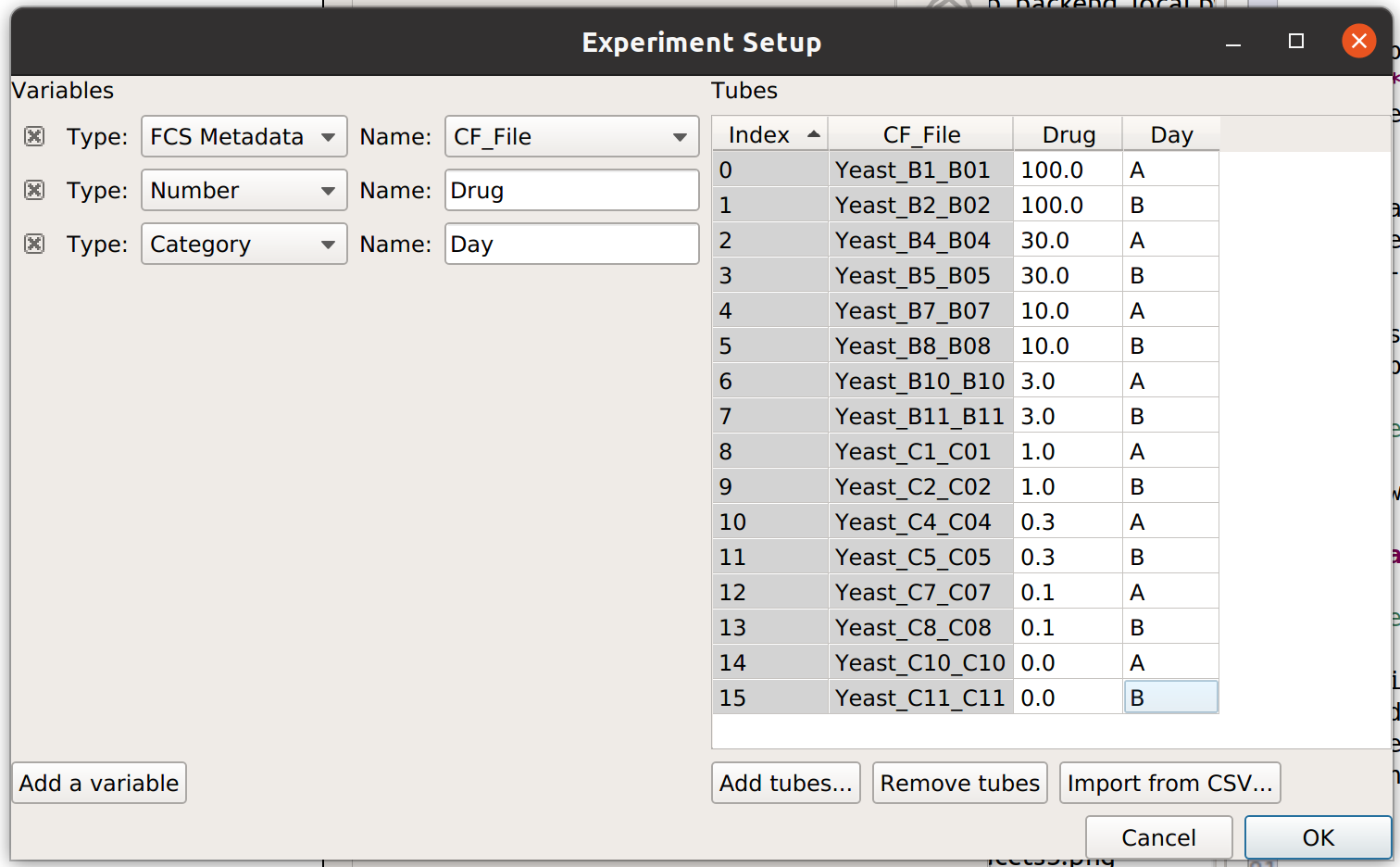
In this case, I have imported twice as many tubes, and labeled them with both the amount of drug I used and which day I did the experiment on.
Now, when I set up my Channel Statistic, I’ll set Group By to both Day and Drug.
Let’s see what this does to my table:
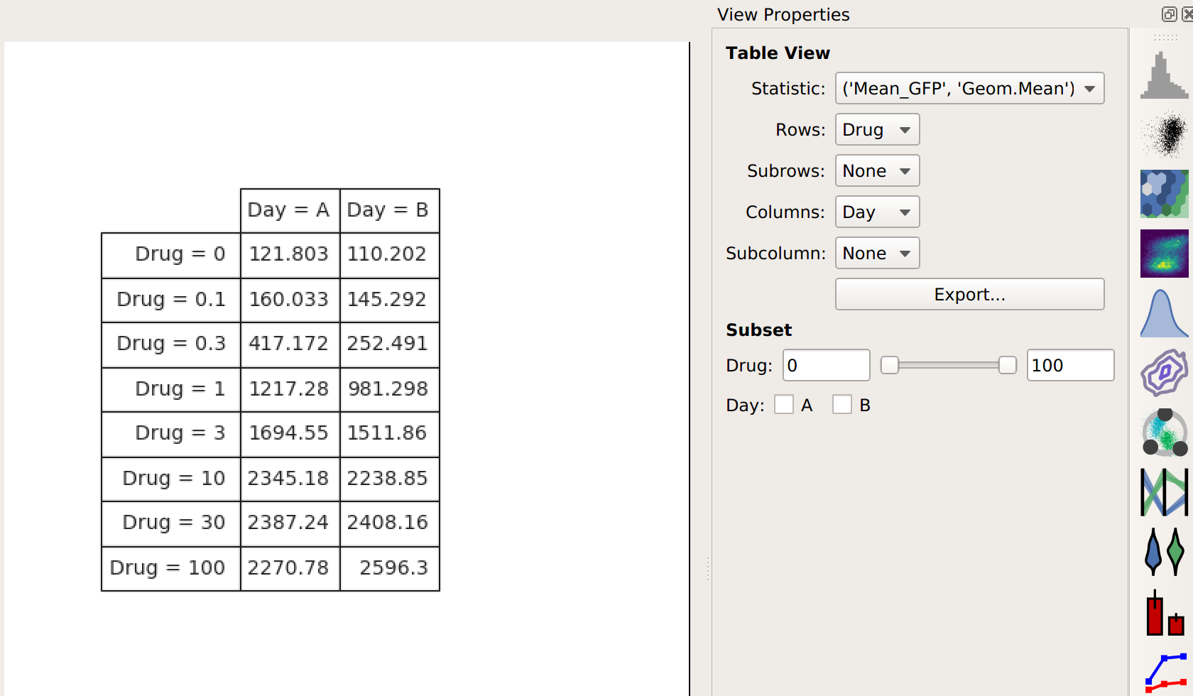
Note that I now have two conditions that I can use when making my table: Drug and Day. This is because the channel statistic operation computed a geometric mean for each unique combination of Drug and Day values. So instead of 8 means, now I have 16. Here, I’ve configured the table view to show different amounts of drug on different rows and different days in different columns.
Again, I could export this if I wanted – or I could plot it. Let’s make another 1D Statistics View plot, putting the two different days in different colors:
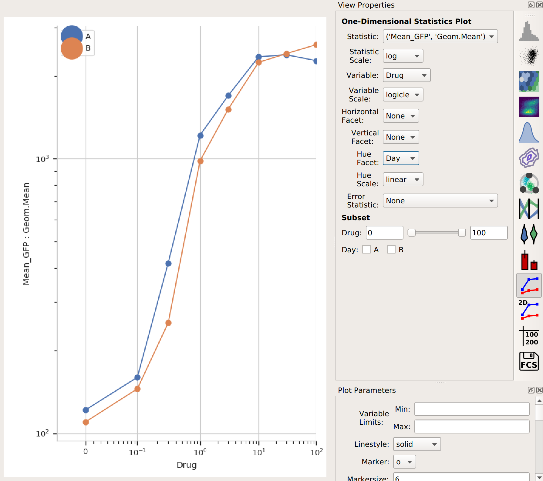
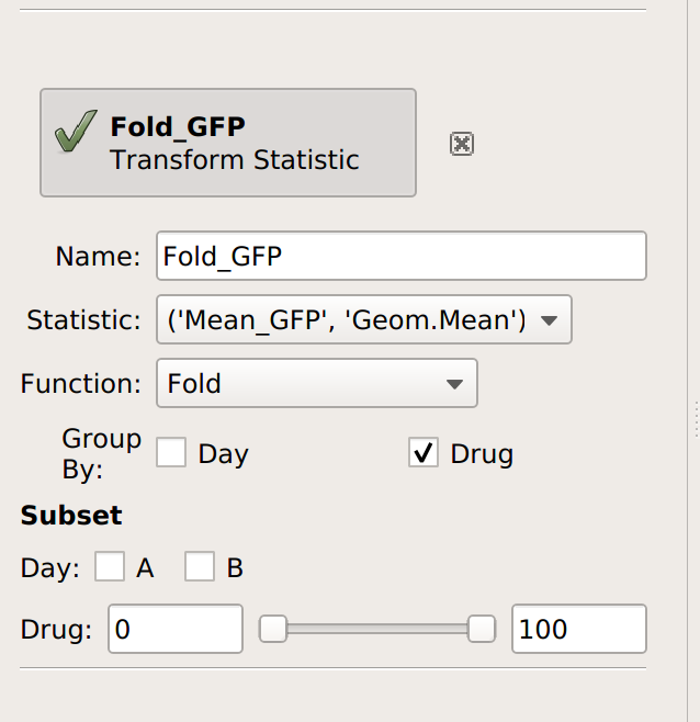
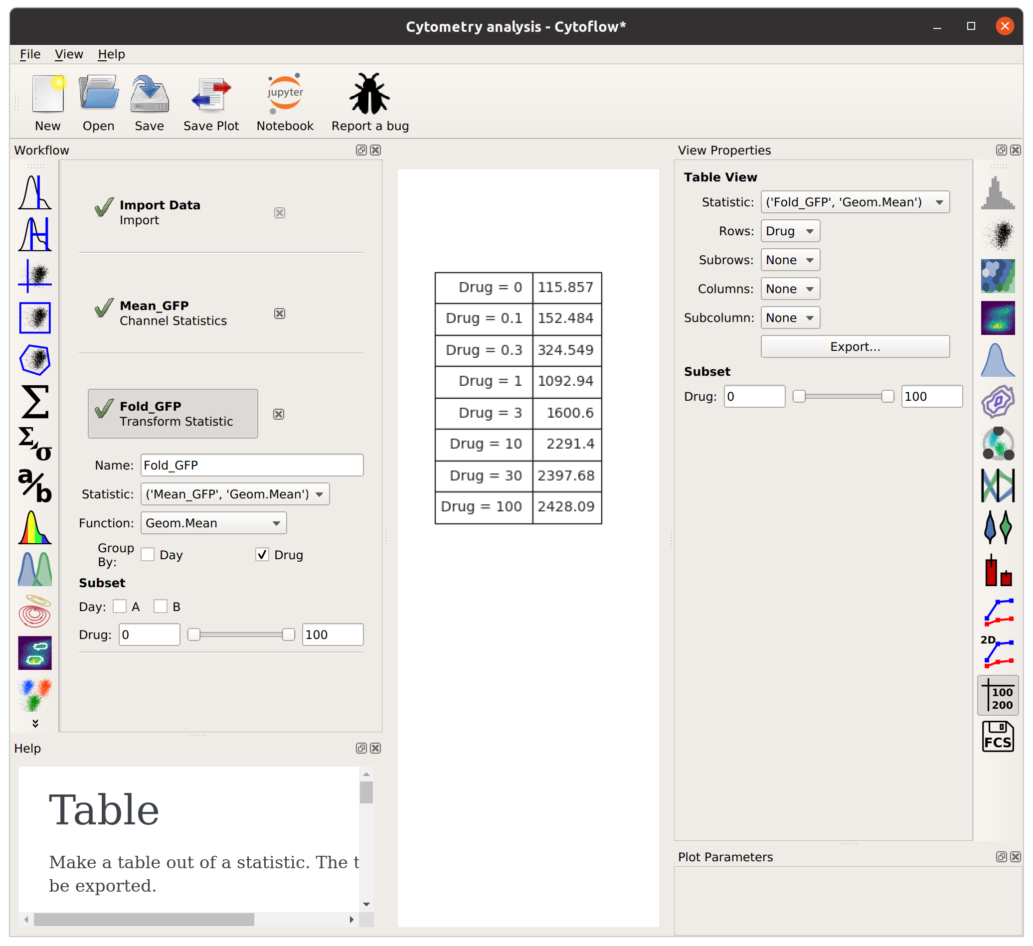
Note that the “Day A” values are pretty consistently higher than “Day B”. I wonder how much higher, and how consistently so? We can answer this question with another operation, called Transform Statistic. This works similarly to Channel Statistic, in that it groups things together and applies a function. However, instead of grouping together events from the flow cytometer, it groups together values in another statistic before applying the function. (This way, it transforms that statistic – see?)
This time, I’ll group by Drug (and not Day). Remember, this will take the starting statistic, split it into groups for each unique value of Drug, and then apply the Fold function to each group. (Fold simply divides every value in the group by the minimum value.)
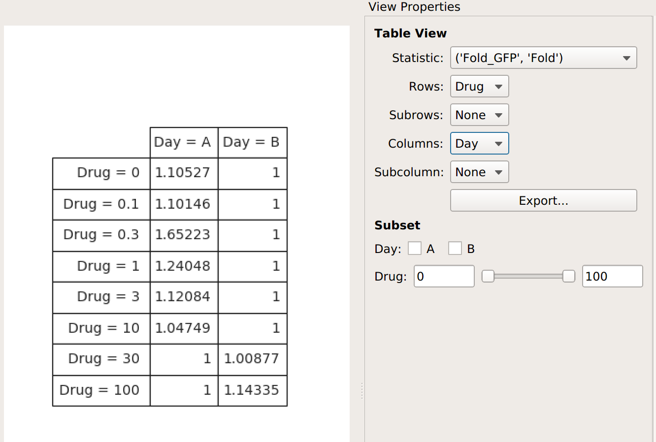
The Fold function produces a statistic the same size and shape as the one it’s operating on. However, some functions reduce the size of the statistic – for example, if we apply Geom.Mean again, we only get a table with one column (because it’s taking the geometric mean of all the values in each group):
Statistics are a pretty key part of the way Cytoflow is meant to be
used. I hope this explanation made sense – if you feel it can be
improved, please feel free to submit a bug (or, even better, a patch
or pull request) to improve it.