cytoflow.views.bar_chart#
Plot a bar chart from a statistic.
BarChartView – the IView class that makes the plot.
- class cytoflow.views.bar_chart.BarChartView[source]#
Bases:
Base1DStatisticsViewPlots a bar chart of some summary statistic
- variable#
The condition that varies when plotting this statistic: used for the x axis of line plots, the bar groups in bar plots, etc. Must be a level in the statistic’s index.
- Type:
Str
- feature#
The column in the statistic to plot (often a channel name.)
- Type:
Str
- error_low#
The name of the column used to plot low extent error bars. If
error_lowis set,error_highmust be set as well.- Type:
Str
- error_high#
The name of the column used to plot high extent error bars. If
error_highis set,error_lowmust be set as well.- Type:
Str
- scale#
The scale applied to the data before plotting it.
- Type:
{‘linear’, ‘log’, ‘logicle’}
- statistic#
The statistic to plot. Must be a key in
Experiment.statistics.- Type:
Str
- xfacet#
Set to one of the index levels in the statistic being plotted, and a new column of subplots will be added for every unique value of that index level.
- Type:
String
- yfacet#
Set to one of the index levels in the statistic being plotted, and a new row of subplots will be added for every unique value of that index level.
- Type:
String
- huefacet#
Set to one of the index levels in the statistic being plotted, and a new colored artist (line, bar, etc) will be added for every unique value of that index level.
- Type:
String
- subset#
An expression that specifies the subset of the statistic to plot. Passed unmodified to
pandas.DataFrame.query.- Type:
Examples
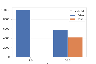
Make a little data set.
>>> import cytoflow as flow
>>> import_op = flow.ImportOp()
>>> import_op.tubes = [flow.Tube(file = "Plate01/RFP_Well_A3.fcs",
...                              conditions = {'Dox' : 10.0}),
...                    flow.Tube(file = "Plate01/CFP_Well_A4.fcs",
...                              conditions = {'Dox' : 1.0})]
>>> import_op.conditions = {'Dox' : 'float'}
>>> ex = import_op.apply()
Add a threshold gate
>>> ex2 = flow.ThresholdOp(name = 'Threshold',
...                        channel = 'Y2-A',
...                        threshold = 2000).apply(ex)
Add a statistic
>>> ex3 = flow.ChannelStatisticOp(name = "ByDox",
...                               channel = "Y2-A",
...                               by = ['Dox', 'Threshold'],
...                               function = len).apply(ex2)
Plot the bar chart
>>> flow.BarChartView(statistic = "ByDox",
...                   variable = "Dox",
...                   feature = 'Y2-A',
...                   huefacet = "Threshold").plot(ex3)
- enum_plots(experiment)[source]#
Returns an iterator over the possible plots that this View can produce. The values returned can be passed to “plot”.
- plot(experiment, plot_name=None, **kwargs)[source]#
Plot a bar chart
- Parameters:
experiment (Experiment) – The
Experimentto plot using this view.title (str) – Set the plot title
xlabel (str) – Set the X axis label
ylabel (str) – Set the Y axis label
huelabel (str) – Set the label for the hue facet (in the legend)
legend (bool) – Plot a legend for the color or hue facet? Defaults to
True.legend_loc (str) – If we plot a legend, where should it go? This is a
matplotliblegend location string, like ‘lower right’ or ‘outside center right’. Default is ‘upper right’.sharex (bool) – If there are multiple subplots, should they share X axes? Defaults to
True.sharey (bool) – If there are multiple subplots, should they share Y axes? Defaults to
True.row_order (list) – Override the row facet value order with the given list. If a value is not given in the ordering, it is not plotted. Defaults to a “natural ordering” of all the values.
col_order (list) – Override the column facet value order with the given list. If a value is not given in the ordering, it is not plotted. Defaults to a “natural ordering” of all the values.
hue_order (list) – Override the hue facet value order with the given list. If a value is not given in the ordering, it is not plotted. Defaults to a “natural ordering” of all the values.
height (float) – The height of each row in inches. Default = 3.0
aspect (float) – The aspect ratio of each subplot. Default = 1.5
col_wrap (int) – If
xfacetis set andyfacetis not set, you can “wrap” the subplots around so that they form a multi-row grid by setting this to the number of columns you want.sns_style ({“darkgrid”, “whitegrid”, “dark”, “white”, “ticks”}) – Which
seabornstyle to apply to the plot? Default iswhitegrid.sns_context ({“notebook”, “paper”, “talk”, “poster”}) – Which
seaborncontext to use? Controls the scaling of plot elements such as tick labels and the legend. Default isnotebook.palette (palette name, list, or dict) – Colors to use for the different levels of the hue variable. Should be something that can be interpreted by
seaborn.color_palette, or a dictionary mapping hue levels to matplotlib colors. See https://seaborn.pydata.org/tutorial/color_palettes.html for a good overview.despine (Bool) – Remove the top and right axes from the plot? Default is
True.plot_name (str) – If this
IViewcan make multiple plots,plot_nameis the name of the plot to make. Must be one of the values retrieved fromenum_plots.orientation ({‘vertical’, ‘horizontal’})
lim ((float, float)) – Set the range of the plot’s axis.
color (a matplotlib color) – Sets the colors of all the bars, even if there is a hue facet
errwidth (scalar) – The width of the error bars, in points
errcolor (a matplotlib color) – The color of the error bars
capsize (scalar) – The size of the error bar caps, in points
Notes
Other
kwargsare passed to matplotlib.axes.Axes.bar