Yeast Dosage-Response Curve#
This is data from a real experiment, measuring the dose response of an engineered yeast line to isopentyladenine, or IP. The yeast is engineered with a basic GFP reporter, and GFP fluorescence is measured after 12 hours, at which time we expect the cells to be at steady-state.
(Reference: Chen et al, Nature Biotech 2005)
Import the cytoflow module.
import cytoflow as flow

# if your figures are too big or too small, you can scale them by changing matplotlib's DPI
import matplotlib
matplotlib.rc('figure', dpi = 160)
First we set up the Experiment. This is primarily the mapping
between the flow data (wells on a microtitre plate, here) and the
metadata (experimental conditions, in this case the IP concentration.)
For this experiment, I did a serial dilution with three dilutions per
log. Note that I specify that this metadata is of type log, which is
represented internally as a numpy type float, but is plotted on
a log scale when we go to visualize it.
Also note that, in order to keep the size of the source distribution manageable, I’ve only included 1000 events from each tube in the example files. The actual data set has 30,000 events from each, which gives a much prettier dose-response curve!
inputs = {
    "Yeast_B1_B01.fcs" : 5.0,
    "Yeast_B2_B02.fcs" : 3.75,
    "Yeast_B3_B03.fcs" : 2.8125,
    "Yeast_B4_B04.fcs" : 2.109,
    "Yeast_B5_B05.fcs" : 1.5820,
    "Yeast_B6_B06.fcs" : 1.1865,
    "Yeast_B7_B07.fcs" : 0.8899,
    "Yeast_B8_B08.fcs" : 0.6674,
    "Yeast_B9_B09.fcs" : 0.5,
    "Yeast_B10_B10.fcs" : 0.3754,
    "Yeast_B11_B11.fcs" : 0.2816,
    "Yeast_B12_B12.fcs" : 0.2112,
    "Yeast_C1_C01.fcs" : 0.1584,
    "Yeast_C2_C02.fcs" : 0.1188,
    "Yeast_C3_C03.fcs" : 0.0892,
    "Yeast_C4_C04.fcs" : 0.0668,
    "Yeast_C5_C05.fcs" : 0.05,
    "Yeast_C6_C06.fcs" : 0.0376,
    "Yeast_C7_C07.fcs" : 0.0282,
    "Yeast_C8_C08.fcs" : 0.0211,
    "Yeast_C9_C09.fcs" : 0.0159
}

tubes = []
for filename, ip in inputs.items():
    tubes.append(flow.Tube(file = "data/" + filename, conditions = {'IP' : ip}))

ex = flow.ImportOp(conditions = {'IP' : "float"},
                   tubes = tubes).apply()
The first step in most cytometry workflows is to filter out debris and
aggregates based on morphological parameters (the forward- and
side-scatter measurements.) So let’s have a look at the FSC-A and SSC-A
channels, using our favorite biexponential scale logicle.
Remember, because we’re not specifying otherwise, this is a plot of all of the data in the experiment, not a single tube!
flow.ScatterplotView(xchannel = "FSC-A",
                     ychannel = "SSC-A",
                     xscale = "logicle",
                     yscale = "logicle").plot(ex, alpha = 0.05)
/home/brian/src/cytoflow/cytoflow/utility/logicle_scale.py:313: CytoflowWarning: Channel FSC-A doesn't have any negative data. Try a log transform instead.
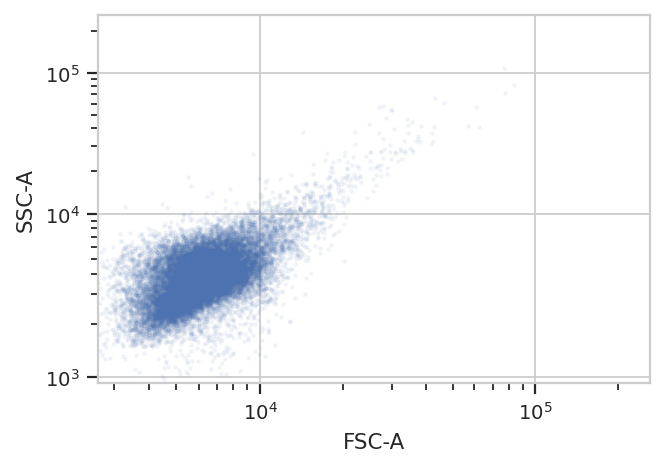
Oops! The warning tells us that the biexponential scale is really
intended for channels that have events around 0, with some negative
events; let’s use a log scale on both FSC-A and SSC-A in the future.
(The fluorescence channels should be fine on a logicle scale,
though.)
Because this is yeast growing in log phase on a drum roller, the distributions in FSC-A and SSC-A are pretty tight. Let’s fit a 2D gaussian to it, and gate out any data that is more than three standard deviations from the mean.
g = flow.GaussianMixtureOp(name = "Debris_Filter",
                           channels = ["FSC-A", "SSC-A"],
                           scale = {'FSC-A' : 'log',
                                    'SSC-A' : 'log'},
                           num_components = 1,
                           sigma = 3)
g.estimate(ex)
g.default_view().plot(ex, alpha = 0.05)

ex2 = g.apply(ex)
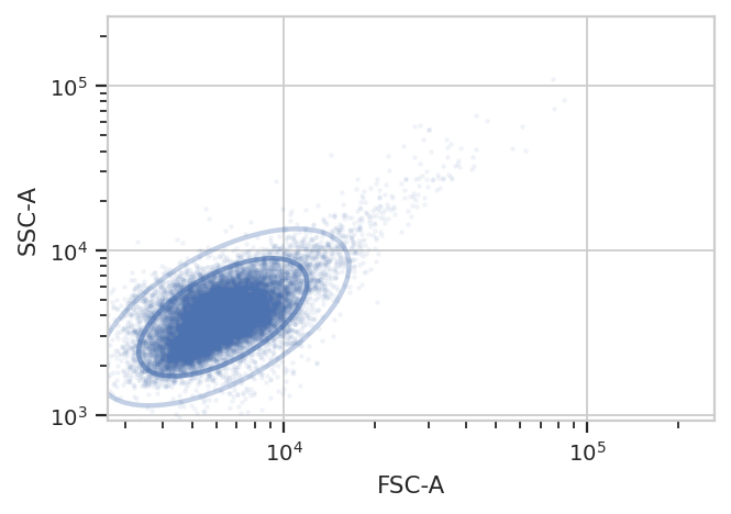
One thing to note: if you’ve read the Machine Learning notebook, you
know that a GaussianMixtureOp adds categorical metadata as well. In
this case, we have a new boolean column named Debris_Filter, which
is True if the event is less than sigma from the centroid and
False otherwise.
ex2.data.head()
| FITC-A | FSC-A | FSC-H | FSC-W | IP | PerCP-Cy5-5-A | SSC-A | SSC-H | SSC-W | Time | Debris_Filter | |
|---|---|---|---|---|---|---|---|---|---|---|---|
| 0 | 2734.459961 | 3720.110107 | 3771.0 | 64651.589844 | 5.0 | -306.440002 | 4036.360107 | 3915.0 | 67567.531250 | 2.3 | True |
| 1 | 3316.320068 | 6256.010254 | 6119.0 | 67003.414062 | 5.0 | -185.179993 | 2631.060059 | 2519.0 | 68451.437500 | 3.2 | True |
| 2 | 3551.320068 | 5292.209961 | 4708.0 | 73668.281250 | 5.0 | -234.059998 | 3729.919922 | 3376.0 | 72406.406250 | 9.2 | True |
| 3 | 3110.459961 | 5934.479980 | 5855.0 | 66425.640625 | 5.0 | 395.739990 | 3499.619873 | 3419.0 | 67081.335938 | 12.7 | True |
| 4 | 2560.560059 | 4605.700195 | 4631.0 | 65177.964844 | 5.0 | -165.440002 | 3196.939941 | 3139.0 | 66745.671875 | 13.0 | True |
Now, let’s look at the FITC-A channel, which is the one we’re interested
in. First of all, just check histograms of the FITC-A distribution in
each tube. Make sure to set the subset trait to only include the
events that aren’t debris!
flow.HistogramView(channel = "FITC-A",
                   scale = "logicle",
                   xfacet = "IP",
                   subset = "Debris_Filter == True").plot(ex2, col_wrap = 3)
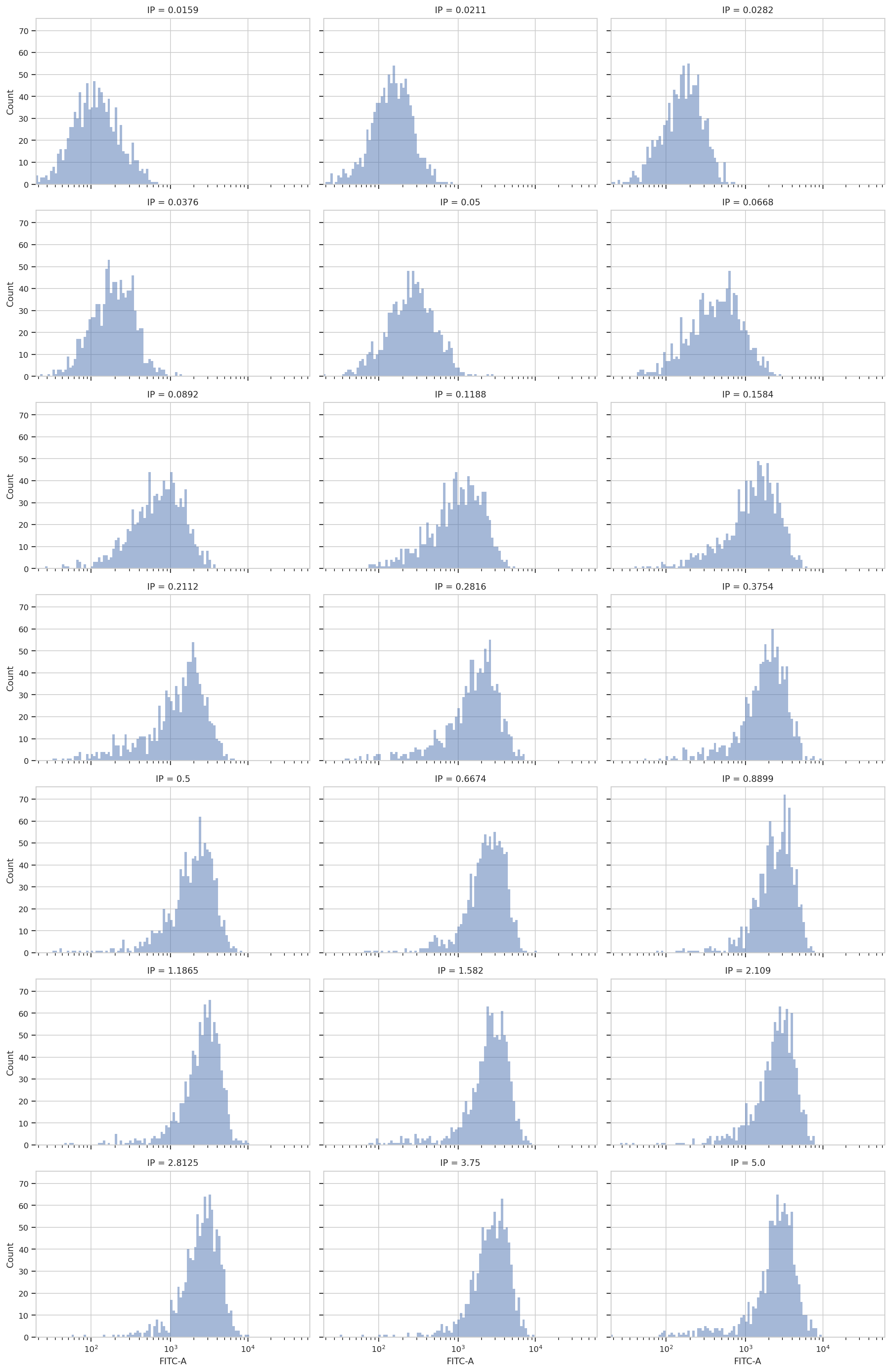
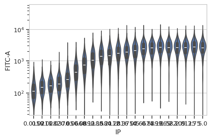
Sure enough, looking at the plots, it’s clear that the histogram peak
moves to the right as the IP concentration increases. We can get a more
compact representation of the same data with one of cytoflow’s
fancier plots, a violin plot:
flow.ViolinPlotView(variable = "IP",
                    channel = "FITC-A",
                    scale = "logicle",
                    subset = "Debris_Filter == True").plot(ex2)
A quick aside - sometimes you get ugly axes because of overlapping
labels. In this case, we want a wider plot. While we can directly
specify the height of a plot, we can’t directly specify its width, only
its aspect ratio (the ratio of the width to the height.) cytoflow
defaults to 1.5; in this case, let’s widen it out to 4. If this results
in a plot that’s wider than your browser, the Jupyter notebook will
scale it down for you.
flow.ViolinPlotView(variable = "IP",
                    channel = "FITC-A",
                    scale = "logicle",
                    subset = "Debris_Filter == True").plot(ex2, aspect = 4)
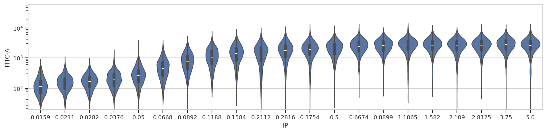
At least on my screen that’s better, but a violin plot is really best
for categorical data (with a modest number of categories.) Instead,
let’s make a true does-response curve. The ChannelStatisticsOp
divides the data into subsets by different values of the IP variable
and applies flow.geom_mean to each subset. Then, the Stats1DView
plots that statistic.
(Confused? Have a look at the Statistics example notebook for a more
in-depth discussion.)
ex3 = flow.ChannelStatisticOp(name = "ByIP",
                              channel = "FITC-A",
                              by = ["IP"],
                              function = flow.geom_mean,
                              subset = "Debris_Filter == True").apply(ex2)

flow.Stats1DView(statistic = "ByIP",
                 feature = "FITC-A",
                 scale = "log",
                 variable = "IP",
                 variable_scale = "log").plot(ex3)
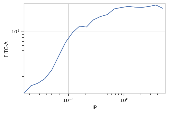
And of course, because the underlying data is just a
pandas.DataFrame, we can manipulate it with the rest of the
Scientific Python ecosystem. Here, we get the compute the geometric
means using pandas.DataFrame.groupby.
(ex2.data.query("Debris_Filter == True")[['IP', 'FITC-A']]
         .groupby('IP')
         .agg(flow.geom_mean))
| FITC-A | |
|---|---|
| IP | |
| 0.0159 | 110.209301 |
| 0.0211 | 143.507986 |
| 0.0282 | 157.332377 |
| 0.0376 | 184.959273 |
| 0.0500 | 250.297256 |
| 0.0668 | 413.781993 |
| 0.0892 | 678.979138 |
| 0.1188 | 955.664252 |
| 0.1584 | 1201.557123 |
| 0.2112 | 1164.530618 |
| 0.2816 | 1503.467572 |
| 0.3754 | 1691.126815 |
| 0.5000 | 1812.333210 |
| 0.6674 | 2219.928952 |
| 0.8899 | 2330.923961 |
| 1.1865 | 2423.731503 |
| 1.5820 | 2362.649599 |
| 2.1090 | 2341.478585 |
| 2.8125 | 2422.780181 |
| 3.7500 | 2549.603737 |
| 5.0000 | 2258.993753 |