Kiani et al, Nature Methods 2014#
This example reproduces Figure 2, part (a), from Kiani et al, Nature Methods 11: 723 (2014).
In order to keep download sizes reasonable, the files only have about 10% of the original events.
Experimental Layout#
This experiment uses a dCas9 fusion to repress the output of a yellow fluorescent reporter. The dCas9 is directed to the repressible promoter by a guide RNA under the control of rtTA3, a transcriptional activator controlled with the small molecule inducer doxycycline (Dox).
The plasmids that were co-transfected are shown below (reproduced from the above publication’s Supplementary Figure 6a.)
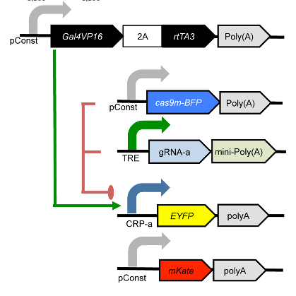
Genetic circuit#
The experiment compares three different conditions: - No dCas9 / no gRNA - No gRNA - The full gene network
Each condition was induced with 0, 100, 500, and 4000 uM Dox.
import cytoflow as flow

# if your figures are too big or too small, you can scale them by changing matplotlib's DPI
import matplotlib
matplotlib.rc('figure', dpi = 160)
As is usual with cytoflow, we start by mapping the files to the
experimental conditions. We have three different conditions; four
different Dox concentrations; and three replicates.
# (Condition, [Dox]) --> filename
inputs = {
    ("Full_Circuit", 0.0) : "Specimen_002_A1_A01.fcs",
    ("Full_Circuit", 100.0) : "Specimen_002_A2_A02.fcs",
    ("Full_Circuit", 500.0) : "Specimen_002_A3_A03.fcs",
    ("Full_Circuit", 4000.0) : "Specimen_002_A4_A04.fcs",
    ("No_gRNA", 0.0) : "Specimen_002_C5_C05.fcs",
    ("No_gRNA", 100.0) : "Specimen_002_C6_C06.fcs",
    ("No_gRNA", 500.0) : "Specimen_002_C7_C07.fcs",
    ("No_gRNA", 4000.0) : "Specimen_002_C8_C08.fcs",
    ("No_Cas9", 0.0) : "Specimen_002_D1_D01.fcs",
    ("No_Cas9", 100.0) : "Specimen_002_D2_D02.fcs",
    ("No_Cas9", 500.0) : "Specimen_002_D3_D03.fcs",
    ("No_Cas9", 4000.0) : "Specimen_002_D4_D04.fcs"}

tubes = []

for repl, path in {1 : "repl1", 2 : "repl2", 3 : "repl3"}.items():
    for (condition, dox), filename in inputs.items():
        tube = flow.Tube(file = path + "/" + filename,
                         conditions = {'Condition' : condition,
                                       'Dox' : dox,
                                       'Replicate' : repl})
        tubes.append(tube)

import_op = flow.ImportOp(conditions = {'Condition' : "category",
                                        'Dox' : "float",
                                        'Replicate' : "int"},
                          tubes = tubes)

ex = import_op.apply()
Have a look at the morphological parameters.
flow.DensityView(xchannel = "FSC-A",
                 ychannel = "SSC-A",
                 xscale = 'log',
                 yscale = 'log').plot(ex, min_quantile = 0.005)
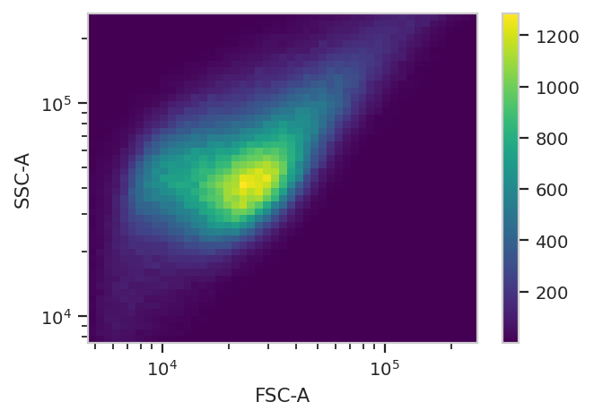
This looks like it’s been pre-gated (ie, there’s not a mixture of populations.) It’s also pushed up against the top axes in both SSC-A and FSC-A, which is a little concerning.
Let’s see how many events we’re getting piled up.
(ex['SSC-A'] == ex['SSC-A'].max()).sum()
5434
Alright. Some events (~5,000 out of 360,000) but not enough to be concerning.
The next thing we usually do is select for positively transfected cells. mKate is the transfection marker, so look at the red channel.
flow.HistogramView(channel = "PE-TxRed YG-A",
                   scale = 'logicle').plot(ex)
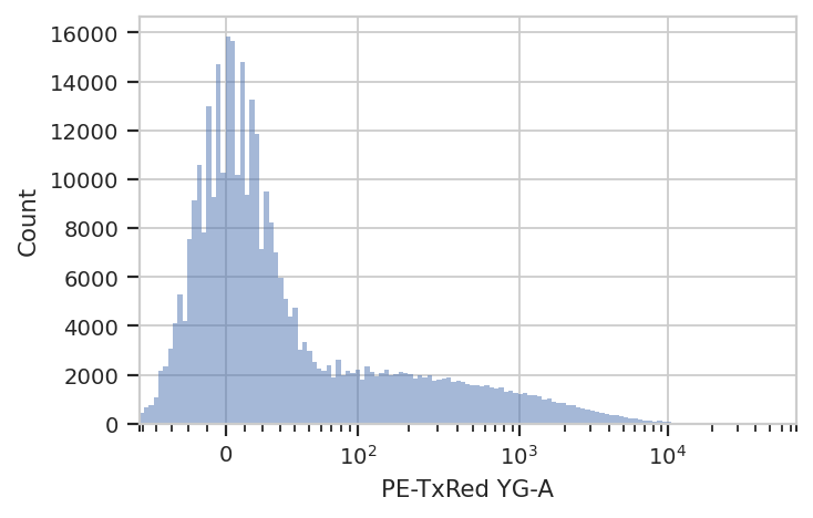
Let’s fit a mixture-of-gaussians, for a nice principled way of separating the transfected population from the untransfected population.
gm = flow.GaussianMixtureOp(name = "GM",
                            channels = ["PE-TxRed YG-A"],
                            scale = {'PE-TxRed YG-A' : 'logicle'},
                            num_components = 2)
gm.estimate(ex)
ex_gm = gm.apply(ex)
gm.default_view().plot(ex_gm)
/home/brian/src/cytoflow/cytoflow/operations/base_op_views.py:376: CytoflowViewWarning: Setting 'huefacet' to 'GM'
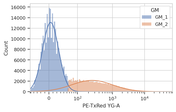
Looks good: the events with GM == 'GM_2' are the cells in the
transfected population. Let’s see how many events were in each
population.
ex_gm.data.groupby(['GM'], observed = True).size()
GM
GM_1    262010
GM_2     97990
dtype: int64
Let’s make a new condition, Transfected, to be a boolean value with
whether the cell was in GM_2 or not. Note: ``add_condition`` acts
on the ``Experiment`` in-place.
ex_gm.add_condition(name = 'Transfected',
                    dtype = 'bool',
                    data = (ex_gm['GM'] == 'GM_2'))
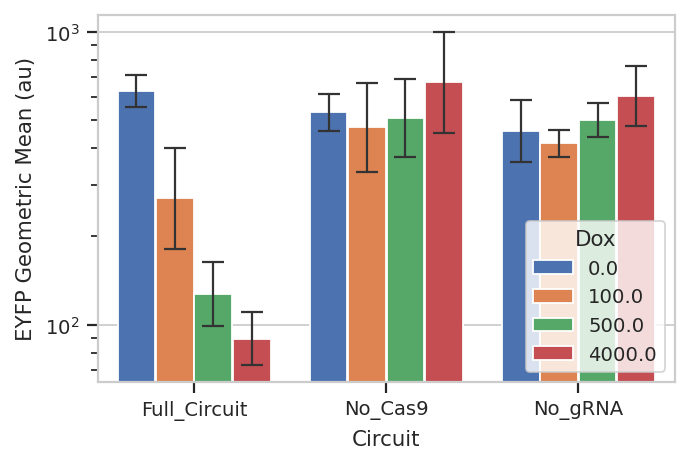
Now, we can create a bar chart to ask how much sample-to-sample
variation we had. We’ll take geometric mean of the the output (EYFP, in
the FITC-A channel) in each condition, [Dox] and replicate, then
compute the geometric mean-of-means and the geometric standard deviation
across the replicates. (This is sliiiightly different than the
corresponding figure in the publication, which shows the geometric mean
across the entire dataset.)
Please note: This is a terrible way to use error bars. See:
https://www.nature.com/nature/journal/v492/n7428/full/492180a.html
and
http://jcb.rupress.org/content/177/1/7
for reasons why. I’m using them here to demonstrate the capability, rather than argue that you should perform your analysis this way.
import pandas as pd

ex_stat = flow.ChannelStatisticOp(name = "FITC_mean_by_replicate",
                                  channel = "FITC-A",
                                  by = ["Condition", "Dox", "Replicate"],
                                  function = flow.geom_mean,
                                  subset = "Transfected == True").apply(ex_gm)

ex_stat = flow.TransformStatisticOp(name = "FITC_mean_sd",
                                    statistic = "FITC_mean_by_replicate",
                                    feature = "FITC-A",
                                    by = ["Condition", "Dox"],
                                    function = lambda x: pd.Series({'Geo.Mean' : flow.geom_mean(x),
                                                                    '*SD' : flow.geom_mean(x) * flow.geom_sd(x),
                                                                    '/SD' : flow.geom_mean(x) / flow.geom_sd(x)})).apply(ex_stat)

flow.BarChartView(statistic = "FITC_mean_sd",
                  feature = "Geo.Mean",
                  error_low = "/SD",
                  error_high = "*SD",
                  variable = "Condition",
                  scale = "log",
                  huefacet = "Dox").plot(ex_stat,
                                         xlabel = 'Circuit',
                                         ylabel = 'EYFP Geometric Mean (au)',
                                         capsize = 5,
                                         errwidth = 1)
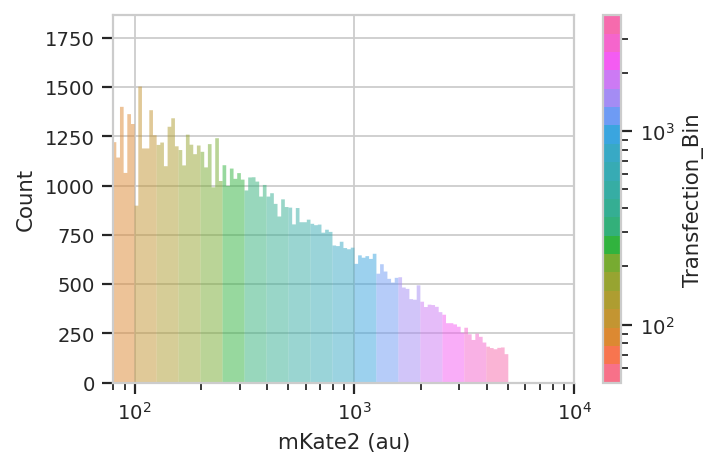
So that’s useful, but maybe there’s more in this data. When you transfect plasmids into mammalian cells, some cells get a lot of plasmids and some get comparatively few – resulting in several orders of magnitude differences in transgene expression. We’ve noticed in our lab that gene circuit behavior frequently changes as copy number changes. Is this the case here? We can bin the data by transfection level, and see if the behavior changes as the bin number increases. We can also ask that the number of events per bin be included as another piece of metadata, so we can exclude bins with a small number of events.
bin_op = flow.BinningOp(name = "Transfection_Bin",
                        channel = "PE-TxRed YG-A",
                        bin_width = 0.1,
                        scale = "log",
                        bin_count_name = "Transfection_Bin_Count")

ex_bin = bin_op.apply(ex_gm)
flow.HistogramView(channel =  "PE-TxRed YG-A",
                   huefacet = "Transfection_Bin",
                   scale = 'log',
                   huescale = 'log',
                   subset = "Transfected == True & "
                            "Transfection_Bin_Count > 1000").plot(ex_bin,
                                                                  lim = (80, 10000),
                                                                  xlabel = 'mKate2 (au)')
Now repeat the above analysis, but as a line plot with transfection bin
on the X-axis and mean FITC output on the Y-axis – pretty much just
adding Transfection_Bin to the by attribute, and making sure
only to include bins with more than 500 events.
import pandas as pd
ex_stat = flow.ChannelStatisticOp(name = "FITC_mean_by_replicate",
channel = "FITC-A",
by = ["Condition", "Dox", "Replicate", "Transfection_Bin"],
function = flow.geom_mean,
subset = "Transfected == True & "
"Transfection_Bin_Count > 500",
fill = 0).apply(ex_bin)
ex_stat = flow.TransformStatisticOp(name = "FITC_mean_sd",
statistic = "FITC_mean_by_replicate",
feature = "FITC-A",
by = ["Condition", "Dox", "Transfection_Bin"],
function = lambda x: pd.Series({'Geo.Mean' : flow.geom_mean(x),
'*SD' : flow.geom_mean(x) * flow.geom_sd(x),
'/SD' : flow.geom_mean(x) / flow.geom_sd(x)})).apply(ex_stat)
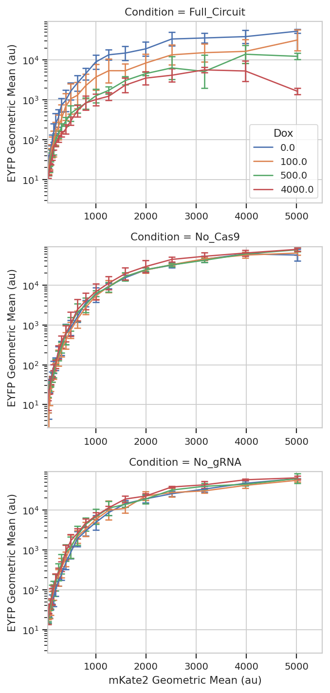
flow.Stats1DView(statistic = "FITC_mean_sd",
variable = "Transfection_Bin",
variable_scale = 'linear',
feature = "Geo.Mean",
error_low = "/SD",
error_high = "*SD",
scale = "log",
huefacet = "Dox",
yfacet = "Condition").plot(ex_stat,
xlabel = 'mKate2 Geometric Mean (au)',
ylabel = 'EYFP Geometric Mean (au)',
sharex = False,
capsize = 3)
/home/brian/src/cytoflow/cytoflow/operations/channel_stat.py:217: CytoflowOpWarning: No events for category ['Condition=Full_Circuit', 'Dox=100.0', 'Replicate=1', 'Transfection_Bin=3981.0']
/home/brian/src/cytoflow/cytoflow/operations/channel_stat.py:217: CytoflowOpWarning: No events for category ['Condition=Full_Circuit', 'Dox=500.0', 'Replicate=3', 'Transfection_Bin=5012.0']
/home/brian/src/cytoflow/cytoflow/operations/channel_stat.py:217: CytoflowOpWarning: No events for category ['Condition=Full_Circuit', 'Dox=4000.0', 'Replicate=1', 'Transfection_Bin=5012.0']
/home/brian/src/cytoflow/cytoflow/operations/channel_stat.py:217: CytoflowOpWarning: No events for category ['Condition=Full_Circuit', 'Dox=4000.0', 'Replicate=1', 'Transfection_Bin=3981.0']
/home/brian/src/cytoflow/cytoflow/operations/channel_stat.py:217: CytoflowOpWarning: No events for category ['Condition=Full_Circuit', 'Dox=4000.0', 'Replicate=3', 'Transfection_Bin=5012.0']