cytoflow.views.histogram_2d#
Plot a 2D histogram.
Histogram2DView – the IView class that makes the plot.
- class cytoflow.views.histogram_2d.Histogram2DView[source]#
Bases:
Base2DViewPlots a 2-d histogram. Similar to a density plot, but the number of events in a bin change the bin’s opacity, so you can use different colors.
- xchannel#
The channel to view on the X axis
- Type:
Str
- ychannel#
The channel to view on the Y axis
- Type:
Str
- xscale#
The scales applied to the
xchanneldata before plotting it.- Type:
{‘linear’, ‘log’, ‘logicle’} (default = ‘linear’)
- yscale#
The scales applied to the
ychanneldata before plotting it.- Type:
{‘linear’, ‘log’, ‘logicle’} (default = ‘linear’)
- subset#
An expression that specifies the subset of the statistic to plot. Passed unmodified to
pandas.DataFrame.query.- Type:
- xfacet#
Set to one of the
Experiment.conditionsin theExperiment, and a new column of subplots will be added for every unique value of that condition.- Type:
String
- yfacet#
Set to one of the
Experiment.conditionsin theExperiment, and a new row of subplots will be added for every unique value of that condition.- Type:
String
- huefacet#
Set to one of the
Experiment.conditionsin the in theExperiment, and a new color will be added to the plot for every unique value of that condition.- Type:
String
Examples
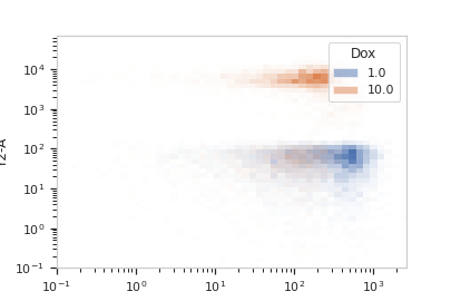
Make a little data set.
>>> import cytoflow as flow
>>> import_op = flow.ImportOp()
>>> import_op.tubes = [flow.Tube(file = "Plate01/RFP_Well_A3.fcs",
...                              conditions = {'Dox' : 10.0}),
...                    flow.Tube(file = "Plate01/CFP_Well_A4.fcs",
...                              conditions = {'Dox' : 1.0})]
>>> import_op.conditions = {'Dox' : 'float'}
>>> ex = import_op.apply()
Plot a density plot
>>> flow.Histogram2DView(xchannel = 'V2-A',
...                      xscale = 'log',
...                      ychannel = 'Y2-A',
...                      yscale = 'log',
...                      huefacet = 'Dox').plot(ex)
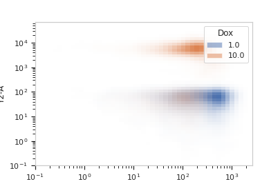
The same plot, smoothed, with a log color scale.
>>> flow.Histogram2DView(xchannel = 'V2-A',
...                      xscale = 'log',
...                      ychannel = 'Y2-A',
...                      yscale = 'log',
...                      huefacet = 'Dox',
...                      huescale = 'log').plot(ex, smoothed = True)
- id = 'cytoflow.view.histogram2d'#
- friend_id = '2D Histogram'#
- plot(experiment, **kwargs)[source]#
Plot a faceted density plot view of a channel
- Parameters:
experiment (Experiment) – The
Experimentto plot using this view.title (str) – Set the plot title
xlabel (str) – Set the X axis label
ylabel (str) – Set the Y axis label
huelabel (str) – Set the label for the hue facet (in the legend)
legend (bool) – Plot a legend for the color or hue facet? Defaults to
True.legend_loc (str) – If we plot a legend, where should it go? This is a
matplotliblegend location string, like ‘lower right’ or ‘outside center right’. Default is ‘upper right’.sharex (bool) – If there are multiple subplots, should they share X axes? Defaults to
True.sharey (bool) – If there are multiple subplots, should they share Y axes? Defaults to
True.row_order (list) – Override the row facet value order with the given list. If a value is not given in the ordering, it is not plotted. Defaults to a “natural ordering” of all the values.
col_order (list) – Override the column facet value order with the given list. If a value is not given in the ordering, it is not plotted. Defaults to a “natural ordering” of all the values.
hue_order (list) – Override the hue facet value order with the given list. If a value is not given in the ordering, it is not plotted. Defaults to a “natural ordering” of all the values.
height (float) – The height of each row in inches. Default = 3.0
aspect (float) – The aspect ratio of each subplot. Default = 1.5
col_wrap (int) – If
xfacetis set andyfacetis not set, you can “wrap” the subplots around so that they form a multi-row grid by setting this to the number of columns you want.sns_style ({“darkgrid”, “whitegrid”, “dark”, “white”, “ticks”}) – Which
seabornstyle to apply to the plot? Default iswhitegrid.sns_context ({“notebook”, “paper”, “talk”, “poster”}) – Which
seaborncontext to use? Controls the scaling of plot elements such as tick labels and the legend. Default isnotebook.palette (palette name, list, or dict) – Colors to use for the different levels of the hue variable. Should be something that can be interpreted by
seaborn.color_palette, or a dictionary mapping hue levels to matplotlib colors. See https://seaborn.pydata.org/tutorial/color_palettes.html for a good overview.despine (Bool) – Remove the top and right axes from the plot? Default is
True.min_quantile (float (>0.0 and <1.0, default = 0.001)) – Clip data that is less than this quantile.
max_quantile (float (>0.0 and <1.0, default = 1.00)) – Clip data that is greater than this quantile.
xlim ((float, float)) – Set the range of the plot’s X axis.
ylim ((float, float)) – Set the range of the plot’s Y axis.
gridsize (int) – The number of bins on the X and Y axis.
smoothed (bool) – Should the mesh be smoothed?
smoothed_sigma (int) – The standard deviation of the smoothing kernel. default = 1.
Notes
Other
kwargsare passed tomatplotlib.axes.Axes.pcolormesh