Tutorial: Transcriptional Repressor Characterization#
This example demonstrates using cytoflow to use calibrated flow cytometry to
characterize a transcriptional repressor in a mammalian multi-plasmid system.
The implementation closely follows that described in
Beal et al and its implementation in
Davidsohn et al.
The experiment whose data we’ll be analyzing characterizes a TALE transcriptional
repressor (TAL14, from
Li et al)
using a multi-plasmid transient transfection in mammalian cells, depicted below:
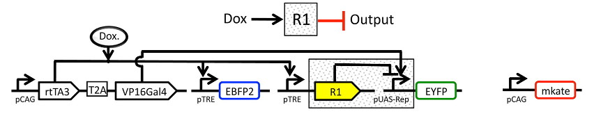
The small molecule doxycycline (“Dox”) drives the transcriptional activator rtTA3 to activate the transcriptional repressor (“R1” in the diagram), which then represses output of the yellow fluorescent protein EYFP. rtTA3 also drives expression of a blue fluorescent protein, eBFP, which serves as a proxy for the amount of repressor. Finally, since we’re doing transient transfection, there’s a huge amount of variability in the level of transfection; we measure transfection level with a constitutively expressed red fluorescent protein, mKate.
If you’d like to follow along, you can do so by downloading one of the cytoflow-#####-examples-advanced.zip files from the Cytoflow releases page on GitHub. The files are in the tasbe/ subdirectory.
Setup#
Start Cytoflow. Under the Import Data operation, choose Set up experiment…
Add one variable, Dox – make it a Number.
Load the
TAL14....fcsfiles from thetasbe/subdirectory, and fill in theDoxconcentrations as per the table below: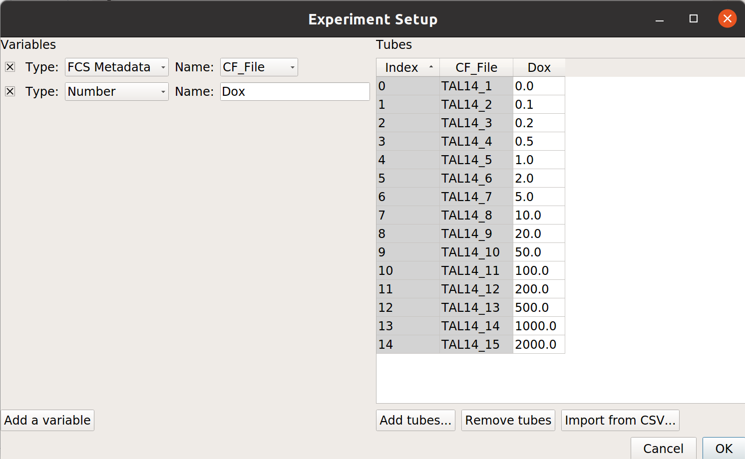
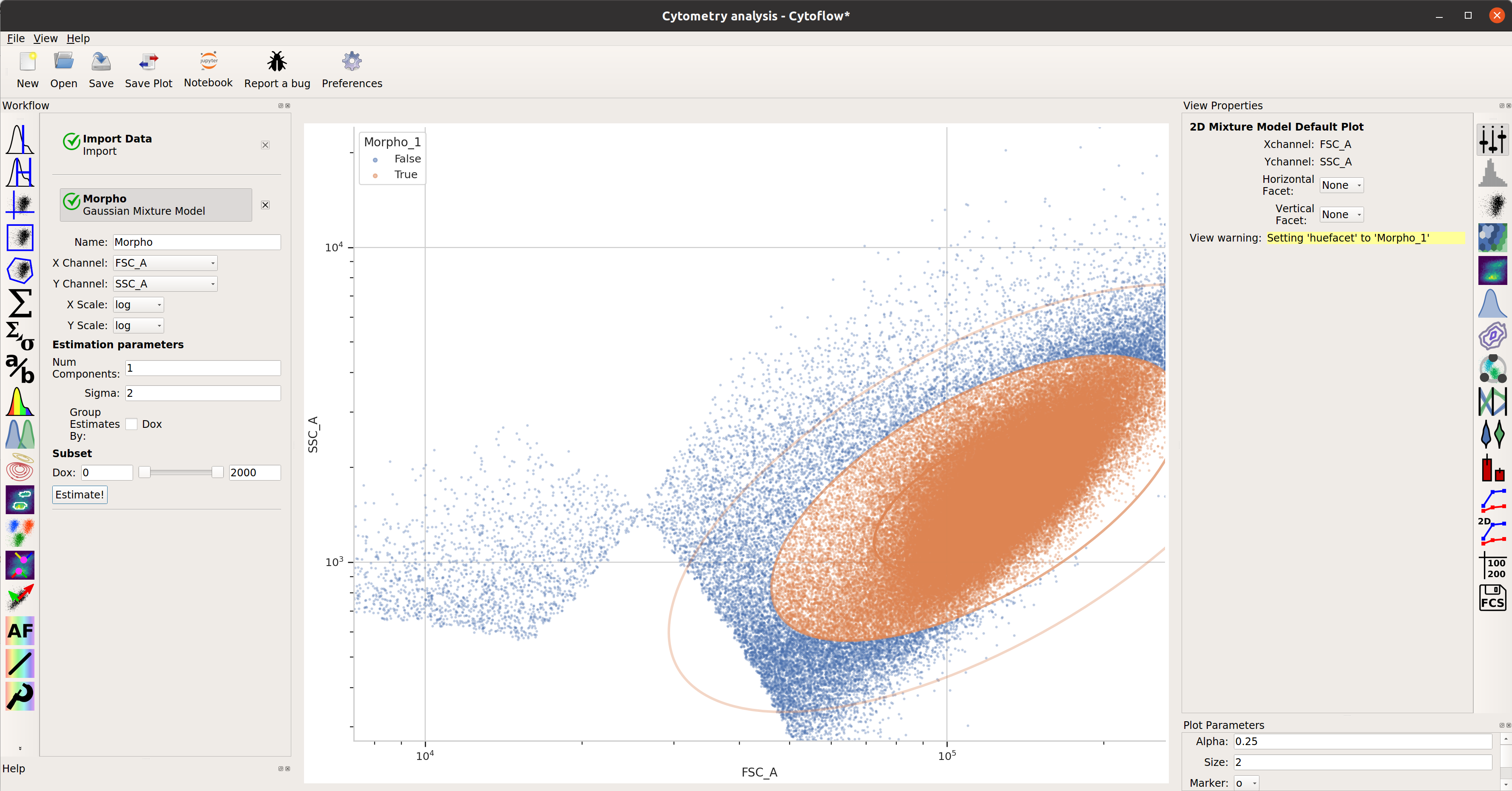
Gate out the debris#
Use a scatter plot to look at the
FSC_AandSSC_Achannels: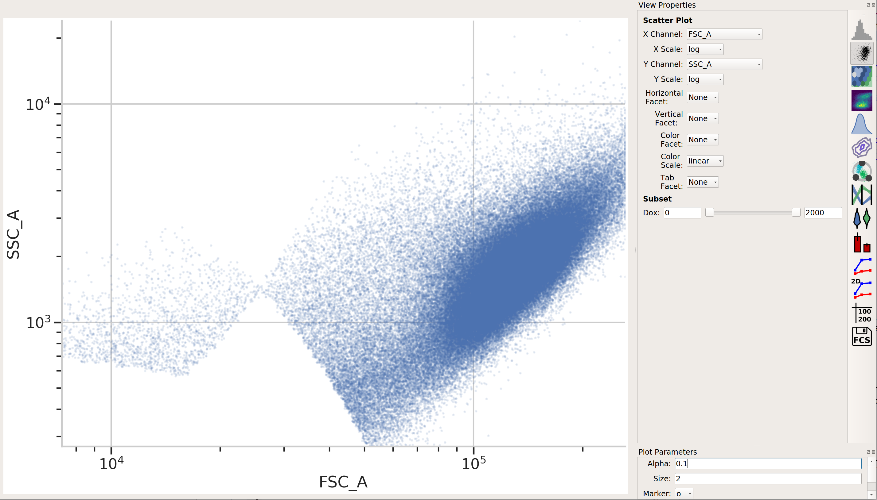
This looks pretty good – a nice tight distribution. Let’s use a 2D gaussian model to take 2 standard deviations around the centroid.
TASBE Calibration#
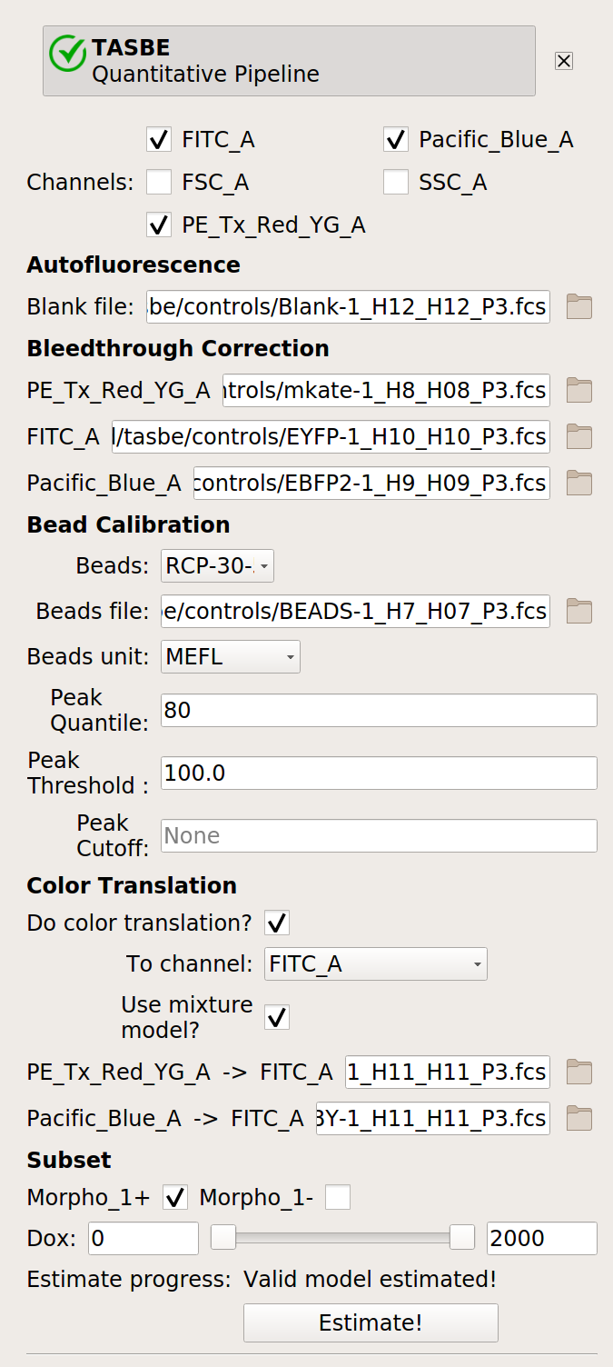
Use the TASBE calibration module to calibrate the
FITC_A,Pacific_Blue_A, andPE_Tx_Red_YG_Achannels. Settings:Autofluorescence / Blank file:
controls/Blank-1_H12_H12_P3.fcsBleedthrough / PE_Tx_Red_YG_A file:
controls/mkate-1_H8_H08_P3.fcsBleedthrough / FITC_A file:
controls/EYFP-1_H10_H10_P3.fcsBleedthrough / Pacific_Blue_A file:
controls/EBFP2-1_H9_H09_P3.fcsBeads:
Spherotech RCP-30-5A Lot AA01-AA04, AB01, AB02, AC01, GAA01-RBeads file:
controls/BEADS-1_H7_H07_P3.fcsBeads unit:
MEFLRemaining beads parameters: left at default
Color translation / Do color translation? :
TrueColor translation / To channel:
FITC_AColor translation / Use mixture model?
TrueColor translation / PE_Tx_Red_YG_A -> FITC_A:
controls/RBY-1_H11_H11_P3.fcsColor translation / Pacific_Blue_A -> FITC_A:
controls/RBY-1_H11_H11_P3.fcsSubset / Morpho_1+:
True
Binned Analysis#
As described above, the example data in this notebook is from a transient transfection of mammalian cells in tissue culture. What this means is that there’s a really broad distribution of fluorescence, corresponding to a broad distribution of transfection levels.
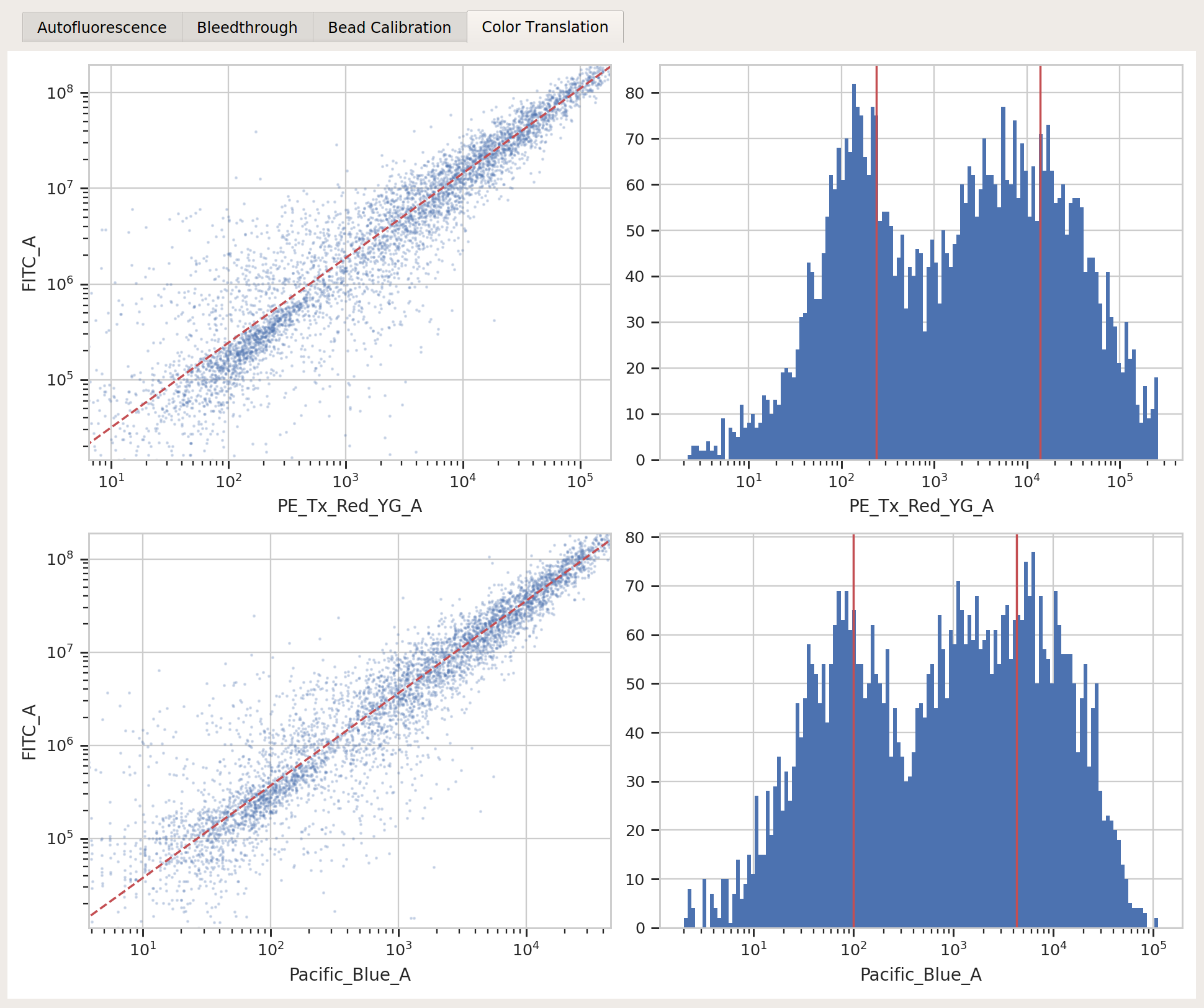
Let’s check the
PE_Tx_Red_YG_Achannel, where our mKate transfection marker is: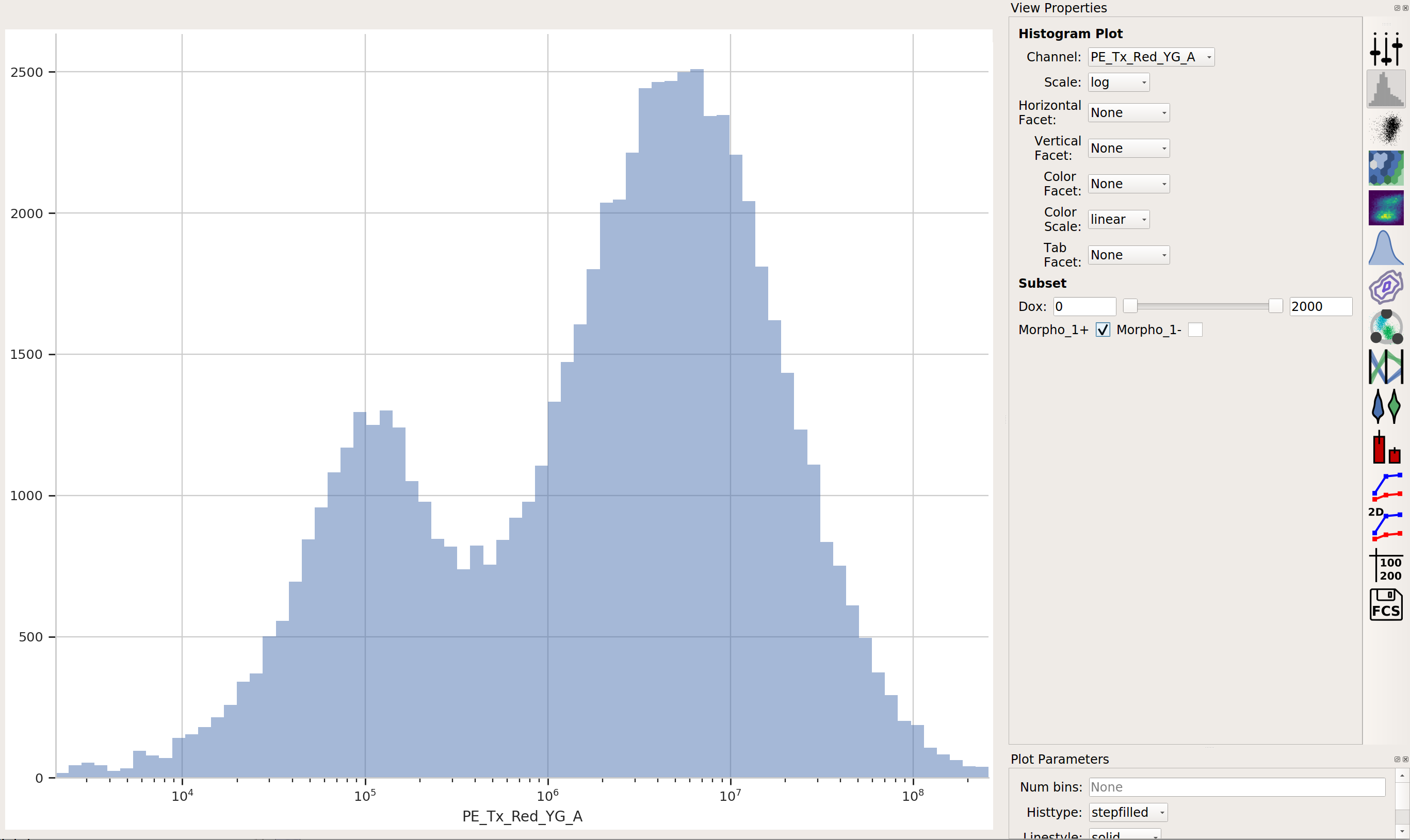
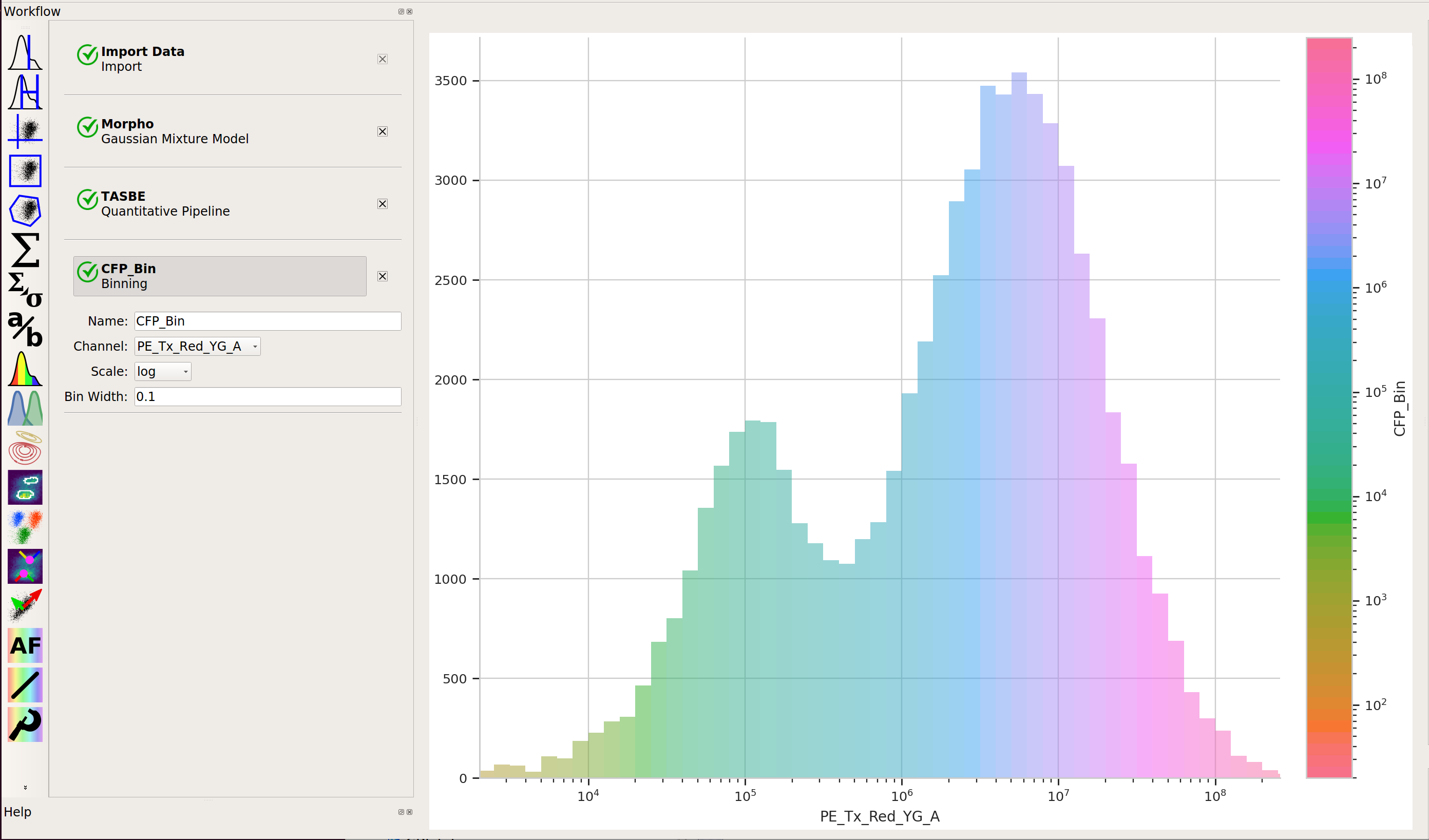
The way we handle this data is by dividing the cells into bins depending on their transfection levels. We find that cells that recieved few plasmids frequently behave differently (quantitatively speaking) than cells that received many plasmids. The Binning module applies evenly spaced bins; in this example, we’re going to apply them on a log scale, every 0.1 log-units.
Apply the Binning module with a log scale and a bin width of 0.1 log units:
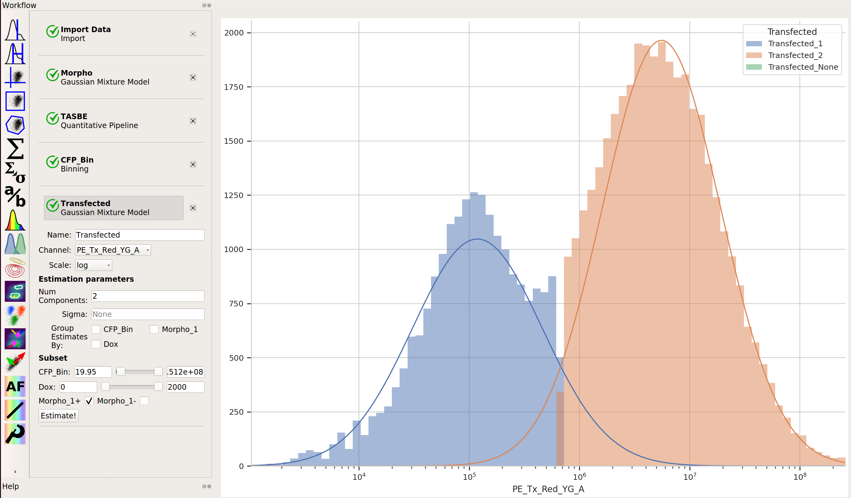
Also, we really only want to look at transfected cells – so let’s use a 1D Gaussian gate to separate the transfected population from the untransfected population:
Creating Transfer Curves#
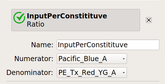
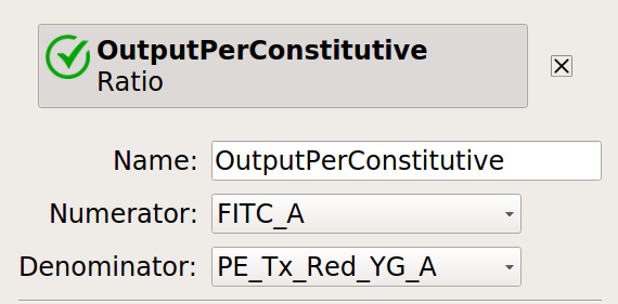
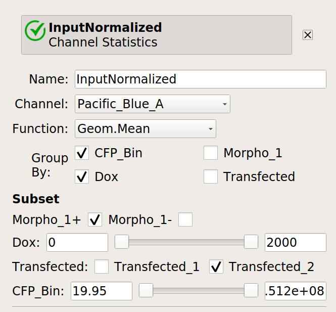
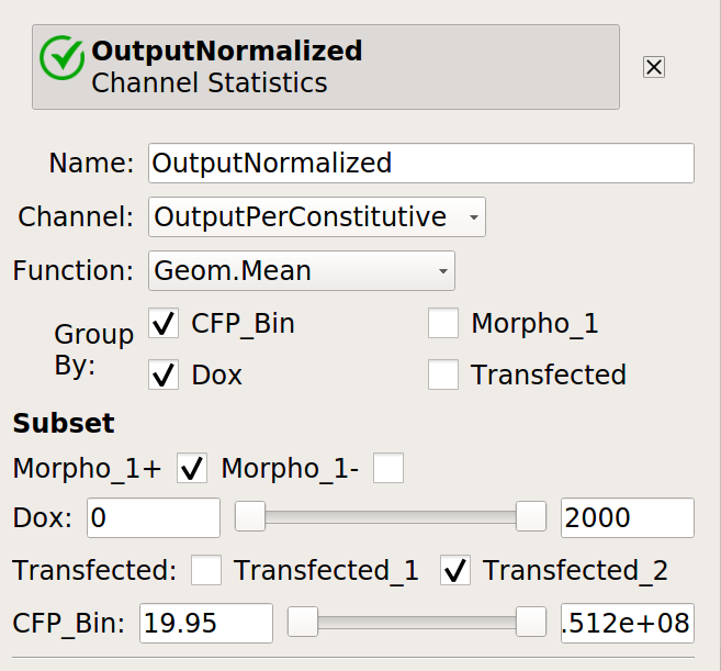
Let’s normalize our input and output fluorescent proteins by our constitutive protein expression using Ratio operation:
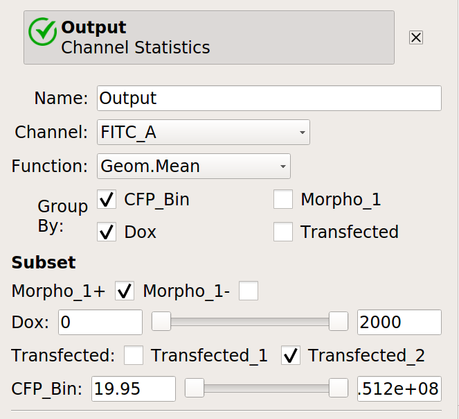
Now, create four statistics: the geometric mean of the input and output fluorescence measurements ,both normalized and not, for each bin, in each
Doxcondition. And make sure to only look at transfected single cells!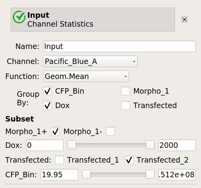
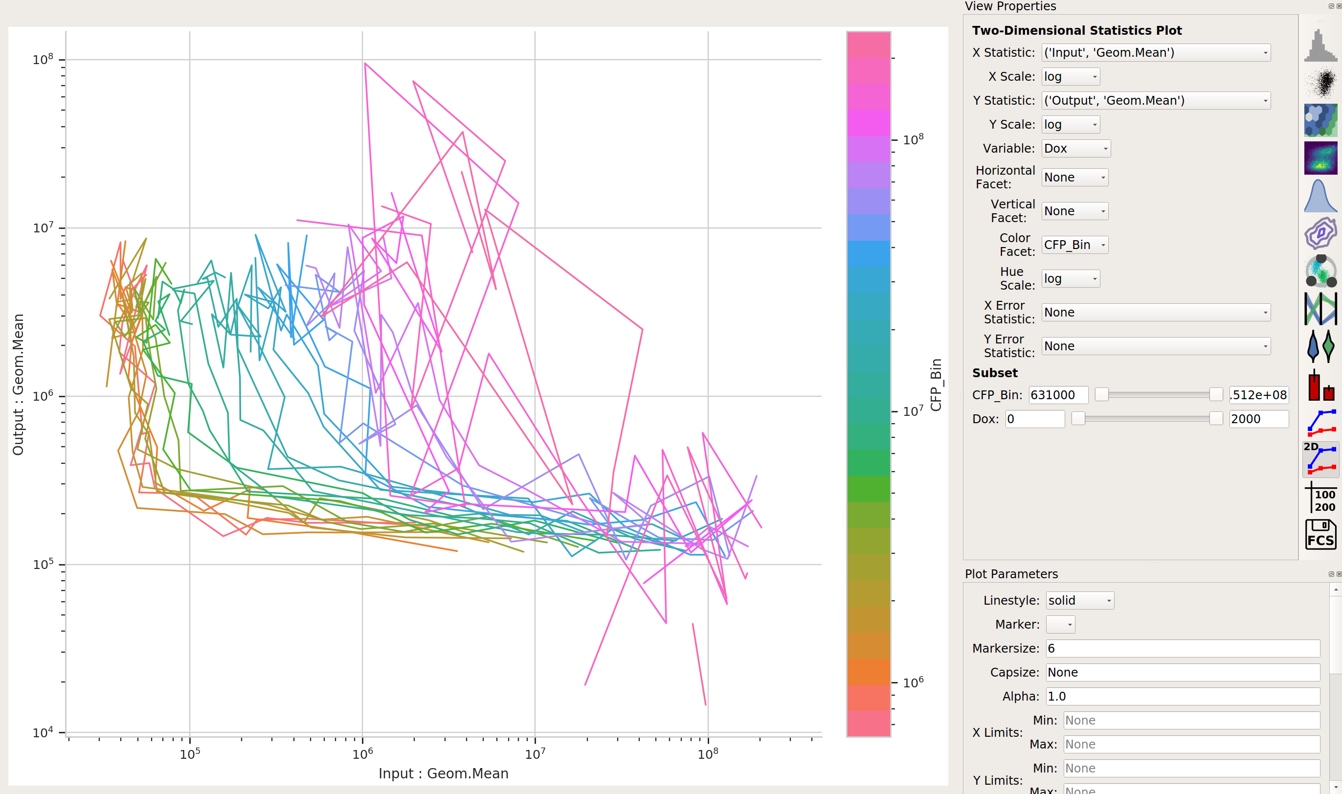
Now, we can start looking at transfer curves. First question: does the blue signal (our “input” signal) increase as we increase
Doxconcentration?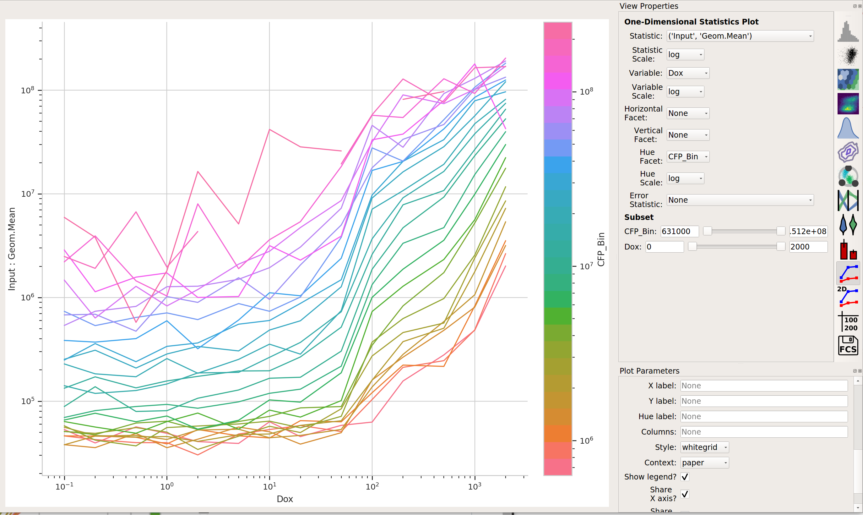
Yes! That’s a good sign that our experiment is working.
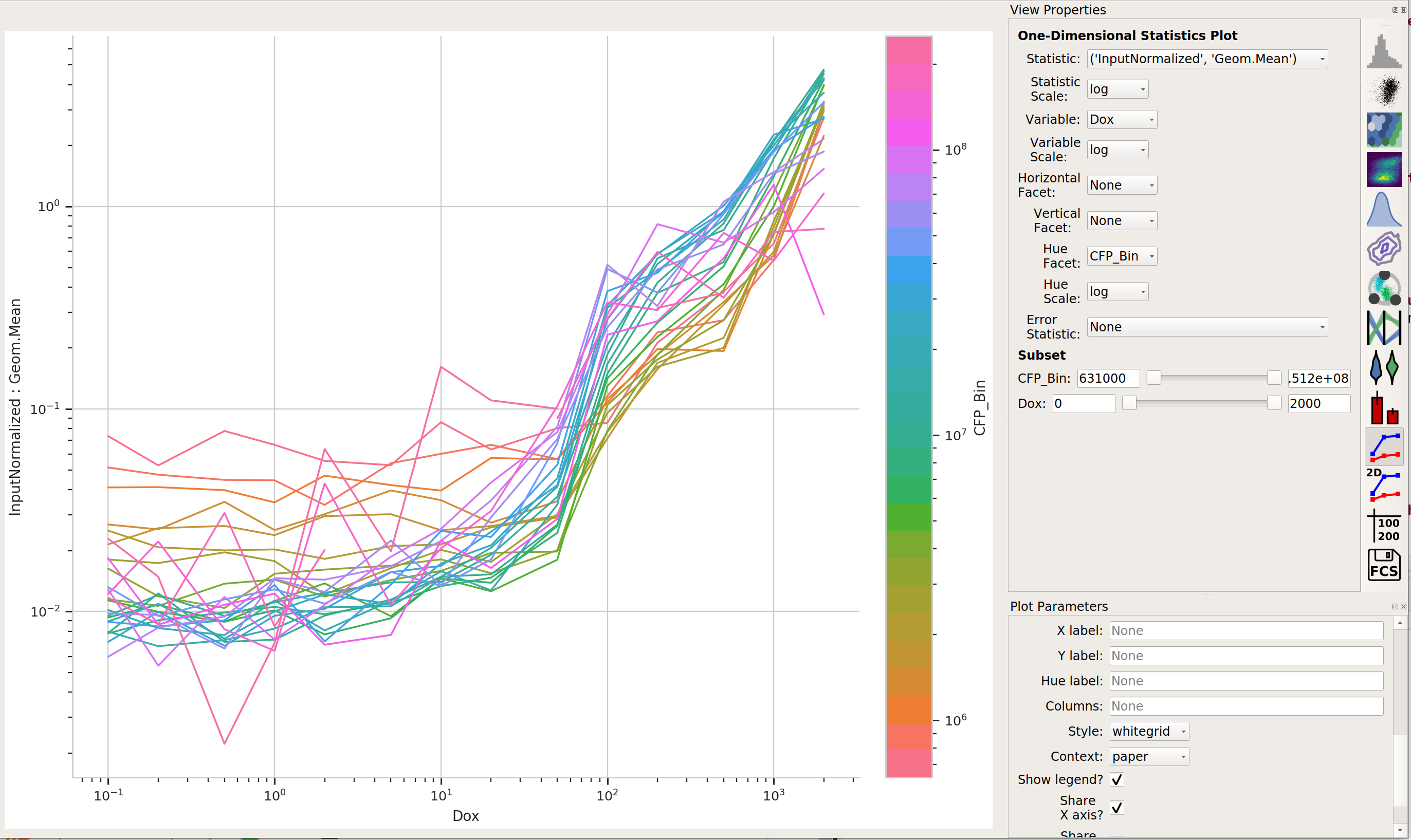
Does the yellow signal (our “output”) decrease as the blue signal (our “input”) increases? Ie, is the repressor “inverting” the signal?
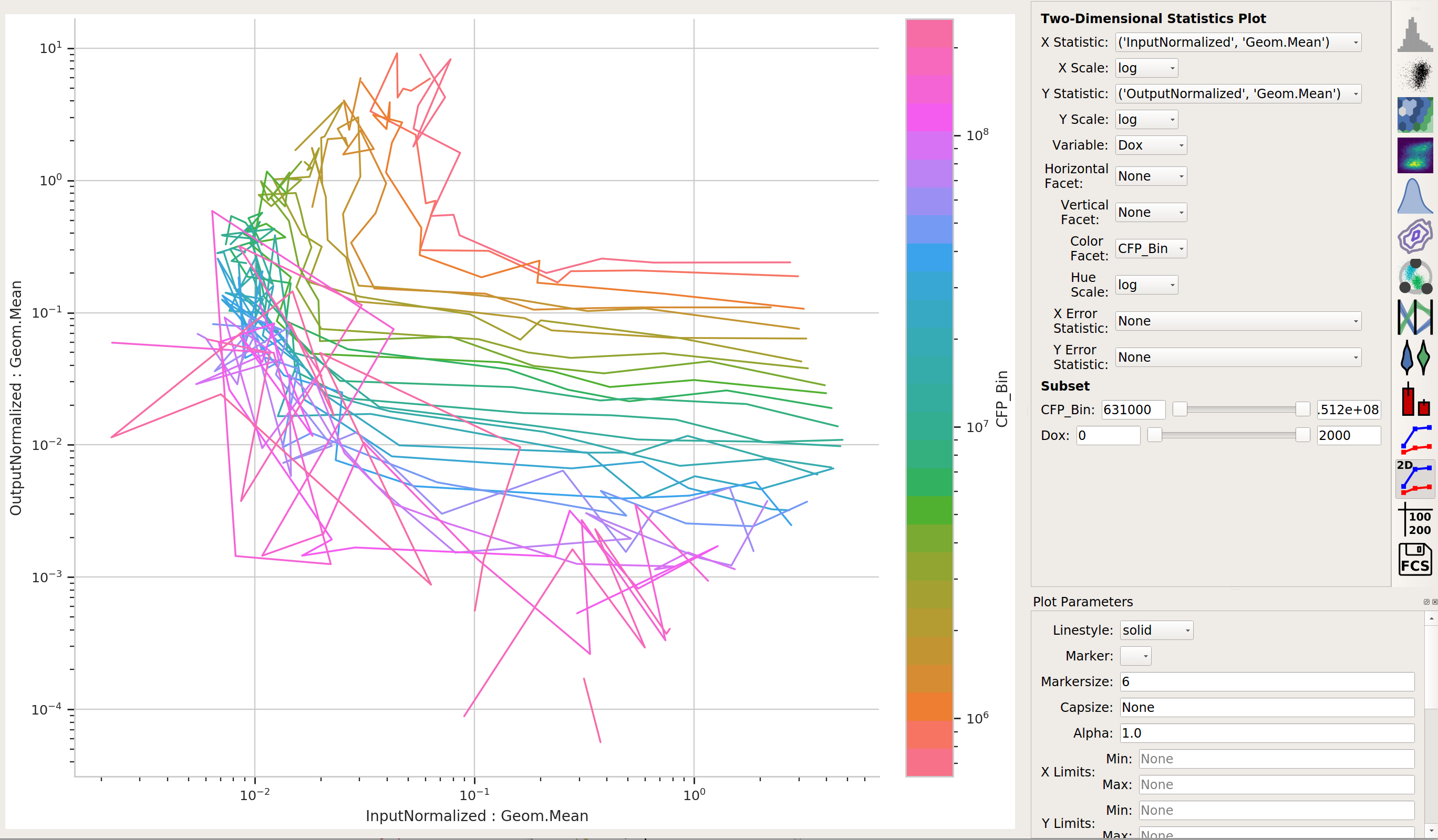
The data is a little “messy” – primarily because of bins that didn’t have many events in them, and thus gave quite noisy signals – but it’s clear that we are seeing an inversion of the input signal to the output signal. The repressor works.