Tutorial: Quickstart#
Welcome to Cytoflow! This document will demonstrate importing some data and running a very basic analysis using the GUI. It should help you get started with the following steps:
Importing data
Basic visualizations
Gating
Summary statistics
If you’d like to follow along, you can do so by downloading one of the cytoflow-#####-examples-basic.zip files from the Cytoflow releases page on GitHub.
Importing data#
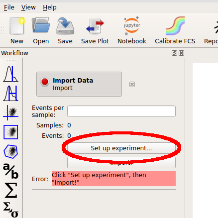
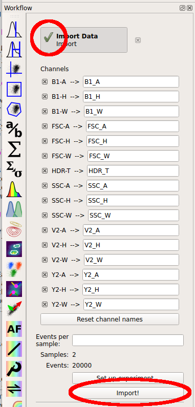
Start the software. The left panel is the “workflow” panel, and upon startup has a single operation named Import Data. Click Set up experiment…
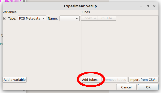
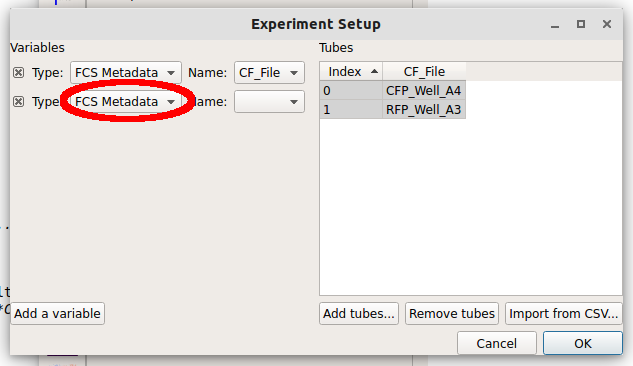
In the Experiment Setup dialog that appears, click Add tubes…
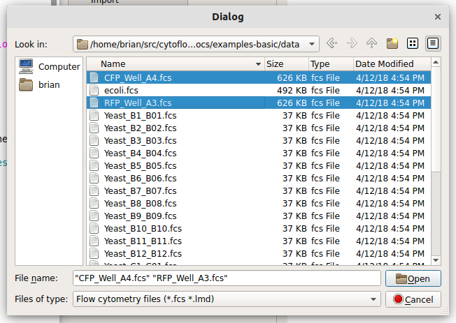
Choose CFP_Well_A4.fcs and RFP_Well_A3.fcs. You can select multiple files by holding down the Control key (Windows or Linux) or the Command key (Mac) while clicking on the files.
Each file is now a row in the Tubes table. Cytoflow assumes that your FCS files were all collected under the same instrument settings (voltages, etc) but have varying experimental conditions (ie your independent variables.) We now have to tell Cytoflow what those conditions are for each tube. Click Add a variable.
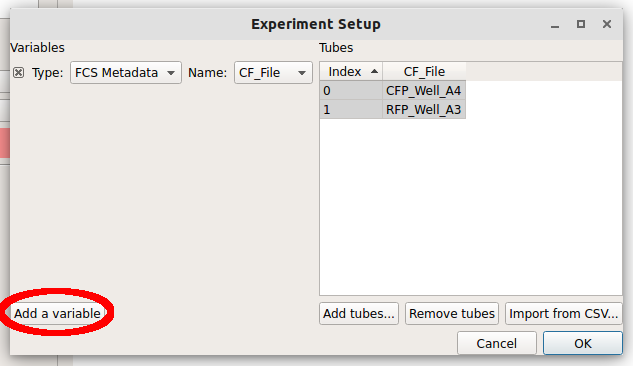
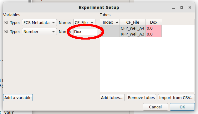
We can make a new variable that is a Category, a Number or True/False (ie a boolean.) Since these two tubes were exposed to different amounts of the small molecule doxycycline, pull down the “Type” selector and choose Number.
Note
If you have an experimental variable saved as metadata in your FCS file, see the Frequently Asked Questions.
Type the name “Dox” into the Name box. Notice how there’s now a new column named “Dox” in the Tubes table.
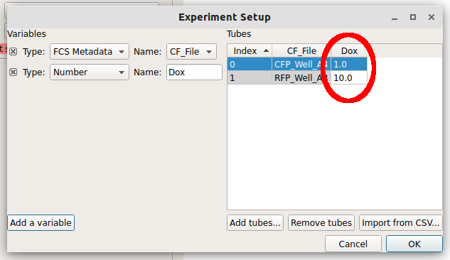
Note how the new column is red. Each tube must have a unique set of conditions to import the data – any tube that shares conditions with another tube is labeled red like this. Type “1.0” into the “Dox” column for the first row (CFP_Well_A4) and “10.0” into the “Dox” column for the second row (RFP_Well_A3). Notice how all the cells are white.
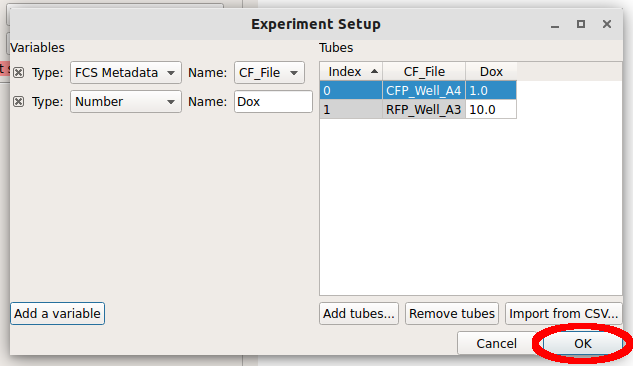
Click “OK” to return to the main screen.
Now, all the channels in those files show up in the Import dialog. You can rename the channels if you’d like, or remove channels that you’re not using, but we won’t worry about that here. Click “Import!” to import the data. Note that the red stop-sign on the module header changes to a green check-mark to show that the operation succeeded.
Basic plotting#
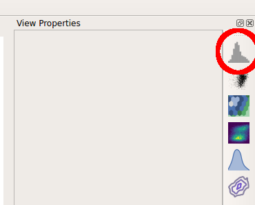
Let’s plot the data. The right panel shows your view settings; choose the Histogram plot button.
The controls in the right panel are the view parameters. We won’t get a plot until we choose a channel to view. Pull down the Channel selector and choose “Y2_A”.
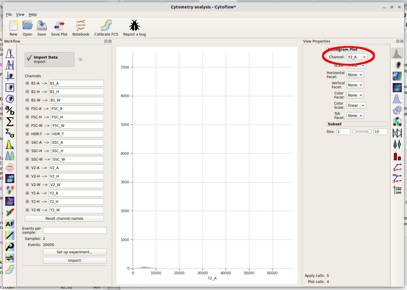
Cytoflow immediately displays a plot. Unfortunately, most of the data in this channel is clustered around 0, which makes it difficult to see using a linear scale (the default.) We can use a different scale by selecting the “Scale” option – choose “logicle” instead.
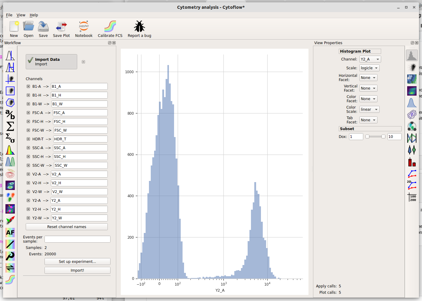
The logicle scale is interesting – it’s linear around 0 and logarithmic elsewhere, and we can immediately see that this data is bimodal.
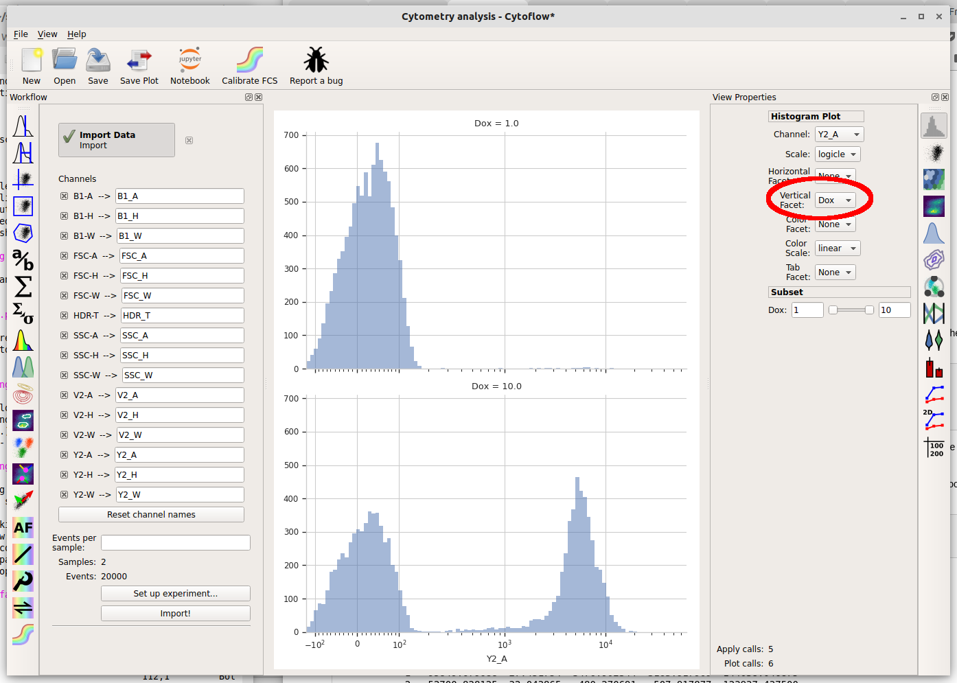
But wait – which tube are we looking at? Here we encounter one of the central principles of Cytoflow: by default, we’re looking at the entire data set. This data comes from both tubes, not just one. We can tell Cytoflow to make a separate plot for each Dox concentration by changing the Vertical facet option to “Dox”.
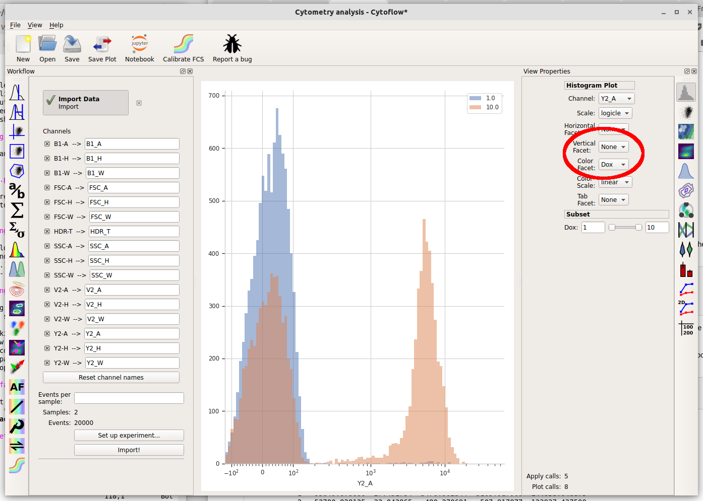
We can also plot the two different Dox concentrations on the same plot using different colors by setting Color Facet to “Dox” instead. Note that you must change Vertical Facet back to “None” as well.
Basic gating#
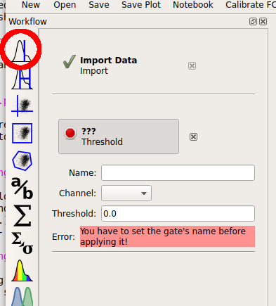
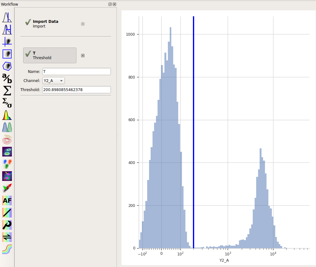
So there’s a clear difference between the two tubes: one has a substantial population above ~200 in the Y2-A channel and the other doesn’t. What is the proportion of “high” cell in each tube? To count these two populations, we first have to use a gate to separate them. Let’s use a threshold gate. First, make one by choosing the threshold gate on the operations toolbar:
Then, set the operation’s name to “T” and the channel to “Y2-A”. Note that when you set the channel, a plot appears in the central pane. It’s on a linear scale again – change it to “logicle” on the plot options pane.
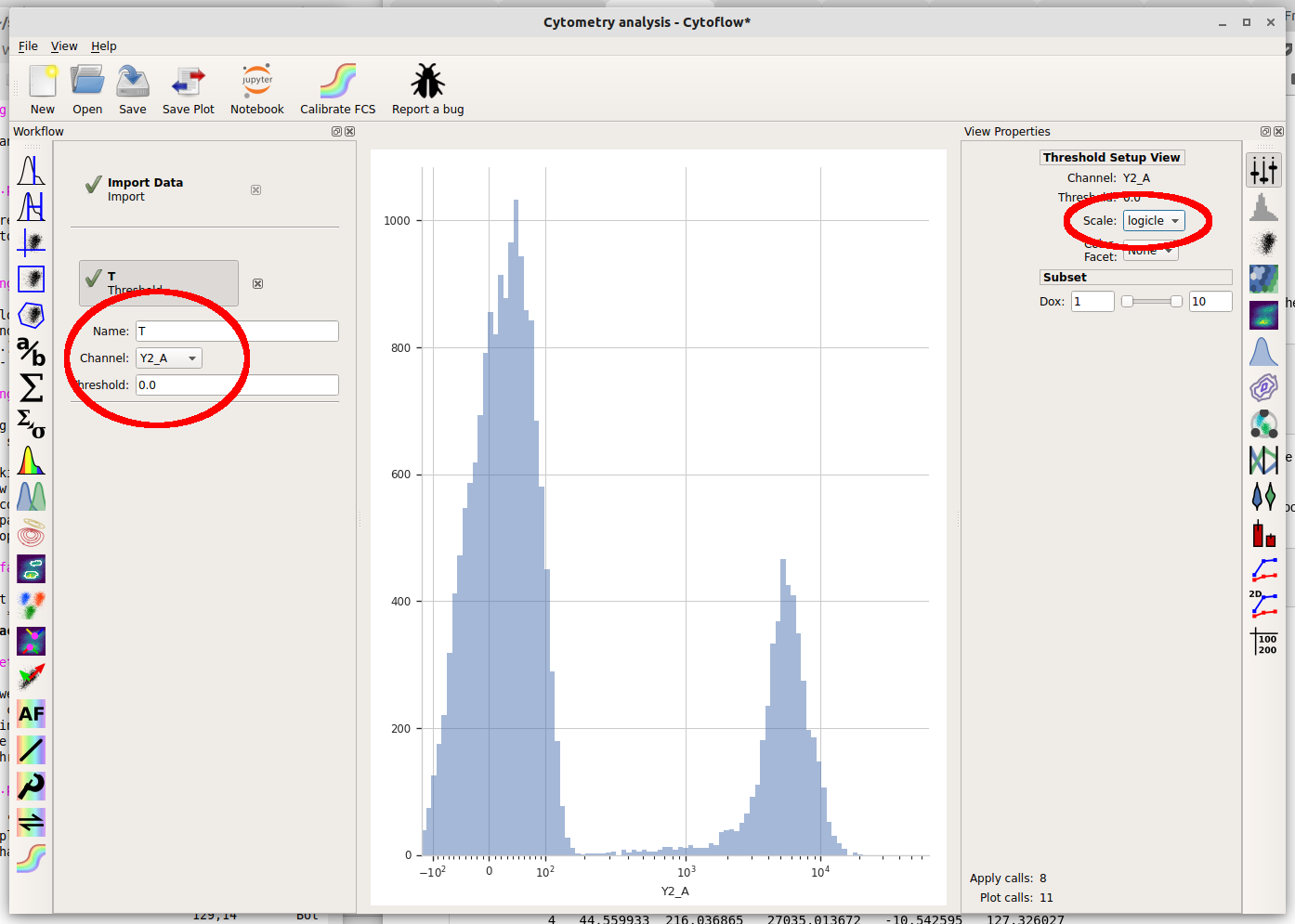
Note that when you move your mouse across the center pane, you now get a blue cursor that follows it. You can set the threshold by clicking on the pane. Choose a value about 200 (ie, one tic above the 10^2 major label.)
When you created a new Threshold gate, you added a new condition to
the data set. This condition is exactly like the “Dox” condition you
set up when you imported your data. That is, now there are some events
that are Dox = 1 and T = True, some events that are
Dox = 1 and T = False, some events that are Dox = 10 and T = True,
and some events that are Dox = 10 and T = False.
You can get a good feel for this if you make a new Histogram. Set the histogram parameters as follows:
Channel = "Y2_A"Scale = "logicle"Vertical Facet = "Dox"Color Facet = "T"
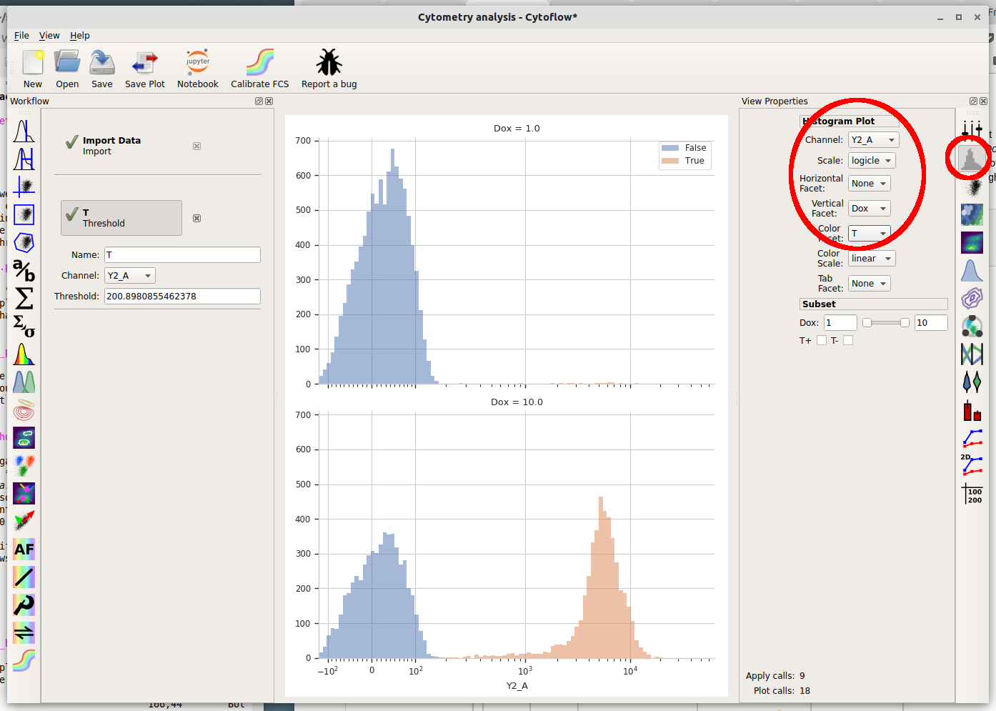
What are we looking at? The two plots, top and bottom, represent the different Dox amounts (look at the titles!) Each is showing the “high” and “low” populations we identified with the Threshold gate in different colors. Play around with the different facets until you are comfortable with what does what. Also poke at the “subset” controls. (Don’t worry, you won’t break anything!)
Basic statistics#
Cytoflow’s reason for existing is to let you do quantitative flow cytometry. So lets quanitate those populations – how many events are in each of them? Once you’ve identified populations, Cytoflow lets you compute a number of summary statistics about each population, then graph statistics. To create a new statistic, choose the large “sigma” button on the operations toolbar, which creates a new Channel Statistic operation.
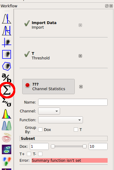
Set the name of the new statistic to “Count”. Choose the “Y2_A” channel, and set the “Function” to “Count”. Under “Group by”, check both the “Dox” and “T” tic boxes.
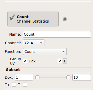
The “Group by” settings are particularly important. You’re telling Cytoflow which groups you want to compute the function on. Cytoflow will break your data set up into unique combinations of all of these variables (which could be experimental conditions, like “Dox”, or gates, like “T”, or other subsets from other operations) and compute the function for each unique subset. So, what we’ve asked Cytoflow to do is break the data into four subsets:
Dox = 1 and T = True
Dox = 1 and T = False
Dox = 10 and T = True
Dox = 10 and T = False
and then compute the “Count” function on each subset.
Finally, let’s plot that summary statistic. Choose the bar plot from the Views toolbar:
Set the view parameters as follows:
Statistic = “Count”
Feature = “Y2-A”
Variable = “Dox”
Hue Facet = “T”
Note: the new statistic is called “Count” because that was the name of the operation that added it. A statistic is just a table – it has one row for each group of data that it was computed from. A statistic can also have multiple columns – taking a name from machine learning, we call these columns features. By default, the channel statistic makes a statistic with one feature, and the feature’s name is the same as the name of the channel.
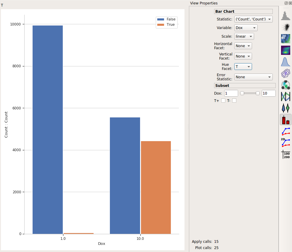
This is the bar plot we wanted: comparing different Dox levels (the two bars on the left vs. the two bars on the right) and how many events were below the threshold (T = False, in blue) vs how many were above it (T = True, in orange.)
Export the plot#
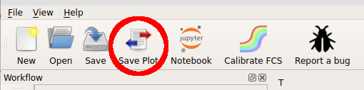
I like to think that Cytoflow’s graphics are nice-looking. Possibly nice enough to publish! (Also, if you publish using Cytoflow, please cite it!) To export the plot, choose “Save plot…” from the toolbar at the top.
In this dialog, you can set many of the visual parameters for the plot, such as the axis labels and plot title. You can also export the figure with a given size (in inches) and resolution (in dots-per-inch) by clicking “Export figure….”.
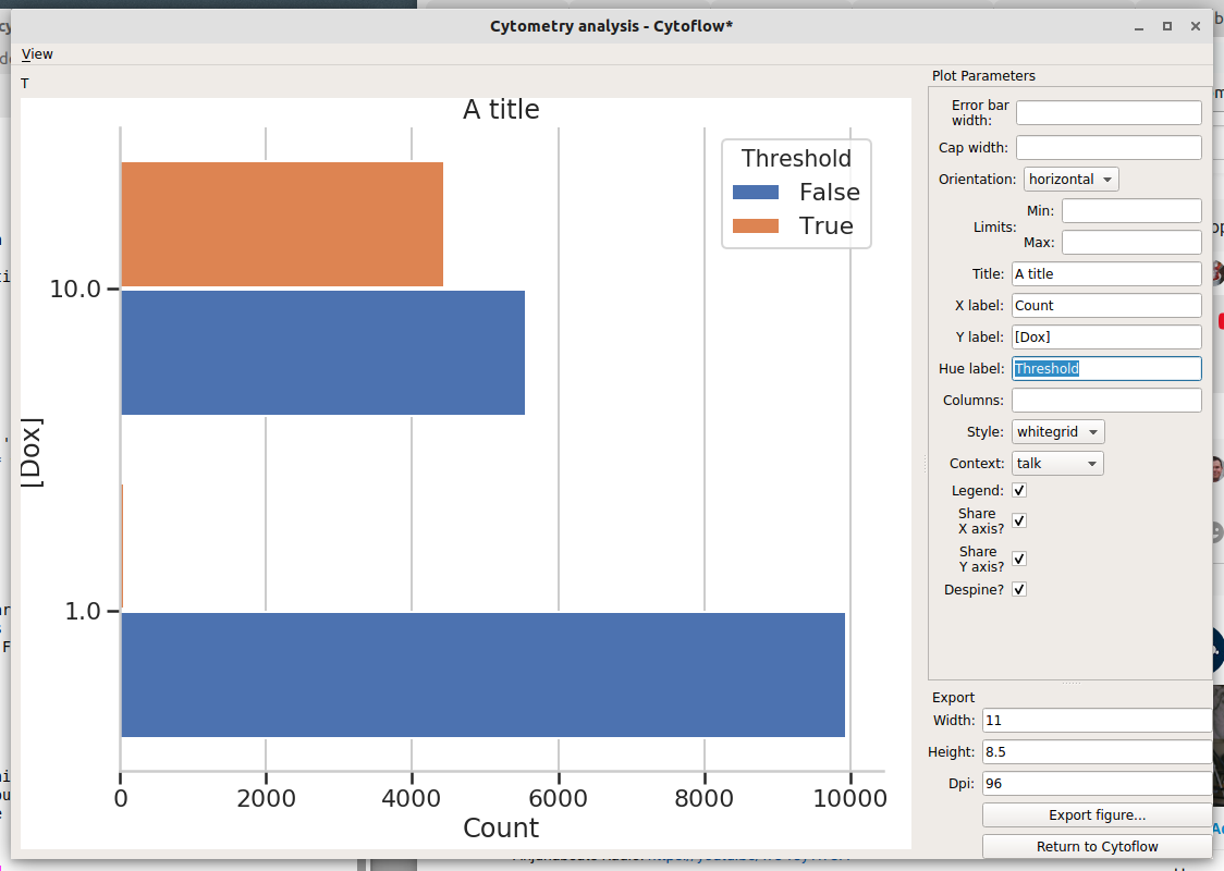
To return to Cytoflow, click “Return to Cytoflow”.