cytoflow.views.violin
A violin plot is a facetted set of kernel density estimates.
ViolinPlotView – the IView class that makes the plot.
- class cytoflow.views.violin.ViolinPlotView[source]
Bases:
cytoflow.views.base_views.Base1DViewPlots a violin plot – a facetted set of kernel density estimates.
- variable
the main variable by which we’re faceting
- Type
Str
- channel
The channel to view
- Type
Str
- scale
The scale applied to the data before plotting it.
- Type
{‘linear’, ‘log’, ‘logicle’}
- subset
An expression that specifies the subset of the statistic to plot. Passed unmodified to
pandas.DataFrame.query.- Type
- xfacet
Set to one of the
Experiment.conditionsin theExperiment, and a new column of subplots will be added for every unique value of that condition.- Type
String
- yfacet
Set to one of the
Experiment.conditionsin theExperiment, and a new row of subplots will be added for every unique value of that condition.- Type
String
- huefacet
Set to one of the
Experiment.conditionsin the in theExperiment, and a new color will be added to the plot for every unique value of that condition.- Type
String
Examples
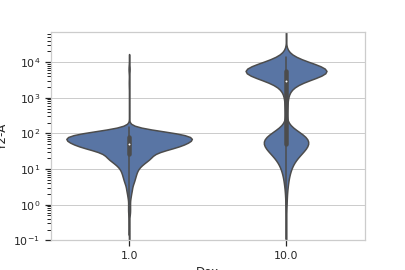
Make a little data set.
>>> import cytoflow as flow
>>> import_op = flow.ImportOp()
>>> import_op.tubes = [flow.Tube(file = "Plate01/RFP_Well_A3.fcs",
...                              conditions = {'Dox' : 10.0}),
...                    flow.Tube(file = "Plate01/CFP_Well_A4.fcs",
...                              conditions = {'Dox' : 1.0})]
>>> import_op.conditions = {'Dox' : 'float'}
>>> ex = import_op.apply()
Plot a violin plot
>>> flow.ViolinPlotView(channel = 'Y2-A',
...                     scale = 'log',
...                     variable = 'Dox').plot(ex)
- plot(experiment, **kwargs)[source]
Plot a violin plot of a variable
- Parameters
experiment (Experiment) – The
Experimentto plot using this view.title (str) – Set the plot title
xlabel (str) – Set the X axis label
ylabel (str) – Set the Y axis label
huelabel (str) – Set the label for the hue facet (in the legend)
legend (bool) – Plot a legend for the color or hue facet? Defaults to
True.sharex (bool) – If there are multiple subplots, should they share X axes? Defaults to
True.sharey (bool) – If there are multiple subplots, should they share Y axes? Defaults to
True.row_order (list) – Override the row facet value order with the given list. If a value is not given in the ordering, it is not plotted. Defaults to a “natural ordering” of all the values.
col_order (list) – Override the column facet value order with the given list. If a value is not given in the ordering, it is not plotted. Defaults to a “natural ordering” of all the values.
hue_order (list) – Override the hue facet value order with the given list. If a value is not given in the ordering, it is not plotted. Defaults to a “natural ordering” of all the values.
height (float) – The height of each row in inches. Default = 3.0
aspect (float) – The aspect ratio of each subplot. Default = 1.5
col_wrap (int) – If
xfacetis set andyfacetis not set, you can “wrap” the subplots around so that they form a multi-row grid by setting this to the number of columns you want.sns_style ({“darkgrid”, “whitegrid”, “dark”, “white”, “ticks”}) – Which
seabornstyle to apply to the plot? Default iswhitegrid.sns_context ({“paper”, “notebook”, “talk”, “poster”}) – Which
seaborncontext to use? Controls the scaling of plot elements such as tick labels and the legend. Default istalk.palette (palette name, list, or dict) – Colors to use for the different levels of the hue variable. Should be something that can be interpreted by
seaborn.color_palette, or a dictionary mapping hue levels to matplotlib colors.despine (Bool) – Remove the top and right axes from the plot? Default is
True.min_quantile (float (>0.0 and <1.0, default = 0.001)) – Clip data that is less than this quantile.
max_quantile (float (>0.0 and <1.0, default = 1.00)) – Clip data that is greater than this quantile.
lim ((float, float)) – Set the range of the plot’s data axis.
orientation ({‘vertical’, ‘horizontal’})
bw ({{‘scott’, ‘silverman’, float}}, optional) – Either the name of a reference rule or the scale factor to use when computing the kernel bandwidth. The actual kernel size will be determined by multiplying the scale factor by the standard deviation of the data within each bin.
scale_plot ({{“area”, “count”, “width”}}, optional) – The method used to scale the width of each violin. If
area, each violin will have the same area. Ifcount, the width of the violins will be scaled by the number of observations in that bin. Ifwidth, each violin will have the same width.scale_hue (bool, optional) – When nesting violins using a
huevariable, this parameter determines whether the scaling is computed within each level of the major grouping variable (scale_hue=True) or across all the violins on the plot (scale_hue=False).gridsize (int, optional) – Number of points in the discrete grid used to compute the kernel density estimate.
inner ({{“box”, “quartile”, None}}, optional) – Representation of the datapoints in the violin interior. If
box, draw a miniature boxplot. Ifquartiles, draw the quartiles of the distribution. Ifpointorstick, show each underlying datapoint. UsingNonewill draw unadorned violins.split (bool, optional) – When using hue nesting with a variable that takes two levels, setting
splitto True will draw half of a violin for each level. This can make it easier to directly compare the distributions.