cytoflow.views.radviz
A “Radviz” plot projects multivariate plots into two dimensions.
RadvizView – the IView class that makes the plot.
- class cytoflow.views.radviz.RadvizView[source]
Bases:
cytoflow.views.base_views.BaseNDViewPlots a Radviz plot. Radviz plots project multivariate plots into two dimensions. Good for looking for clusters.
- channels
The channels to view
- Type
List(Str)
- scale
Re-scale the data in the specified channels before plotting. If a channel isn’t specified, assume that the scale is linear.
- Type
Dict(Str : {“linear”, “logicle”, “log”})
- subset
An expression that specifies the subset of the statistic to plot. Passed unmodified to
pandas.DataFrame.query.- Type
- xfacet
Set to one of the
Experiment.conditionsin theExperiment, and a new column of subplots will be added for every unique value of that condition.- Type
String
- yfacet
Set to one of the
Experiment.conditionsin theExperiment, and a new row of subplots will be added for every unique value of that condition.- Type
String
- huefacet
Set to one of the
Experiment.conditionsin the in theExperiment, and a new color will be added to the plot for every unique value of that condition.- Type
String
Notes
The Radviz plot is based on a method of “dimensional anchors” 1. The variables are conceived as points equidistant around a unit circle, and each data point connected to each anchor by a spring whose stiffness corresponds to the value of that data point. The location of the data point is the location where springs’ tensions are minimized. Fortunately, there is fast matrix math to do this.
As per 2, the order of the anchors can make a huge difference. I’ve adapted the code from the R
radvizpackage 3 to compute the cosine similarity of all possible circular permutations (“necklaces”). For a moderate number of anchors such as is likely to be encountered here, computing them all is completely feasible.References
- 1
Hoffman P, Grinstein G, Pinkney D. Dimensional anchors: a graphic primitive for multidimensional multivariate information visualizations. Proceedings of the 1999 workshop on new paradigms in information visualization and manipulation in conjunction with the eighth ACM internation conference on Information and knowledge management. 1999 Nov 1 (pp. 9-16). ACM.
- 2
Di Caro L, Frias-Martinez V, Frias-Martinez E. Analyzing the role of dimension arrangement for data visualization in radviz. Advances in Knowledge Discovery and Data Mining. 2010:125-32.
- 3
Examples
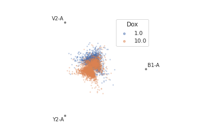
Make a little data set.
>>> import cytoflow as flow
>>> import_op = flow.ImportOp()
>>> import_op.tubes = [flow.Tube(file = "Plate01/RFP_Well_A3.fcs",
...                              conditions = {'Dox' : 10.0}),
...                    flow.Tube(file = "Plate01/CFP_Well_A4.fcs",
...                              conditions = {'Dox' : 1.0})]
>>> import_op.conditions = {'Dox' : 'float'}
>>> ex = import_op.apply()
Plot the radviz.
>>> flow.RadvizView(channels = ['B1-A', 'V2-A', 'Y2-A'],
...                 scale = {'Y2-A' : 'log',
...                          'V2-A' : 'log',
...                          'B1-A' : 'log'},
...                 huefacet = 'Dox').plot(ex)
- plot(experiment, **kwargs)[source]
Plot a faceted Radviz plot
- Parameters
experiment (Experiment) – The
Experimentto plot using this view.title (str) – Set the plot title
xlabel (str) – Set the X axis label
ylabel (str) – Set the Y axis label
huelabel (str) – Set the label for the hue facet (in the legend)
legend (bool) – Plot a legend for the color or hue facet? Defaults to
True.sharex (bool) – If there are multiple subplots, should they share X axes? Defaults to
True.sharey (bool) – If there are multiple subplots, should they share Y axes? Defaults to
True.row_order (list) – Override the row facet value order with the given list. If a value is not given in the ordering, it is not plotted. Defaults to a “natural ordering” of all the values.
col_order (list) – Override the column facet value order with the given list. If a value is not given in the ordering, it is not plotted. Defaults to a “natural ordering” of all the values.
hue_order (list) – Override the hue facet value order with the given list. If a value is not given in the ordering, it is not plotted. Defaults to a “natural ordering” of all the values.
height (float) – The height of each row in inches. Default = 3.0
aspect (float) – The aspect ratio of each subplot. Default = 1.5
col_wrap (int) – If
xfacetis set andyfacetis not set, you can “wrap” the subplots around so that they form a multi-row grid by setting this to the number of columns you want.sns_style ({“darkgrid”, “whitegrid”, “dark”, “white”, “ticks”}) – Which
seabornstyle to apply to the plot? Default iswhitegrid.sns_context ({“paper”, “notebook”, “talk”, “poster”}) – Which
seaborncontext to use? Controls the scaling of plot elements such as tick labels and the legend. Default istalk.palette (palette name, list, or dict) – Colors to use for the different levels of the hue variable. Should be something that can be interpreted by
seaborn.color_palette, or a dictionary mapping hue levels to matplotlib colors.despine (Bool) – Remove the top and right axes from the plot? Default is
True.min_quantile (float (>0.0 and <1.0, default = 0.001)) – Clip data that is less than this quantile.
max_quantile (float (>0.0 and <1.0, default = 1.00)) – Clip data that is greater than this quantile.
lim (Dict(Str : (float, float))) – Set the range of each channel’s axis. If unspecified, assume that the limits are the minimum and maximum of the clipped data
alpha (float (default = 0.25)) – The alpha blending value, between 0 (transparent) and 1 (opaque).
s (int (default = 2)) – The size in points^2.
marker (a matplotlib marker style, usually a string) – Specfies the glyph to draw for each point on the scatterplot. See matplotlib.markers for examples. Default: ‘o’
Notes
Other
kwargsare passed to matplotlib.pyplot.scatter