cytoflow.operations.polygon
-
class
cytoflow.operations.polygon.PolygonOp[source]¶ Bases:
traits.has_traits.HasStrictTraitsApply a polygon gate to a cytometry experiment.
-
name¶ The operation name. Used to name the new metadata field in the experiment that’s created by
apply()Type: Str
-
xchannel, ychannel The names of the x and y channels to apply the gate.
Type: Str
-
xscale, yscale The scales applied to the data before drawing the polygon.
Type: {‘linear’, ‘log’, ‘logicle’} (default = ‘linear’)
-
vertices¶ The polygon verticies. An ordered list of 2-tuples, representing the x and y coordinates of the vertices.
Type: List((Float, Float))
Notes
This module uses
matplotlib.path.Path()to represent the polygon, because membership testing is very fast.You can set the verticies by hand, I suppose, but it’s much easier to use the interactive view you get from
default_view()to do so.Examples
Make a little data set.
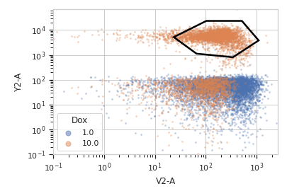
>>> import cytoflow as flow
>>> import_op = flow.ImportOp()
>>> import_op.tubes = [flow.Tube(file = "Plate01/RFP_Well_A3.fcs",
...                              conditions = {'Dox' : 10.0}),
...                    flow.Tube(file = "Plate01/CFP_Well_A4.fcs",
...                              conditions = {'Dox' : 1.0})]
>>> import_op.conditions = {'Dox' : 'float'}
>>> ex = import_op.apply()
Create and parameterize the operation.
>>> p = flow.PolygonOp(name = "Polygon",
...                    xchannel = "V2-A",
...                    ychannel = "Y2-A")
>>> p.vertices = [(23.411982294776319, 5158.7027015021222),
...               (102.22182270573683, 23124.058843387455),
...               (510.94519955277201, 23124.058843387455),
...               (1089.5215641232173, 3800.3424832180476),
...               (340.56382570202402, 801.98947404942271),
...               (65.42597937575897, 1119.3133482602157)]
Show the default view.
>>> df = p.default_view(huefacet = "Dox",
...                    xscale = 'log',
...                    yscale = 'log')
>>> df.plot(ex)
Note
If you want to use the interactive default view in a Jupyter notebook, make sure you say
%matplotlib notebookin the first cell (instead of%matplotlib inlineor similar). Then calldefault_view()withinteractive = True:df = p.default_view(huefacet = "Dox", xscale = 'log', yscale = 'log', interactive = True) df.plot(ex)
Apply the gate, and show the result
>>> ex2 = p.apply(ex)
>>> ex2.data.groupby('Polygon').size()
Polygon
False    15875
True      4125
dtype: int64
-
apply(experiment)[source]¶ Applies the threshold to an experiment.
Parameters: experiment (Experiment) – the old Experimentto which this op is appliedReturns: a new :class:’Experiment`, the same as old_experimentbut with a new column of type bool with the same as the operation name. The bool isTrueif the event’s measurement is within the polygon, andFalseotherwise.Return type: Experiment Raises: util.CytoflowOpError– if for some reason the operation can’t be applied to this experiment. The reason is inCytoflowOpError.args
-
-
class
cytoflow.operations.polygon.PolygonSelection[source]¶ Bases:
cytoflow.operations.base_op_views.Op2DView,cytoflow.views.scatterplot.ScatterplotViewPlots, and lets the user interact with, a 2D polygon selection.
-
interactive¶ is this view interactive? Ie, can the user set the polygon verticies with mouse clicks?
Type: bool
-
xchannel, ychannel The channels to use for this view’s X and Y axes. If you created the view using
default_view(), this is already set.Type: String
-
xscale, yscale The way to scale the x axes. If you created the view using
default_view(), this may be already set.Type: {‘linear’, ‘log’, ‘logicle’}
-
op¶ The
IOperationthat this view is associated with. If you created the view usingdefault_view(), this is already set.Type: Instance(IOperation)
-
xlim, ylim Set the min and max limits of the plots’ x and y axes.
Type: (float, float)
-
xfacet, yfacet Set to one of the
conditionsin theExperiment, and a new row or column of subplots will be added for every unique value of that condition.Type: String
-
huefacet¶ Set to one of the
conditionsin the in theExperiment, and a new color will be added to the plot for every unique value of that condition.Type: String
Examples
In a Jupyter notebook with %matplotlib notebook
>>> s = flow.PolygonOp(xchannel = "V2-A",
...                    ychannel = "Y2-A")
>>> poly = s.default_view()
>>> poly.plot(ex2)
>>> poly.interactive = True
-
plot(experiment, **kwargs)[source]¶ Plot the scatter plot, and then plot the selection on top of it.
Parameters: - experiment (Experiment) – The
Experimentto plot using this view. - title (str) – Set the plot title
- xlabel, ylabel (str) – Set the X and Y axis labels
- huelabel (str) – Set the label for the hue facet (in the legend)
- legend (bool) – Plot a legend for the color or hue facet? Defaults to True.
- sharex, sharey (bool) – If there are multiple subplots, should they share axes? Defaults to True.
- row_order, col_order, hue_order (list) – Override the row/column/hue facet value order with the given list. If a value is not given in the ordering, it is not plotted. Defaults to a “natural ordering” of all the values.
- height (float) – The height of each row in inches. Default = 3.0
- aspect (float) – The aspect ratio of each subplot. Default = 1.5
- col_wrap (int) – If xfacet is set and yfacet is not set, you can “wrap” the subplots around so that they form a multi-row grid by setting col_wrap to the number of columns you want.
- sns_style ({“darkgrid”, “whitegrid”, “dark”, “white”, “ticks”}) – Which seaborn style to apply to the plot? Default is whitegrid.
- sns_context ({“paper”, “notebook”, “talk”, “poster”}) – Which seaborn context to use? Controls the scaling of plot elements such as tick labels and the legend. Default is talk.
- despine (Bool) – Remove the top and right axes from the plot? Default is True.
- min_quantile (float (>0.0 and <1.0, default = 0.001)) – Clip data that is less than this quantile.
- max_quantile (float (>0.0 and <1.0, default = 1.00)) – Clip data that is greater than this quantile.
- xlim, ylim ((float, float)) – Set the range of the plot’s axis.
- alpha (float (default = 0.25)) – The alpha blending value, between 0 (transparent) and 1 (opaque).
- s (int (default = 2)) – The size in points^2.
- marker (a matplotlib marker style, usually a string) – Specfies the glyph to draw for each point on the scatterplot. See matplotlib.markers for examples. Default: ‘o’
- experiment (Experiment) – The
-