cytoflow.operations.range2d
-
class
cytoflow.operations.range2d.Range2DOp[source]¶ Bases:
traits.has_traits.HasStrictTraitsApply a 2D range gate to a cytometry experiment.
-
name¶ The operation name. Used to name the new metadata field in the experiment that’s created by
apply()Type: Str
-
xchannel¶ The name of the first channel to apply the range gate.
Type: Str
-
xlow¶ The lowest value in xchannel to include in this gate.
Type: Float
-
xhigh¶ The highest value in xchannel to include in this gate.
Type: Float
-
ychannel¶ The name of the secon channel to apply the range gate.
Type: Str
-
ylow¶ The lowest value in ychannel to include in this gate.
Type: Float
-
yhigh¶ The highest value in ychannel to include in this gate.
Type: Float
Examples
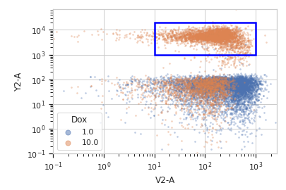
Make a little data set.
>>> import cytoflow as flow
>>> import_op = flow.ImportOp()
>>> import_op.tubes = [flow.Tube(file = "Plate01/RFP_Well_A3.fcs",
...                              conditions = {'Dox' : 10.0}),
...                    flow.Tube(file = "Plate01/CFP_Well_A4.fcs",
...                              conditions = {'Dox' : 1.0})]
>>> import_op.conditions = {'Dox' : 'float'}
>>> ex = import_op.apply()
Create and parameterize the operation.
>>> r = flow.Range2DOp(name = "Range2D",
...                    xchannel = "V2-A",
...                    xlow = 10,
...                    xhigh = 1000,
...                    ychannel = "Y2-A",
...                    ylow = 1000,
...                    yhigh = 20000)
Show the default view.
>>> rv = r.default_view(huefacet = "Dox",
...                     xscale = 'log',
...                     yscale = 'log')
>>> rv.plot(ex)
Note
If you want to use the interactive default view in a Jupyter notebook, make sure you say
%matplotlib notebookin the first cell (instead of%matplotlib inlineor similar). Then calldefault_view()withinteractive = True:rv = r.default_view(huefacet = "Dox", xscale = 'log', yscale = 'log', interactive = True) rv.plot(ex)
Apply the gate, and show the result
>>> ex2 = r.apply(ex)
>>> ex2.data.groupby('Range2D').size()
Range2D
False    16405
True      3595
dtype: int64
-
apply(experiment)[source]¶ Applies the threshold to an experiment.
Parameters: experiment (Experiment) – the old_experiment to which this op is applied Returns: a new Experiment, the same as the old experiment but with a new column with a data type ofbooland the same as the operationname. The bool isTrueif the event’s measurement inxchannelis greater thanxlowand less thanhigh, and the event’s measurement inychannelis greater thanylowand less thanyhigh; it isFalseotherwise.Return type: Experiment
-
-
class
cytoflow.operations.range2d.RangeSelection2D[source]¶ Bases:
cytoflow.operations.base_op_views.Op2DView,cytoflow.views.scatterplot.ScatterplotViewPlots, and lets the user interact with, a 2D selection.
-
interactive¶ is this view interactive? Ie, can the user set min and max with a mouse drag?
Type: Bool
-
xchannel, ychannel The channels to use for this view’s X and Y axes. If you created the view using
default_view(), this is already set.Type: String
-
xscale, yscale The way to scale the x axes. If you created the view using
default_view(), this may be already set.Type: {‘linear’, ‘log’, ‘logicle’}
-
op¶ The
IOperationthat this view is associated with. If you created the view usingdefault_view(), this is already set.Type: Instance(IOperation)
-
xlim, ylim Set the min and max limits of the plots’ x and y axes.
Type: (float, float)
-
xfacet, yfacet Set to one of the
conditionsin theExperiment, and a new row or column of subplots will be added for every unique value of that condition.Type: String
-
huefacet¶ Set to one of the
conditionsin the in theExperiment, and a new color will be added to the plot for every unique value of that condition.Type: String
Notes
We inherit xfacet and yfacet from cytoflow.views.ScatterplotView, but they must both be unset!
Examples
In a Jupyter notebook with %matplotlib notebook
>>> r = flow.Range2DOp(name = "Range2D",
...                    xchannel = "V2-A",
...                    ychannel = "Y2-A"))
>>> rv = r.default_view()
>>> rv.interactive = True
>>> rv.plot(ex2)
-
plot(experiment, **kwargs)[source]¶ Plot the underlying scatterplot and then plot the selection on top of it.
Parameters: - experiment (Experiment) – The
Experimentto plot using this view. - title (str) – Set the plot title
- xlabel, ylabel (str) – Set the X and Y axis labels
- huelabel (str) – Set the label for the hue facet (in the legend)
- legend (bool) – Plot a legend for the color or hue facet? Defaults to True.
- sharex, sharey (bool) – If there are multiple subplots, should they share axes? Defaults to True.
- row_order, col_order, hue_order (list) – Override the row/column/hue facet value order with the given list. If a value is not given in the ordering, it is not plotted. Defaults to a “natural ordering” of all the values.
- height (float) – The height of each row in inches. Default = 3.0
- aspect (float) – The aspect ratio of each subplot. Default = 1.5
- col_wrap (int) – If xfacet is set and yfacet is not set, you can “wrap” the subplots around so that they form a multi-row grid by setting col_wrap to the number of columns you want.
- sns_style ({“darkgrid”, “whitegrid”, “dark”, “white”, “ticks”}) – Which seaborn style to apply to the plot? Default is whitegrid.
- sns_context ({“paper”, “notebook”, “talk”, “poster”}) – Which seaborn context to use? Controls the scaling of plot elements such as tick labels and the legend. Default is talk.
- despine (Bool) – Remove the top and right axes from the plot? Default is True.
- min_quantile (float (>0.0 and <1.0, default = 0.001)) – Clip data that is less than this quantile.
- max_quantile (float (>0.0 and <1.0, default = 1.00)) – Clip data that is greater than this quantile.
- xlim, ylim ((float, float)) – Set the range of the plot’s axis.
- alpha (float (default = 0.25)) – The alpha blending value, between 0 (transparent) and 1 (opaque).
- s (int (default = 2)) – The size in points^2.
- marker (a matplotlib marker style, usually a string) – Specfies the glyph to draw for each point on the scatterplot. See matplotlib.markers for examples. Default: ‘o’
- experiment (Experiment) – The
-